The SLNEČNICE 80 interior is a thoughtfully designed family home, where every solution responds to real life. A warm walnut wood decor, a marble-character worktop, and several carefully considered details that most visitors never discover – that’s what this apartment in the Bratislava residence SLNEČNICE POP is all about.
VISUALISATION vs. REALISATION – two phases of one interior’s story. Take a look with us at the SLNEČNICE interior design.
- Interior design and realisation coordination
- Slnečnice residence, Bratislava, Slovakia
- 80 m2
living area
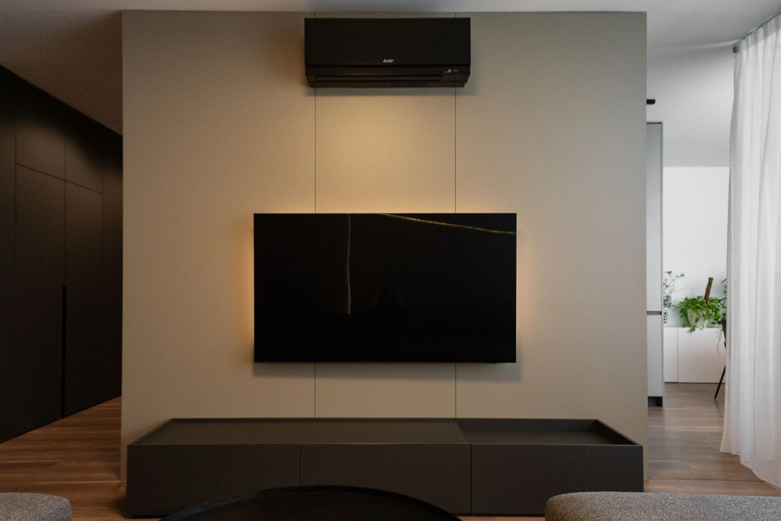
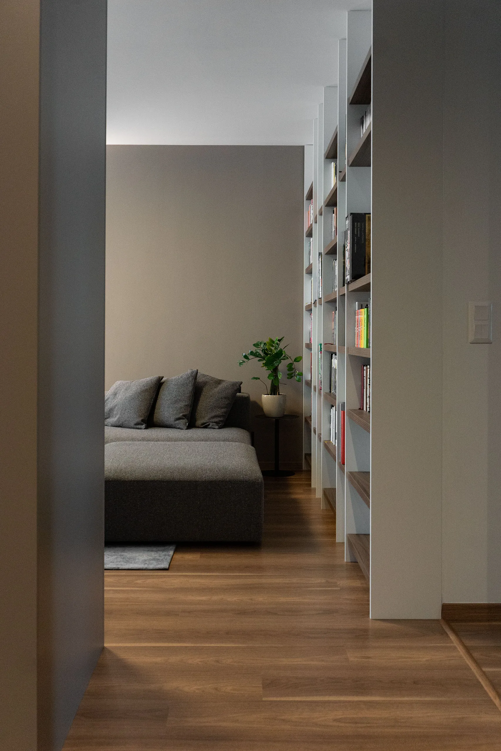
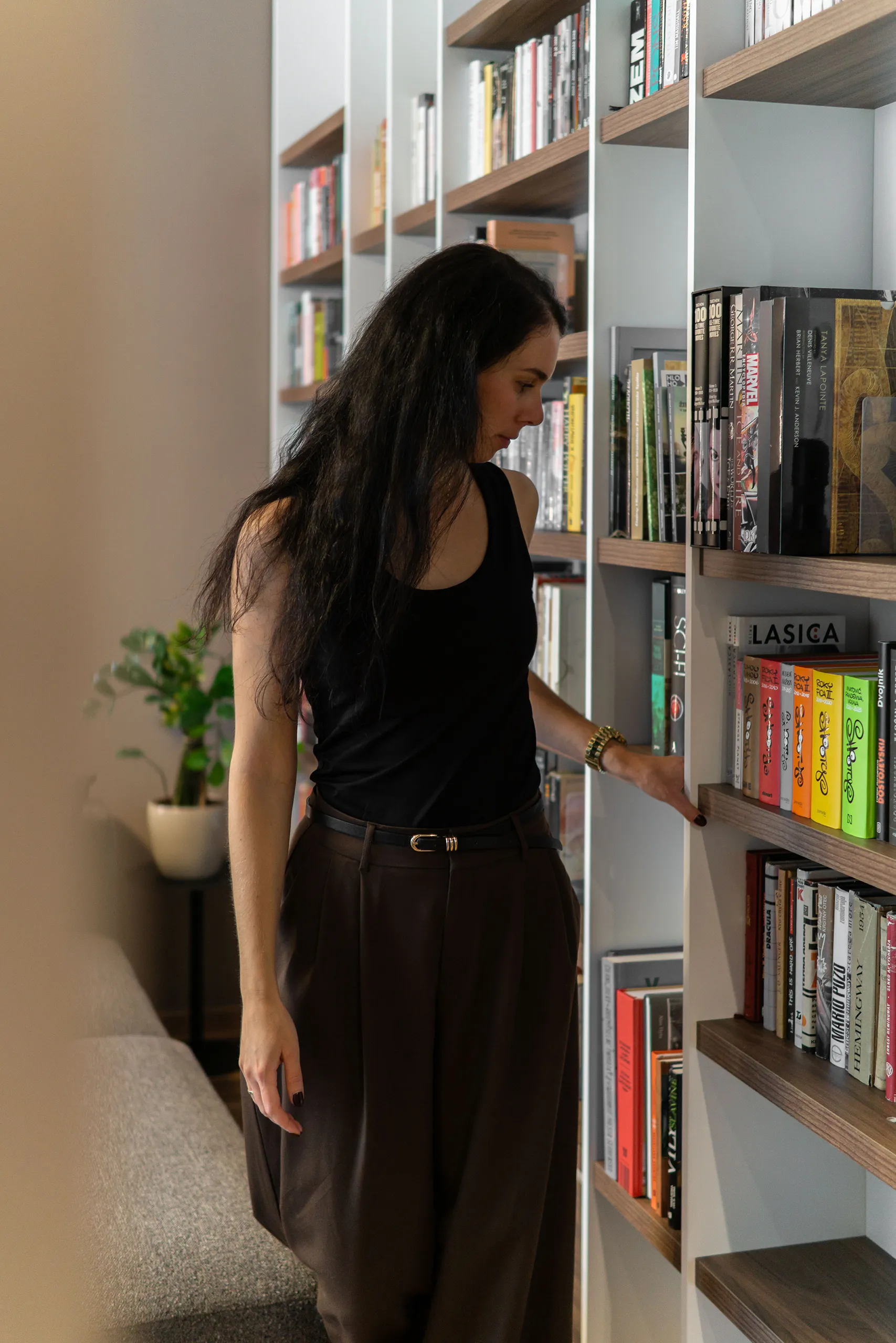
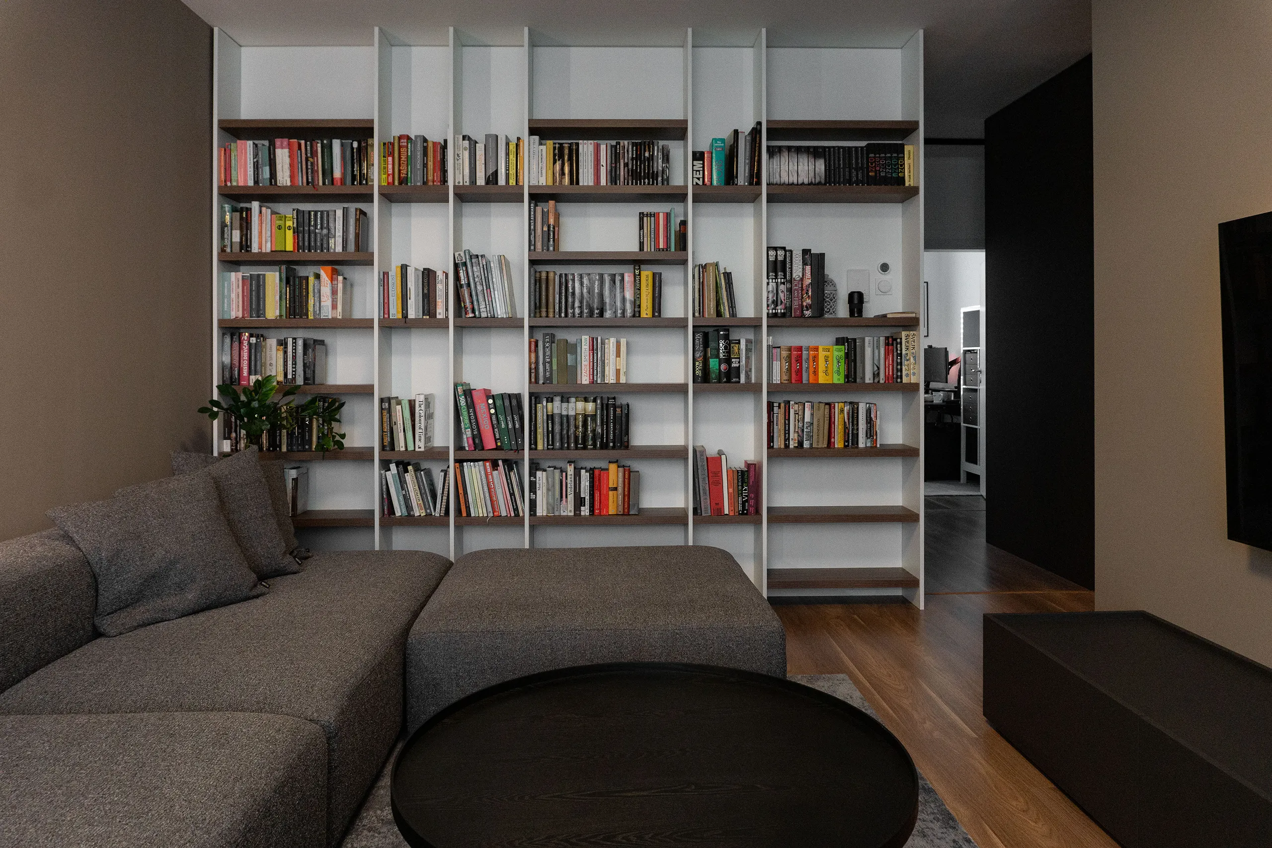
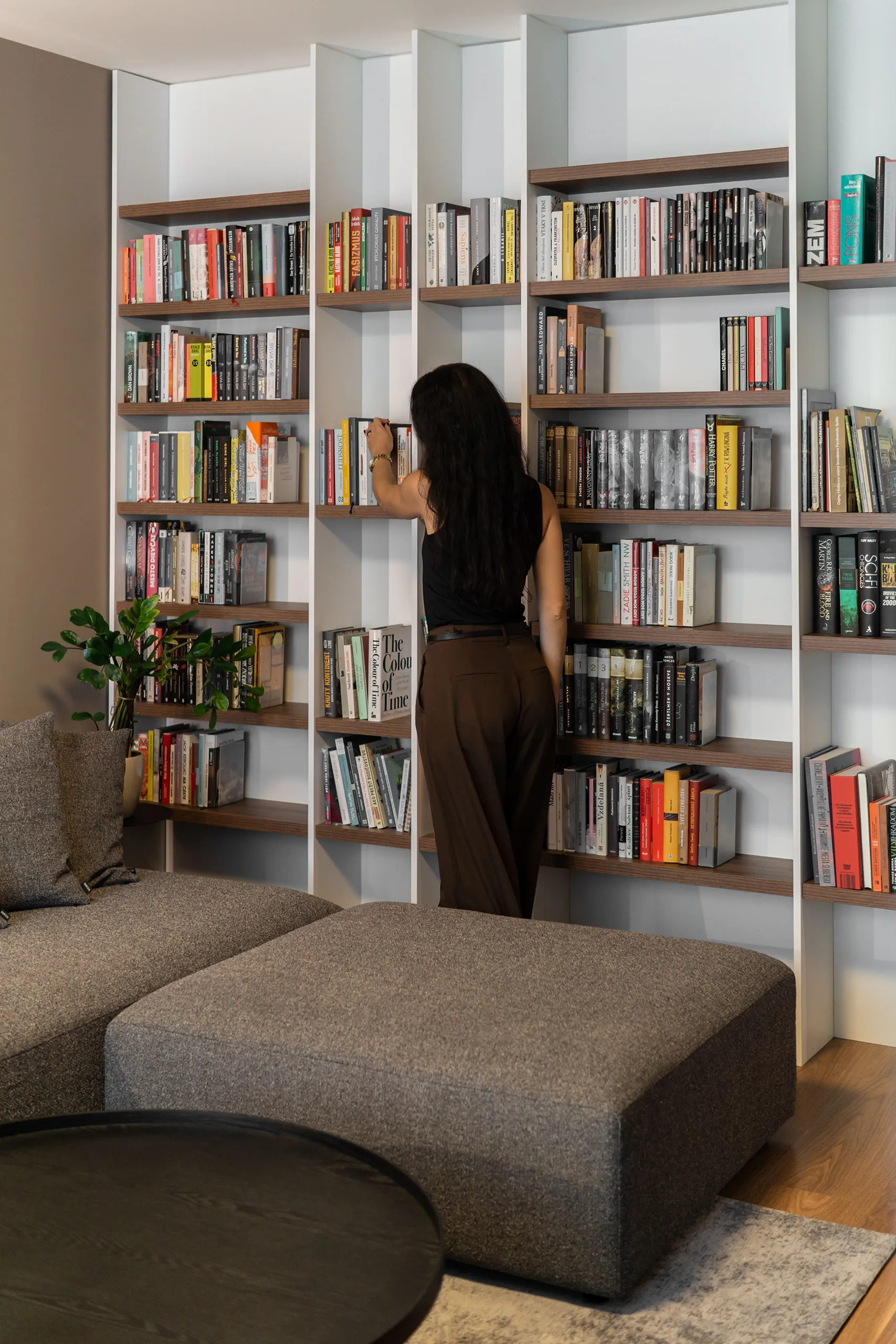
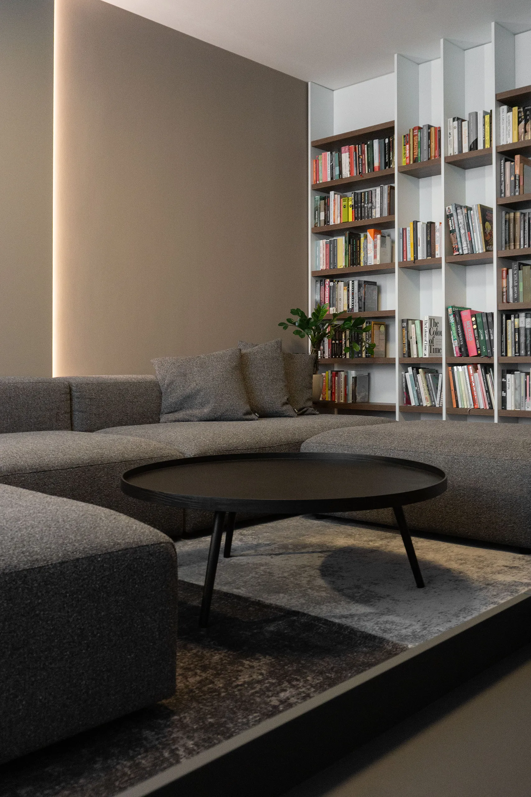
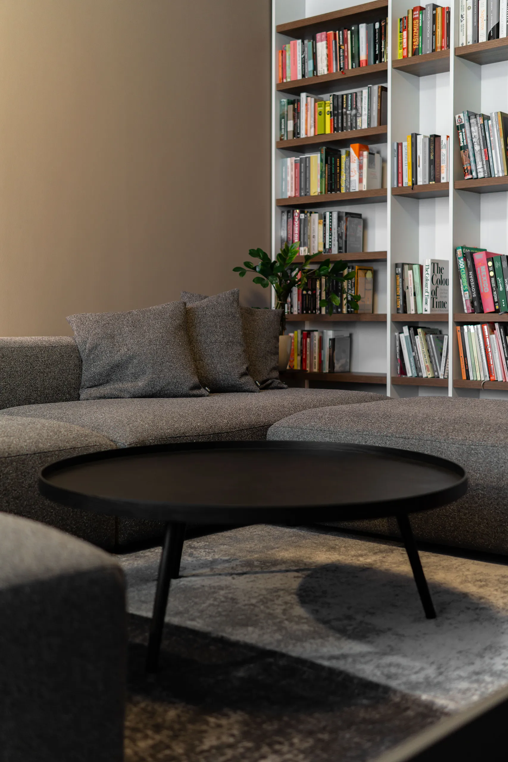
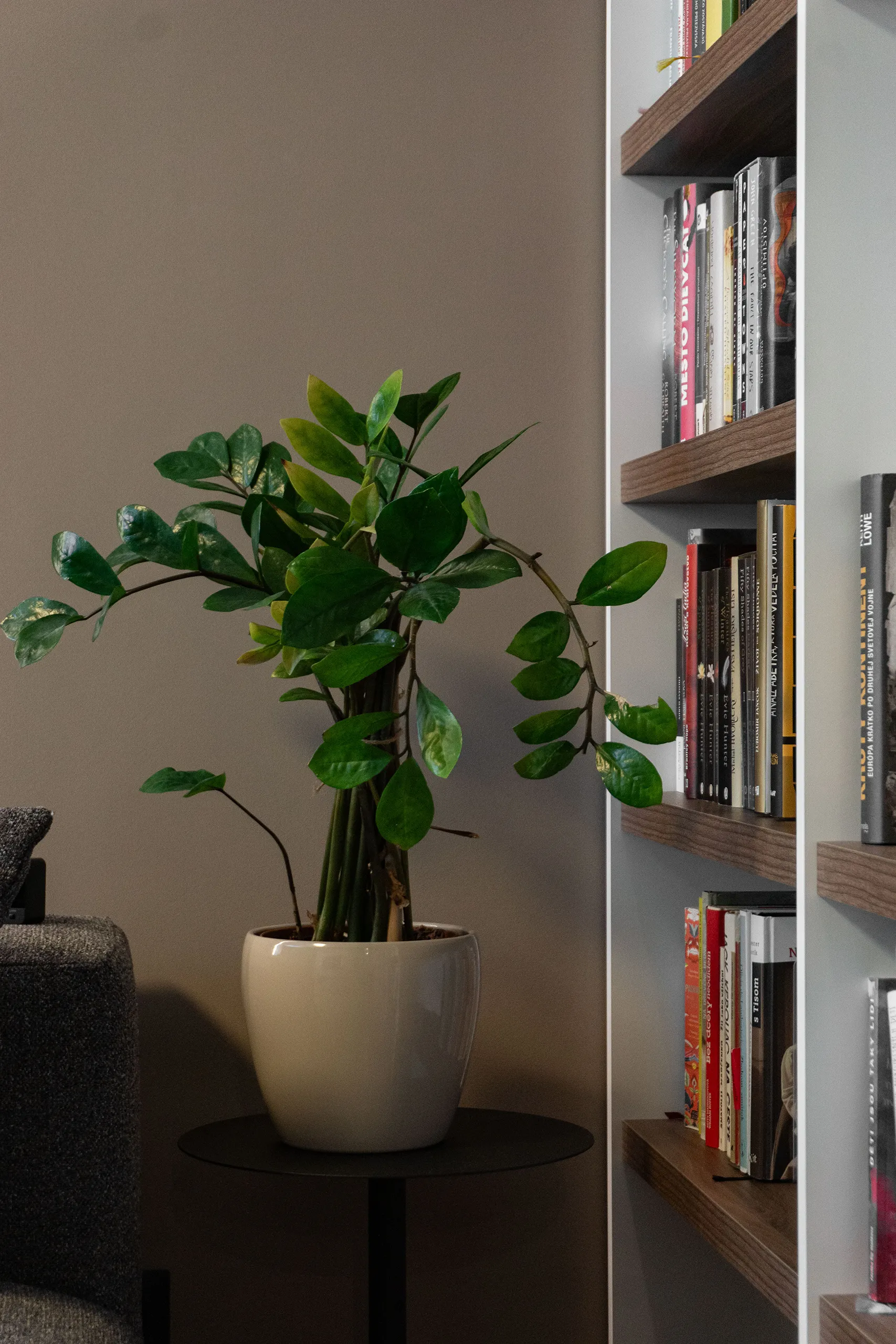
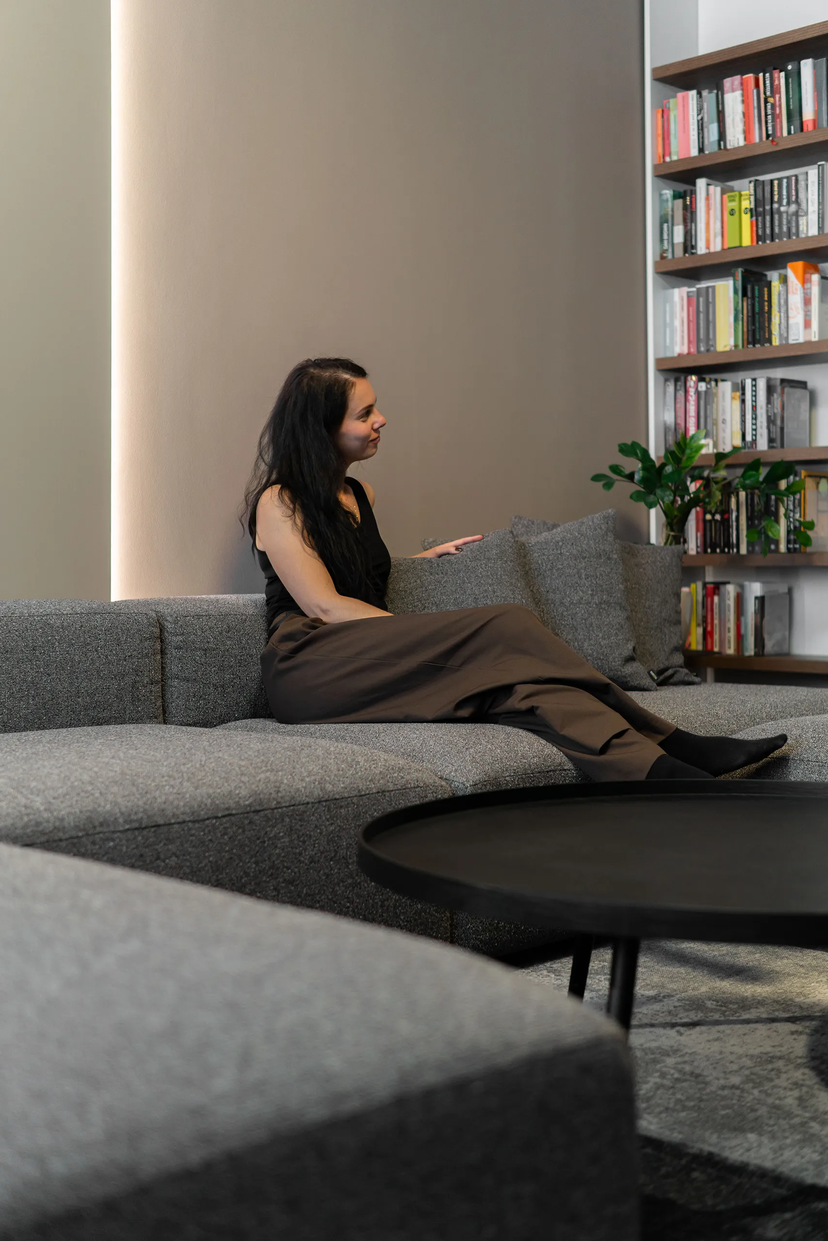
One wall, entirely for books … and Blu-ray discs, because good films deserve their own dedicated spot on the shelf. This wall intentionally takes over the whole expression and attention of the room, so we kept the rest of the design very purist.
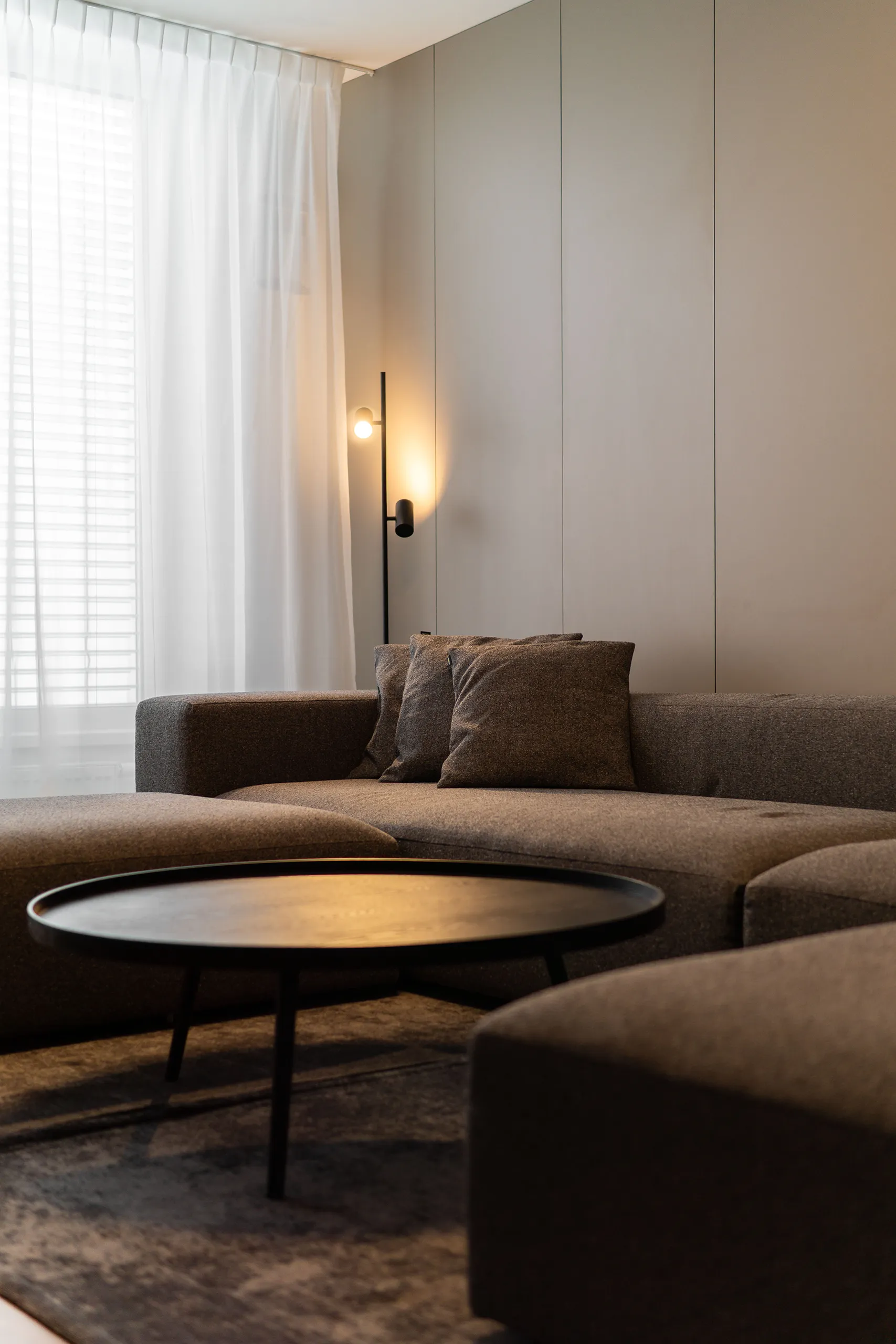
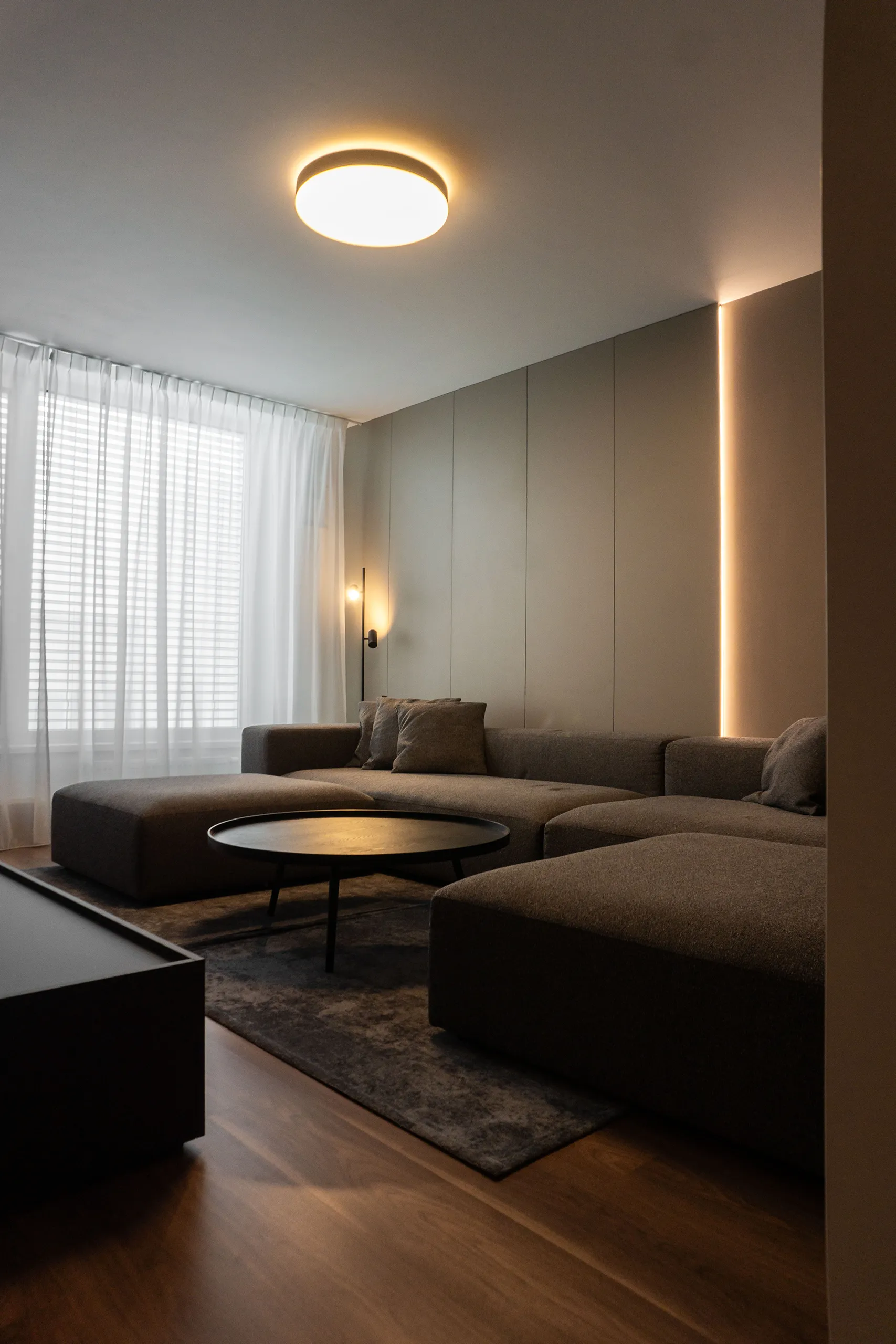
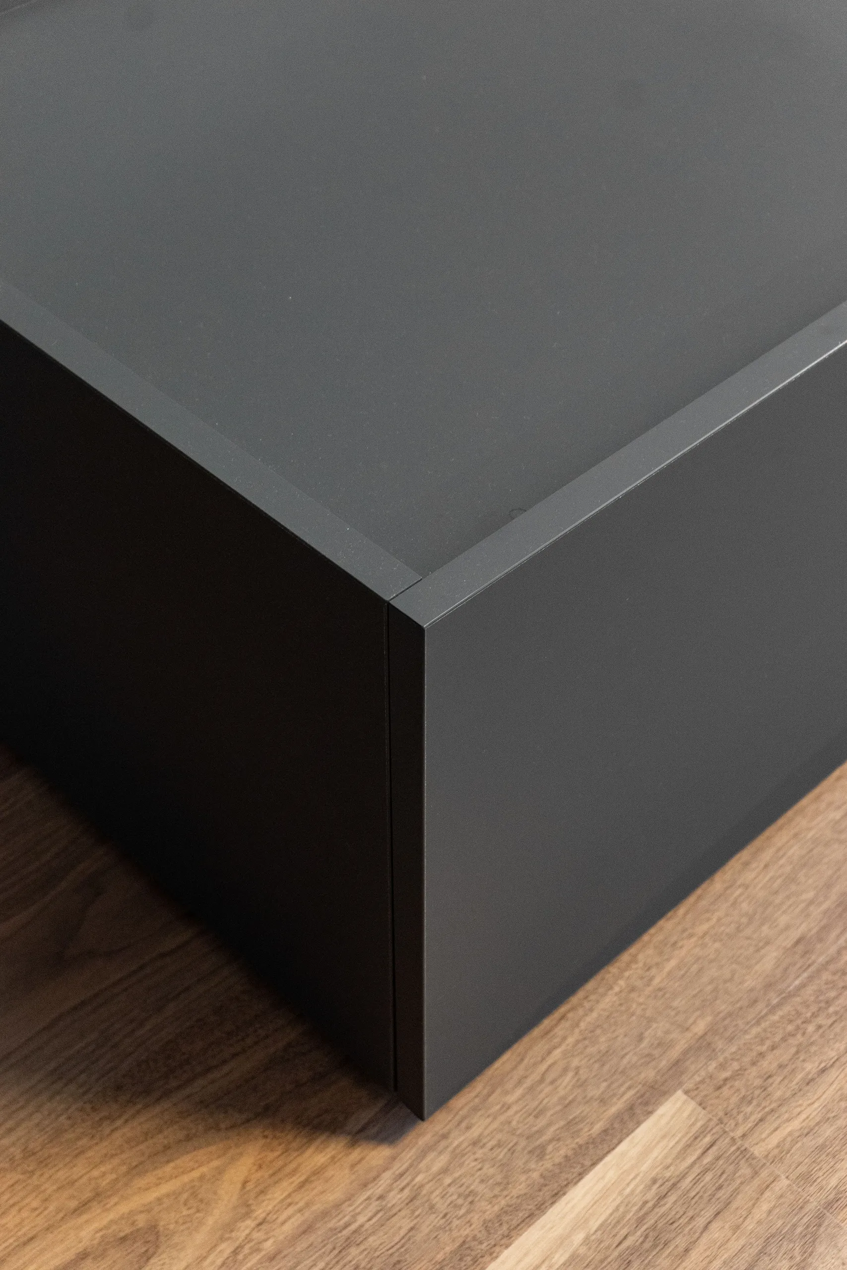
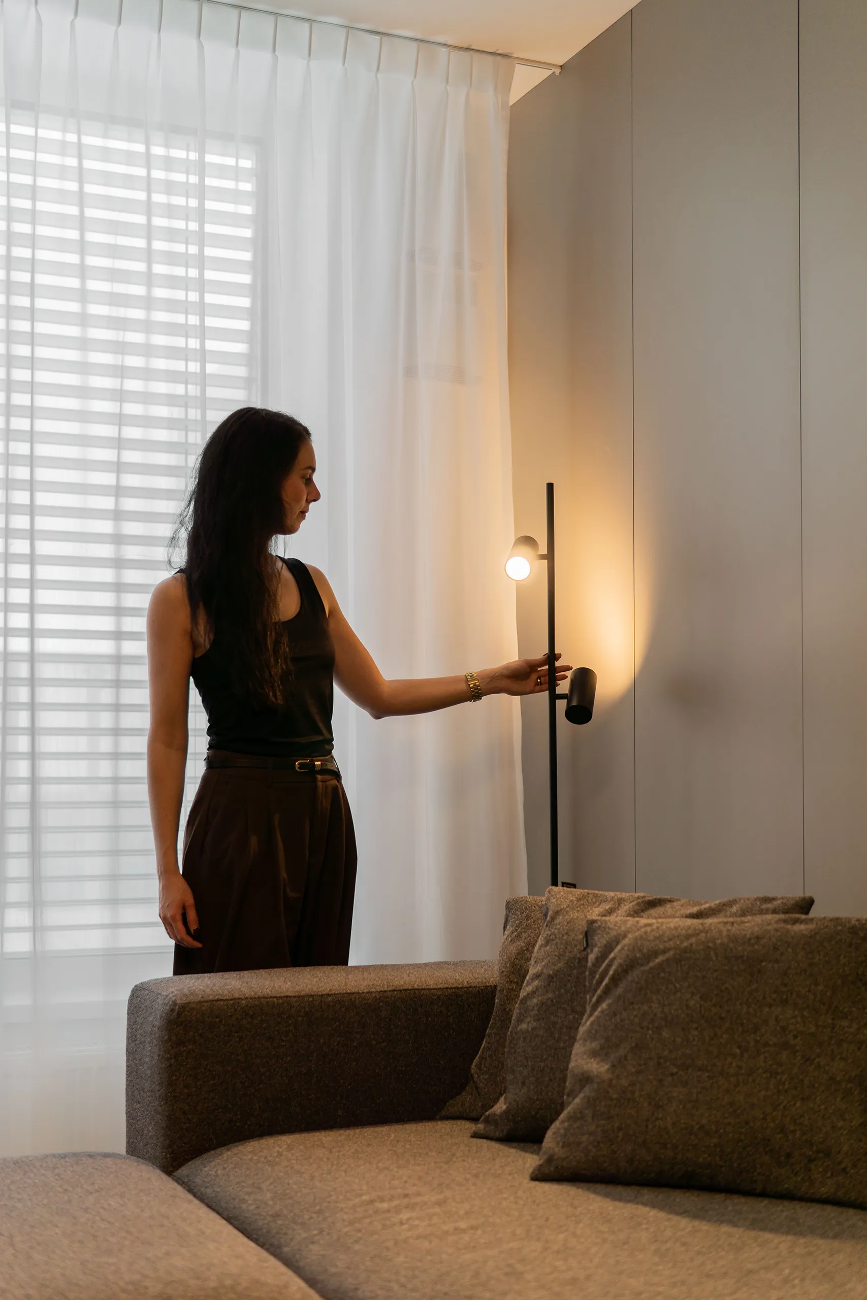
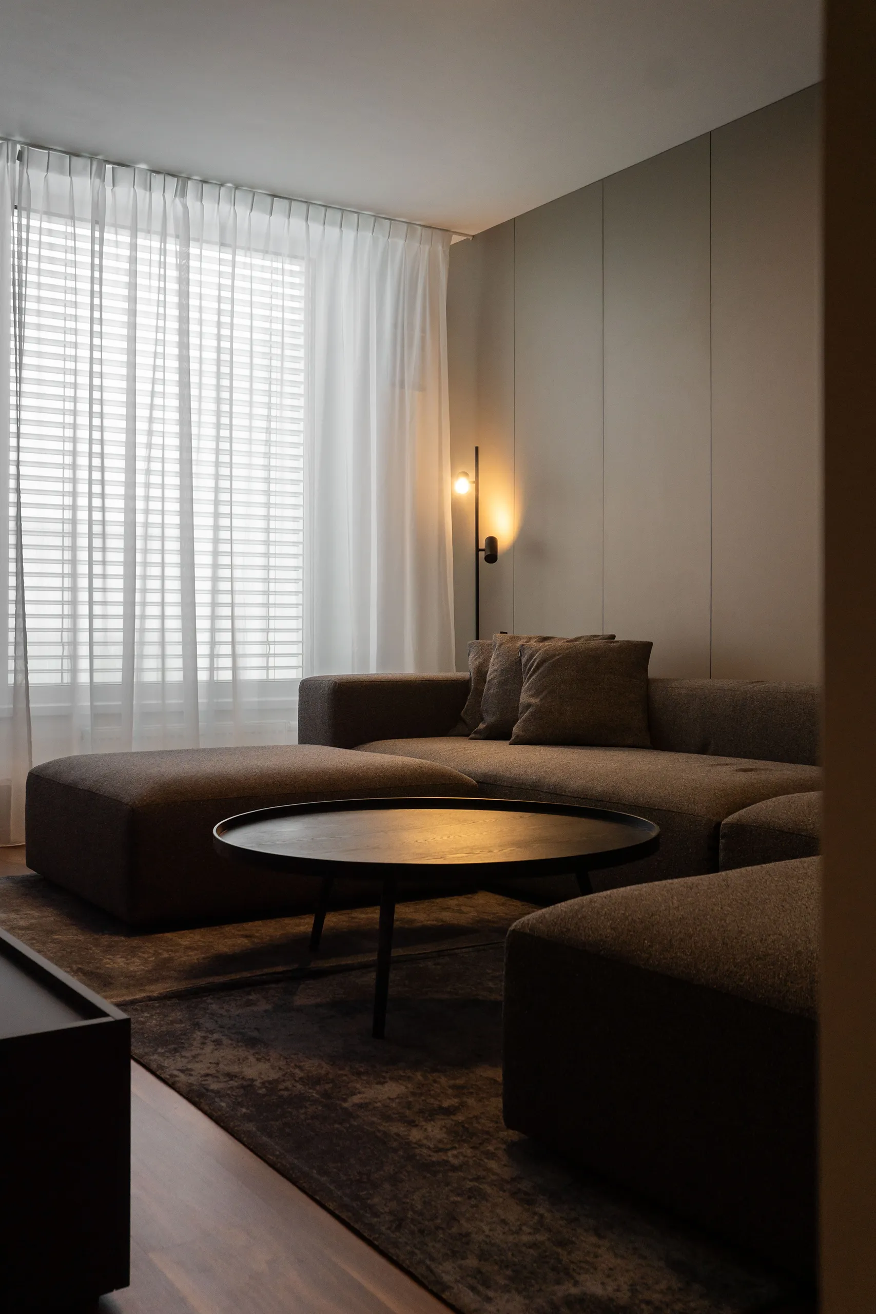
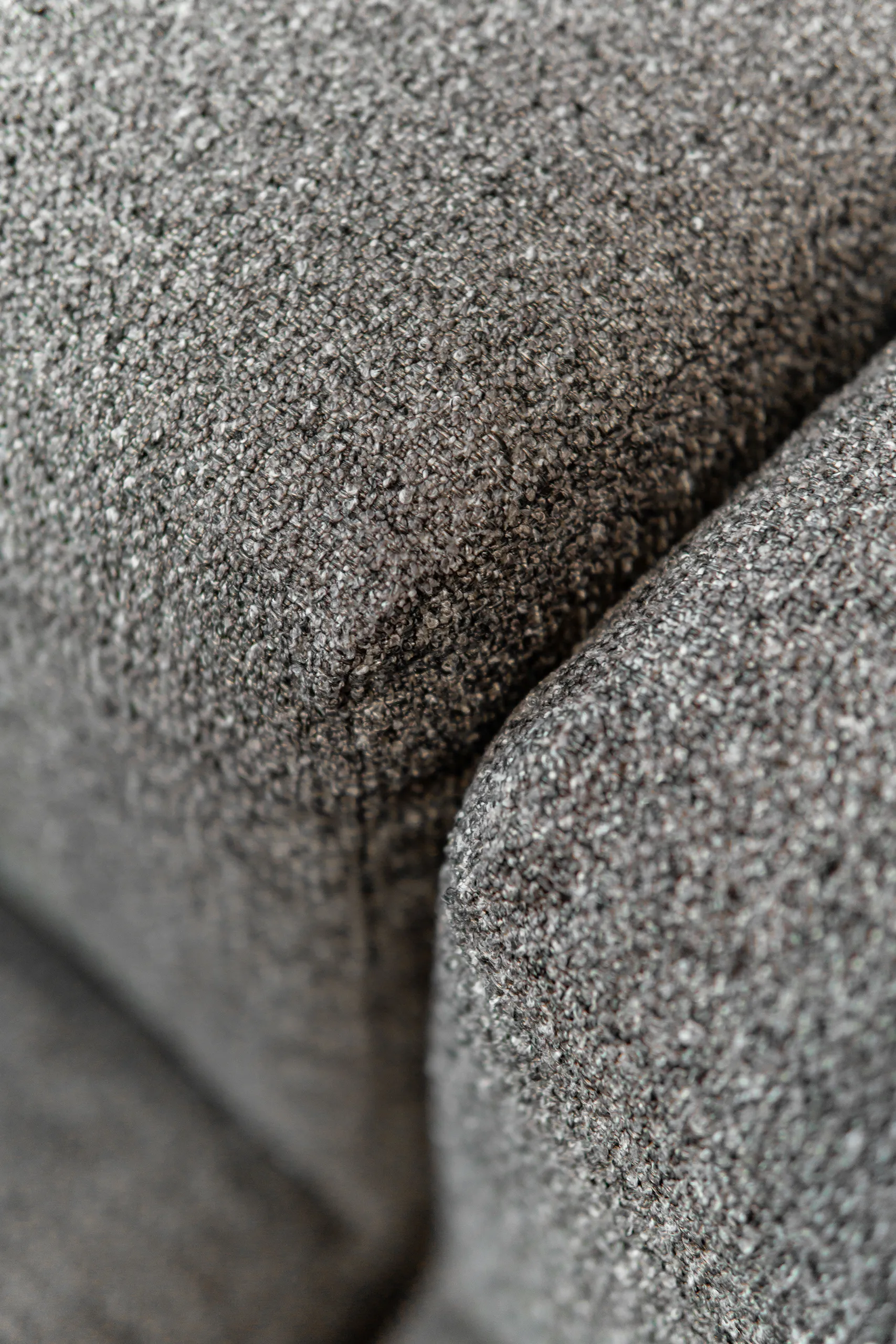
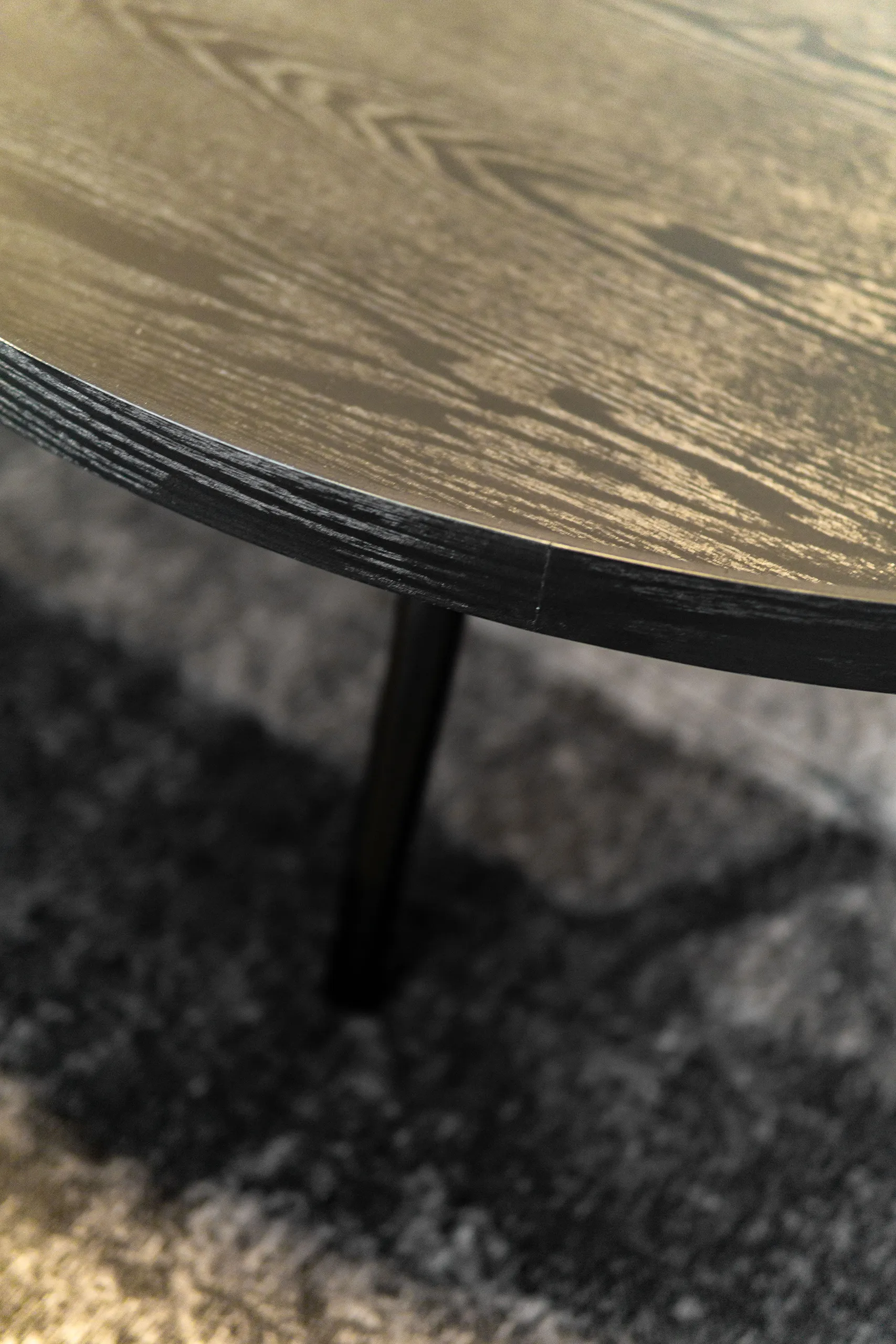
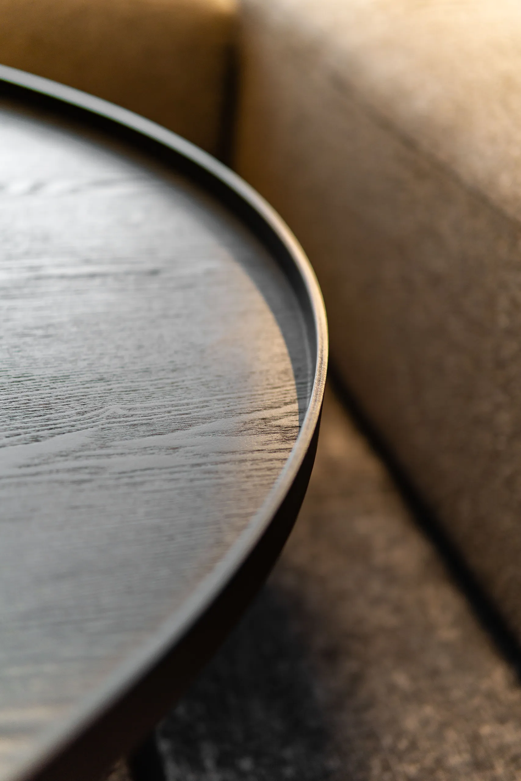
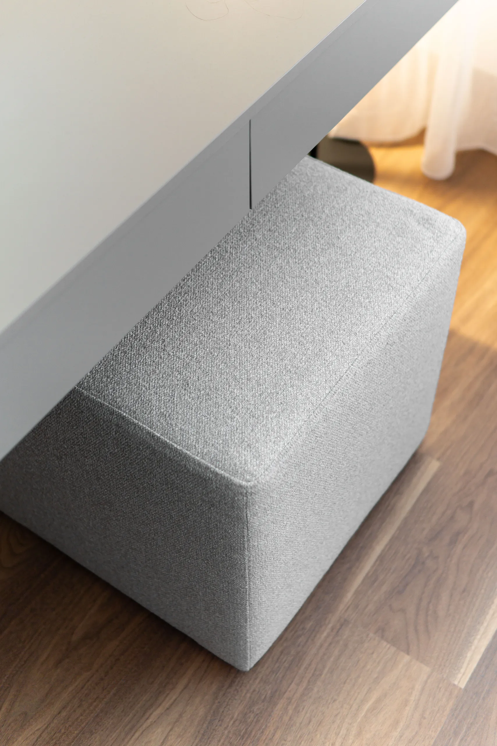
A large modular sofa with a sliding ottoman that playfully doubles as an extended chaise whenever needed. On the wall behind it, we went with a furniture panel featuring a simple repeating division and backlighting … one of those details that lifts the whole atmosphere up a level. And let’s not forget the coffee table … round, generously sized, in black. The round shape next to a large sofa isn’t a coincidence … it softens the lines, opens up the space, and for a family with children, it’s simply a practical bonus choice.
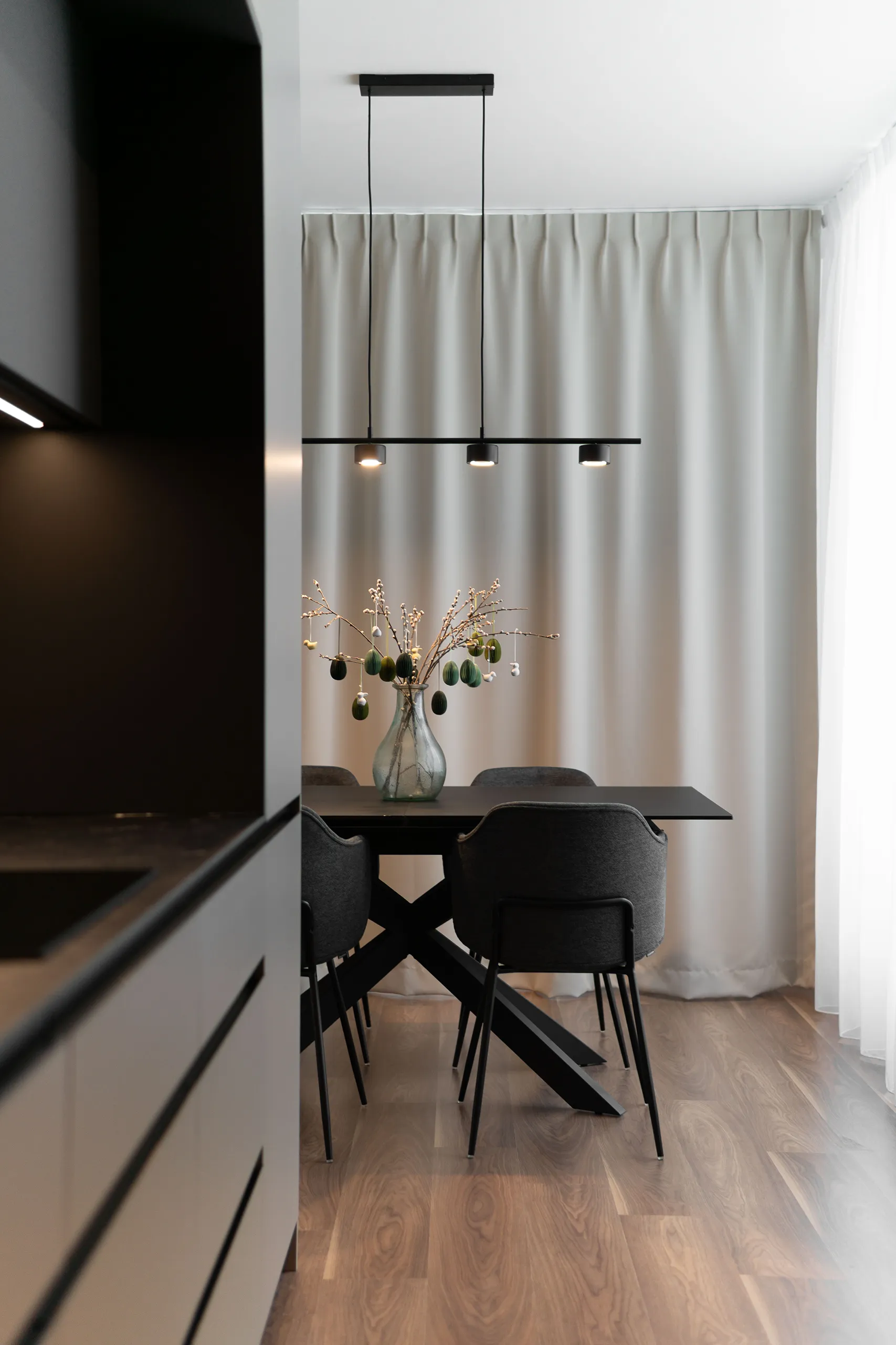
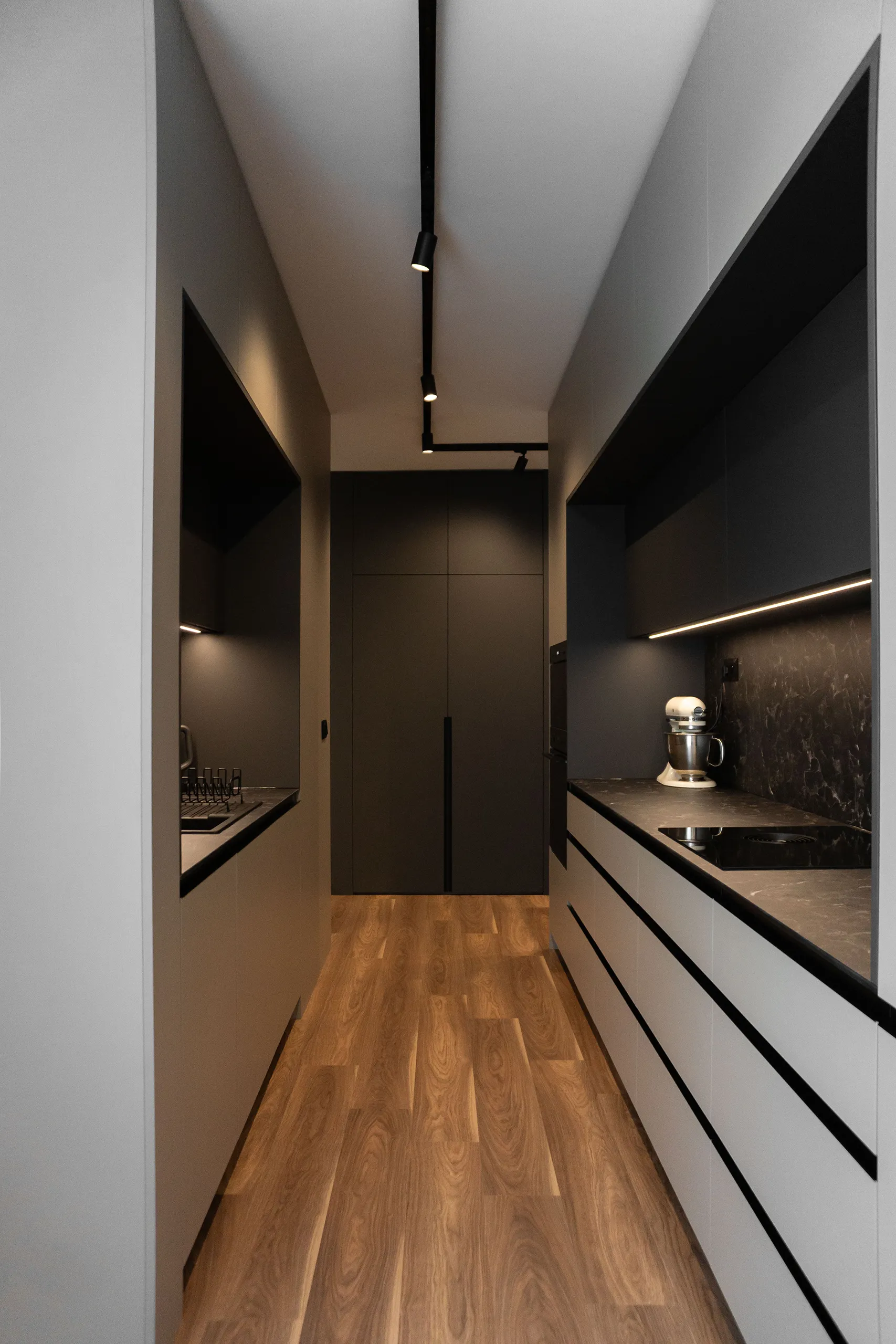
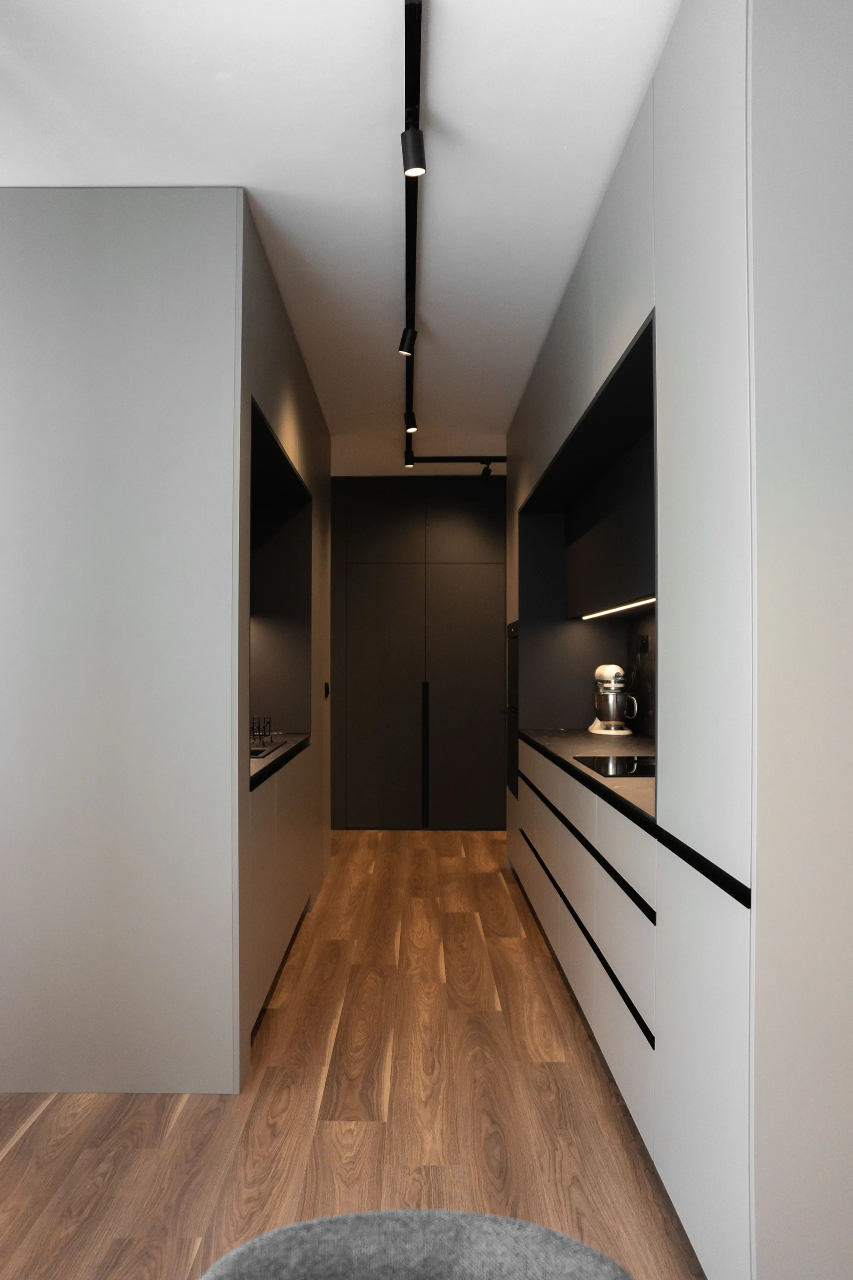
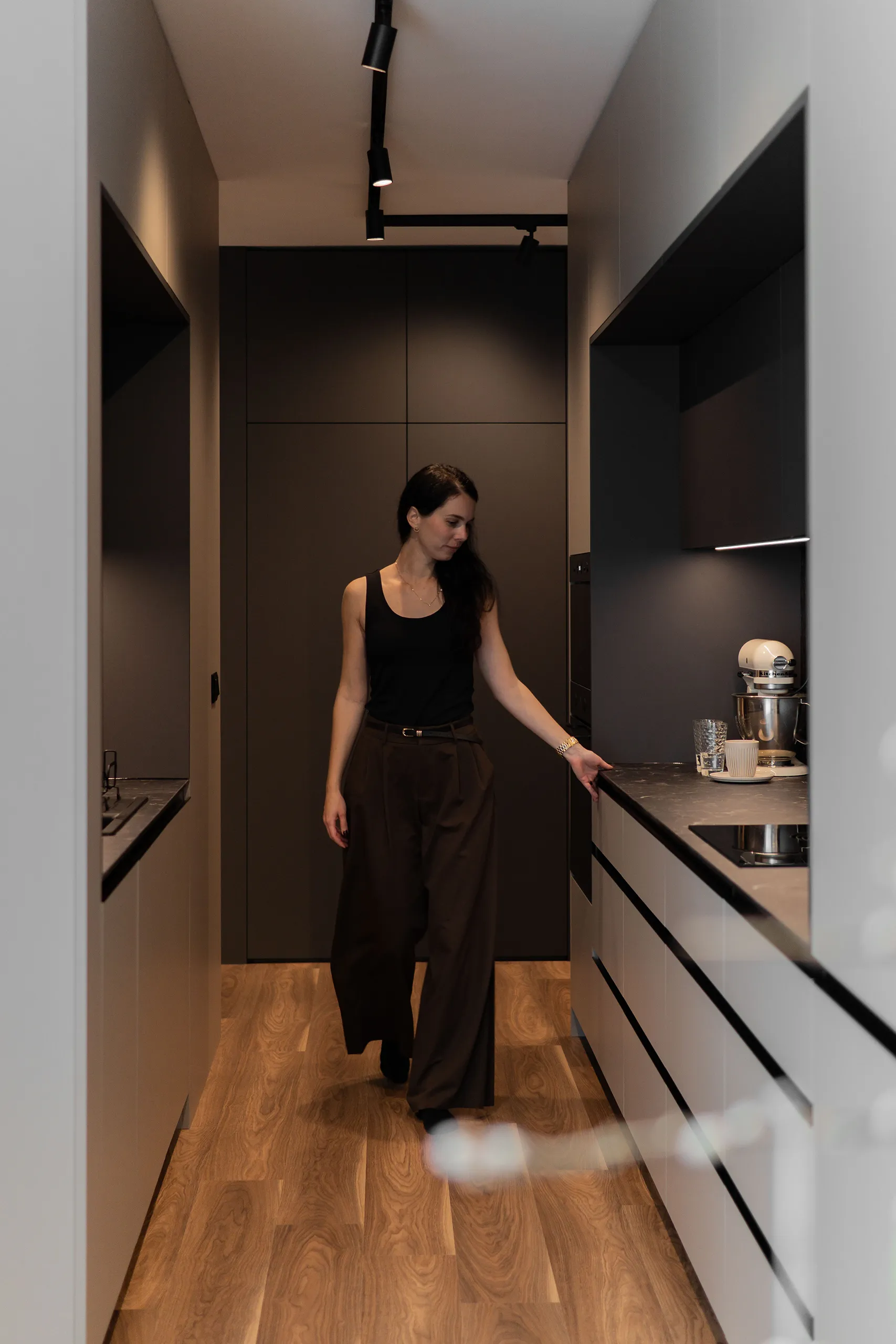
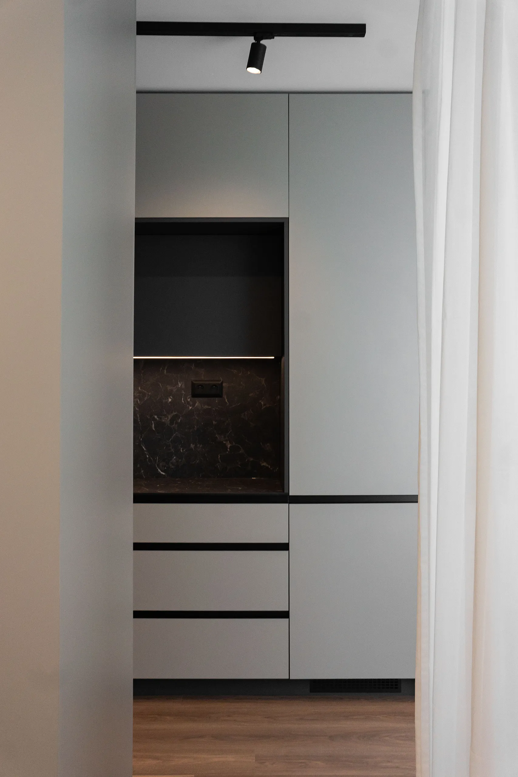
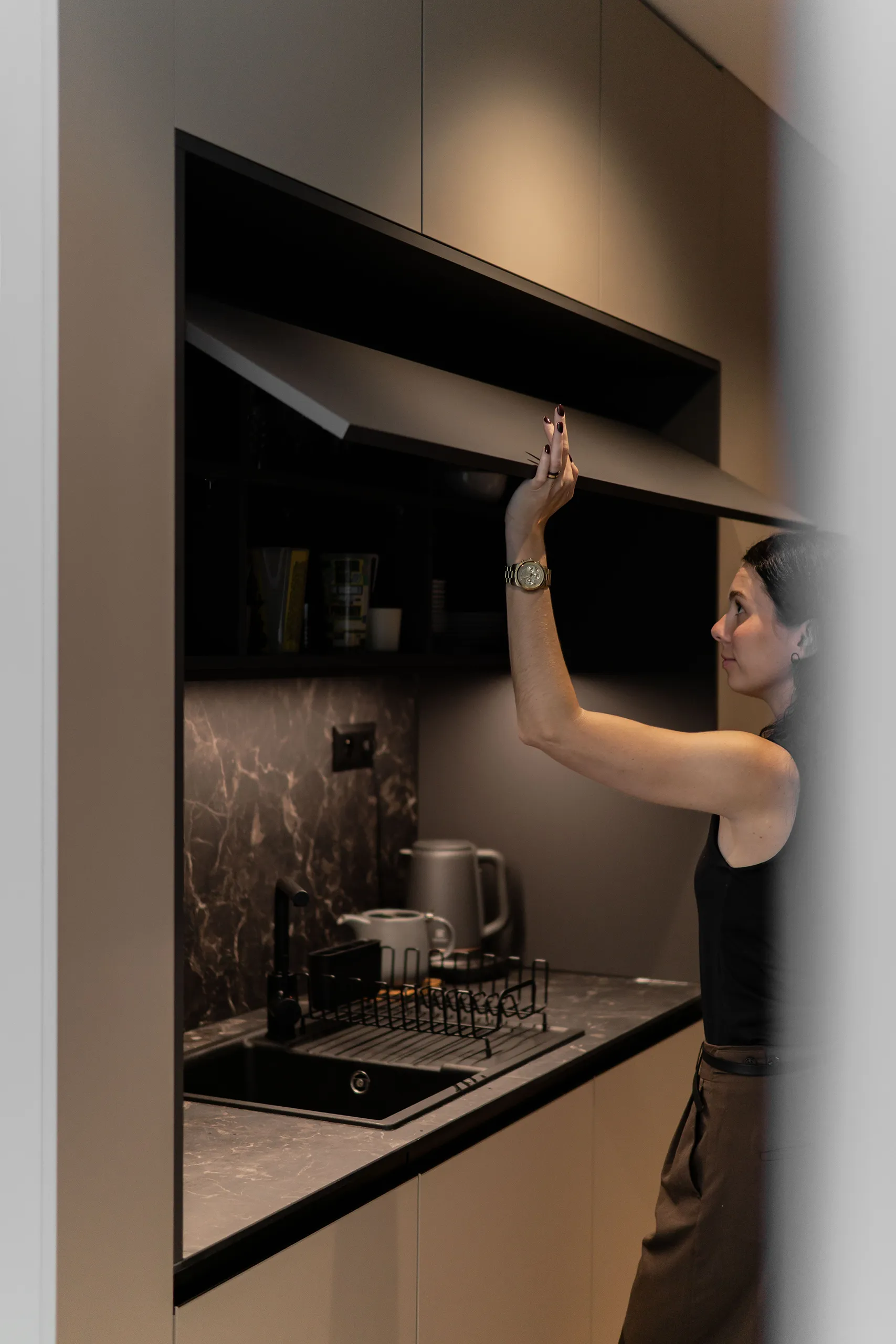
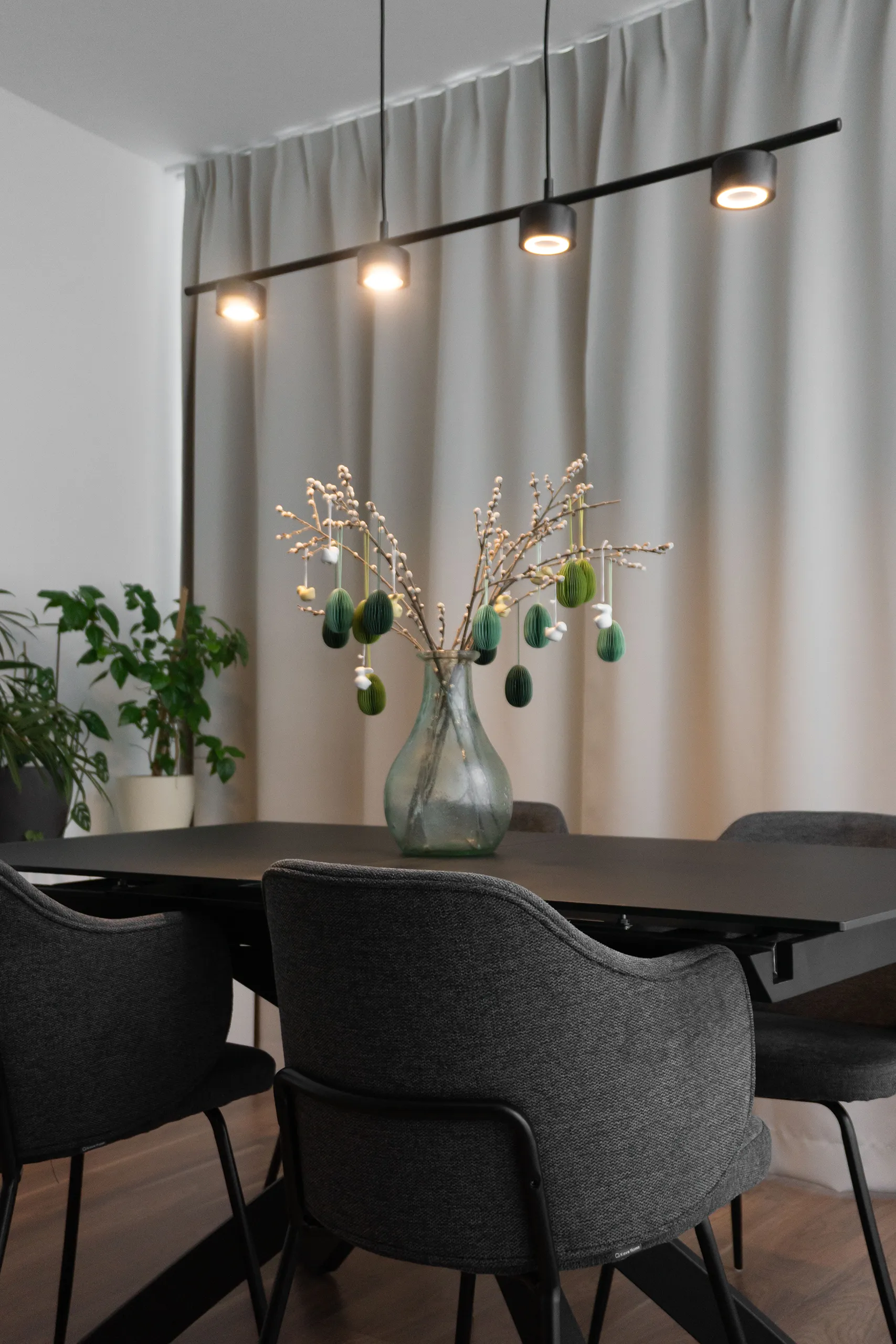
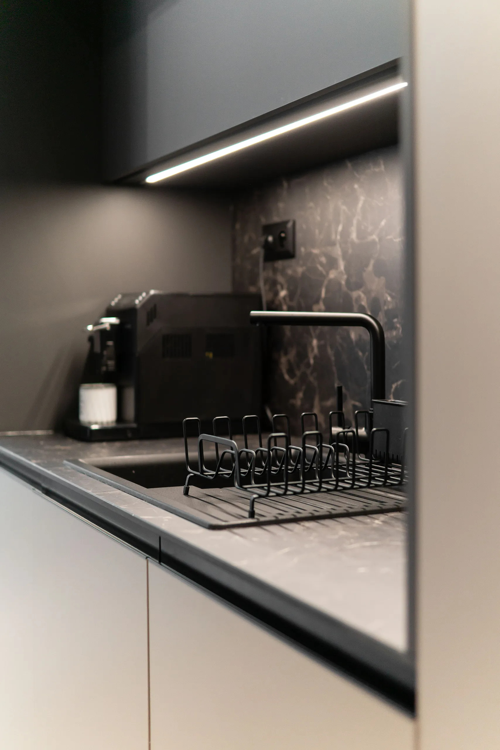
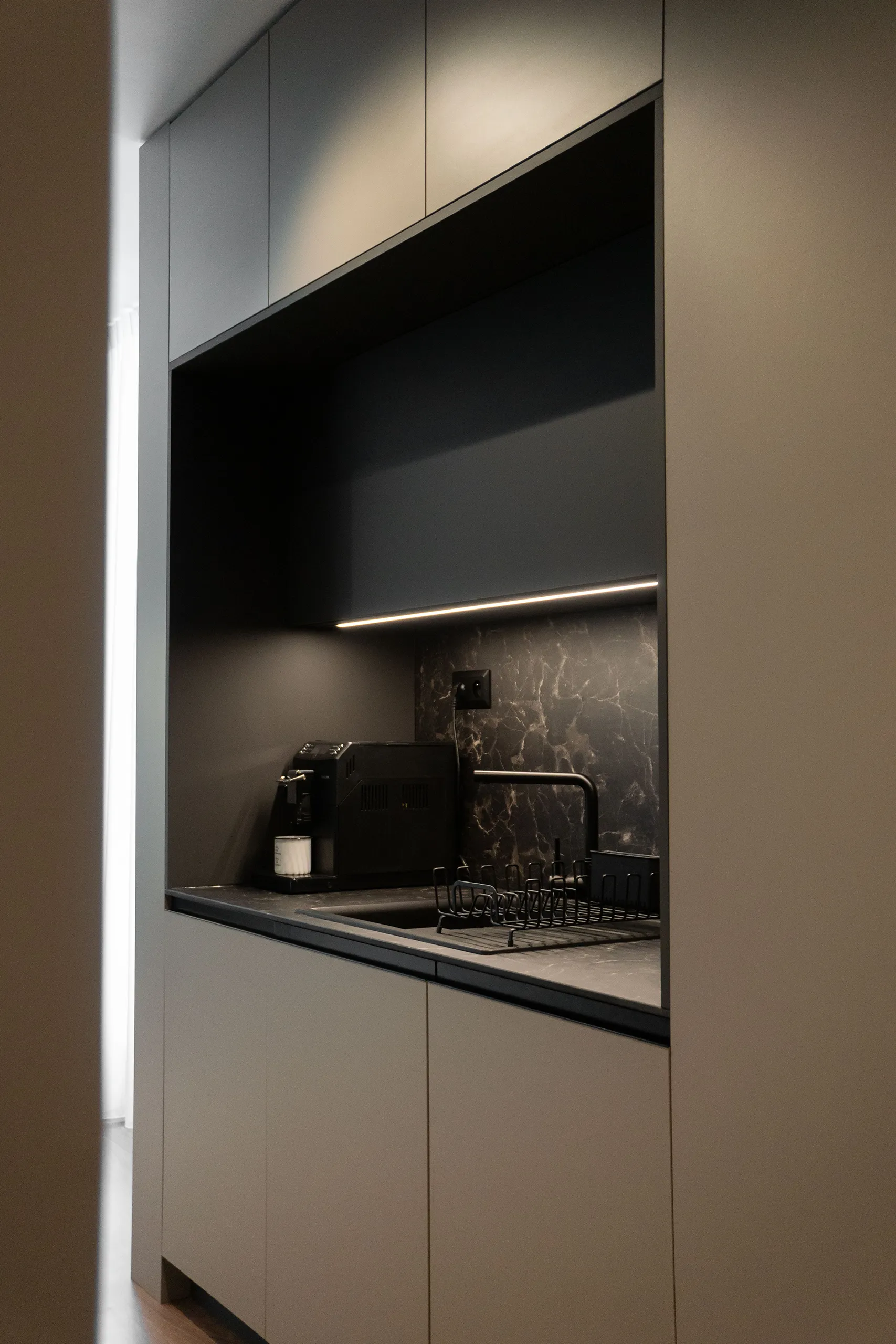
kitchen
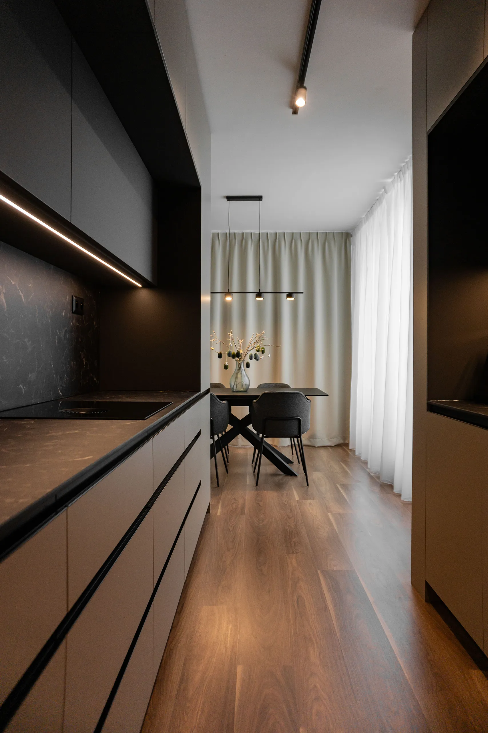
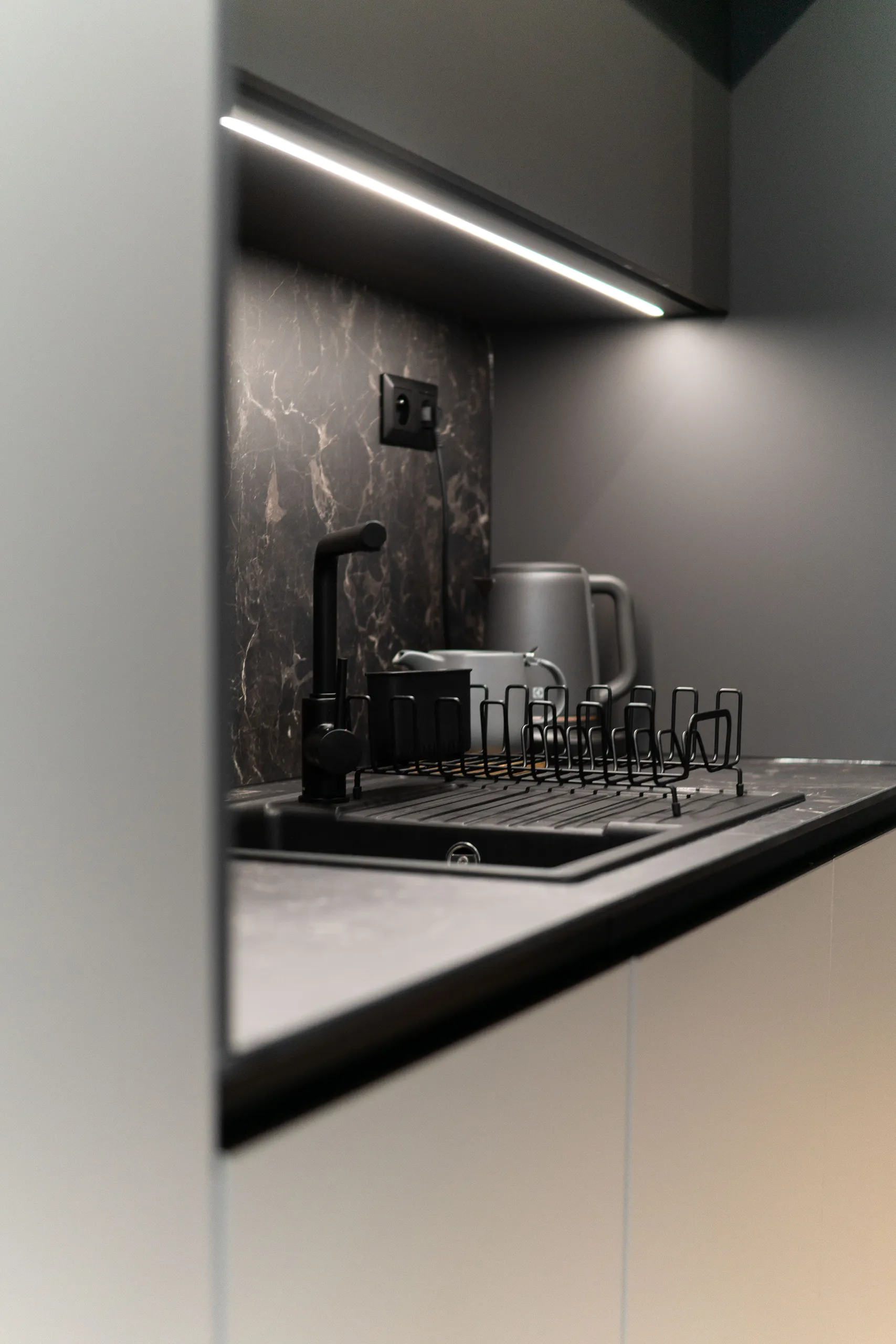
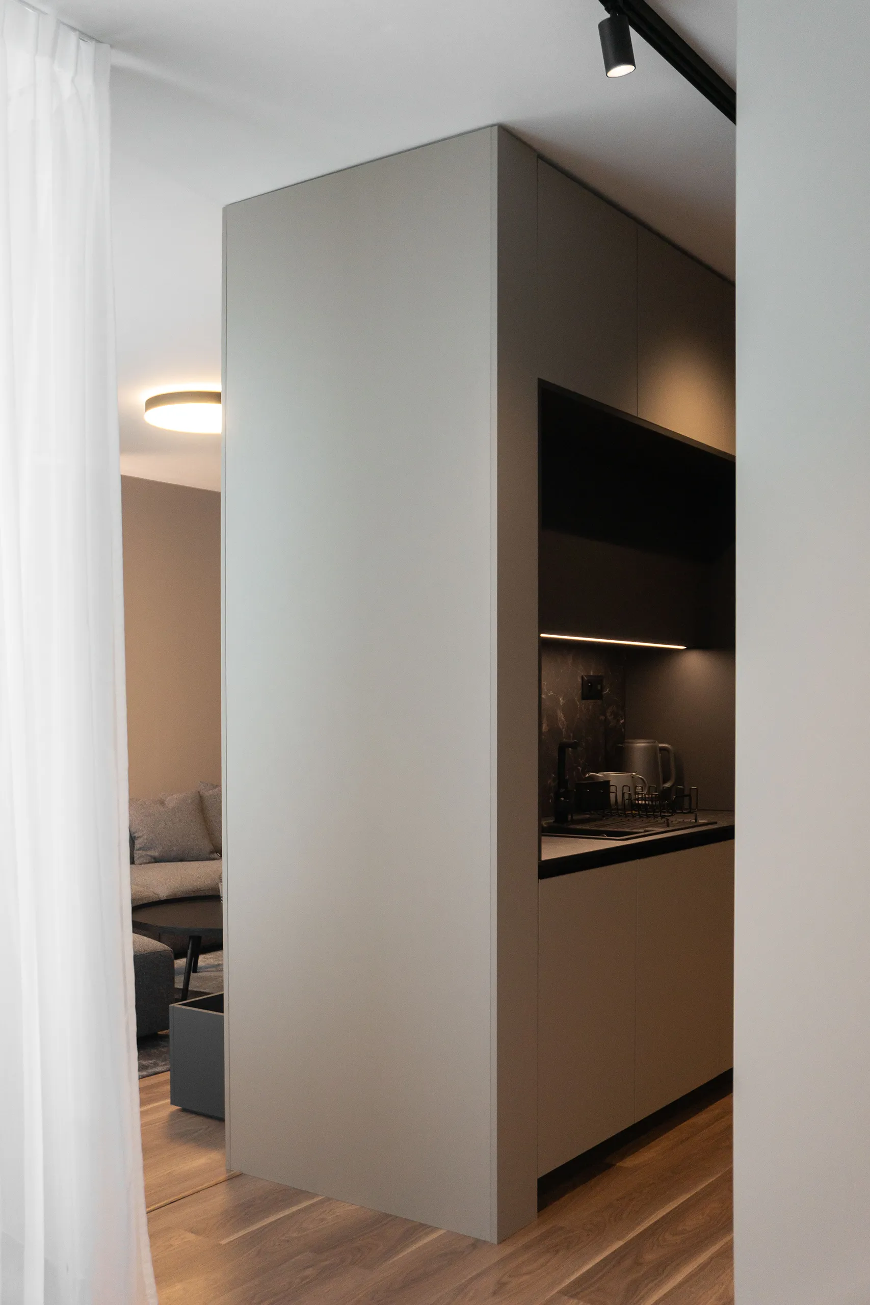
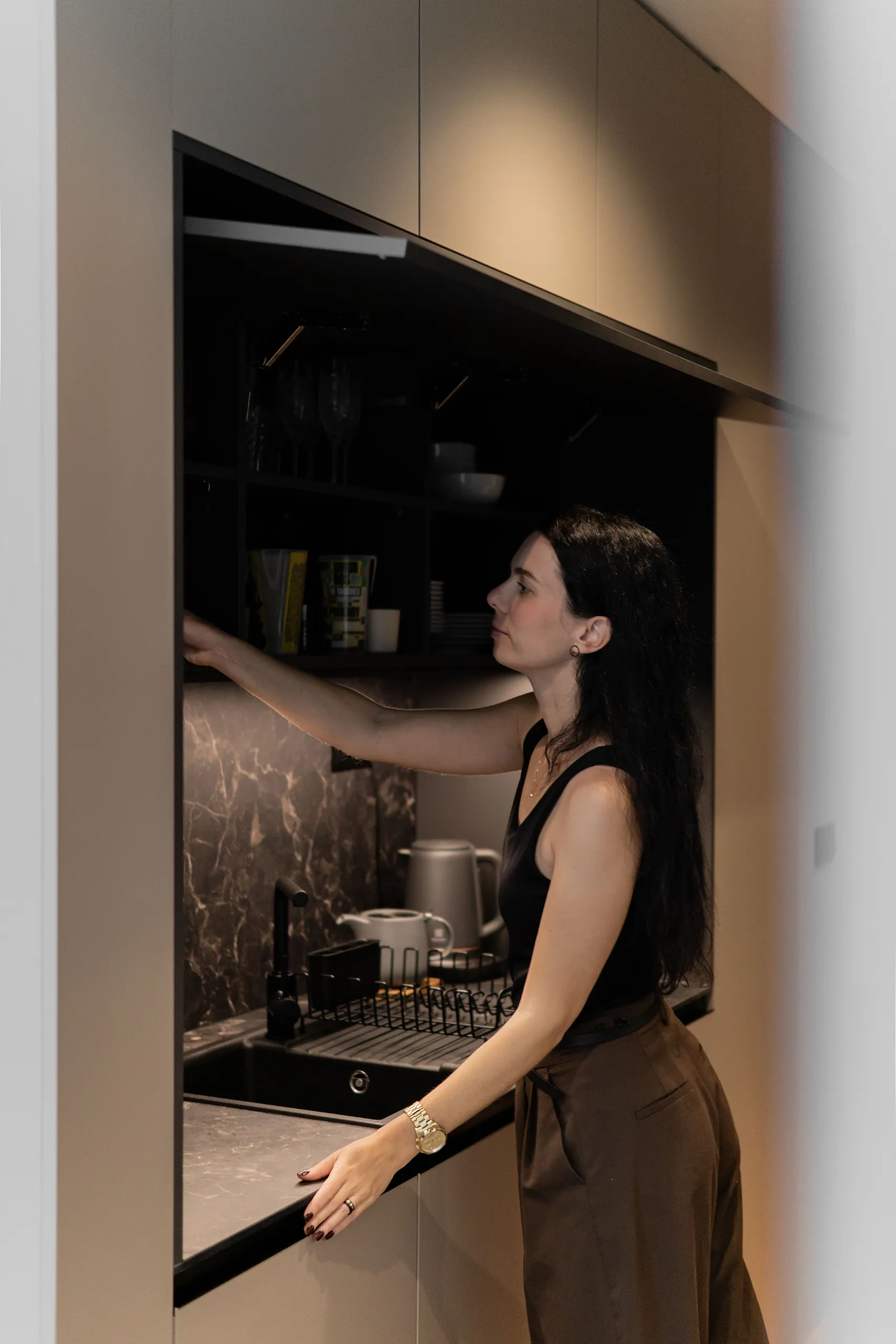
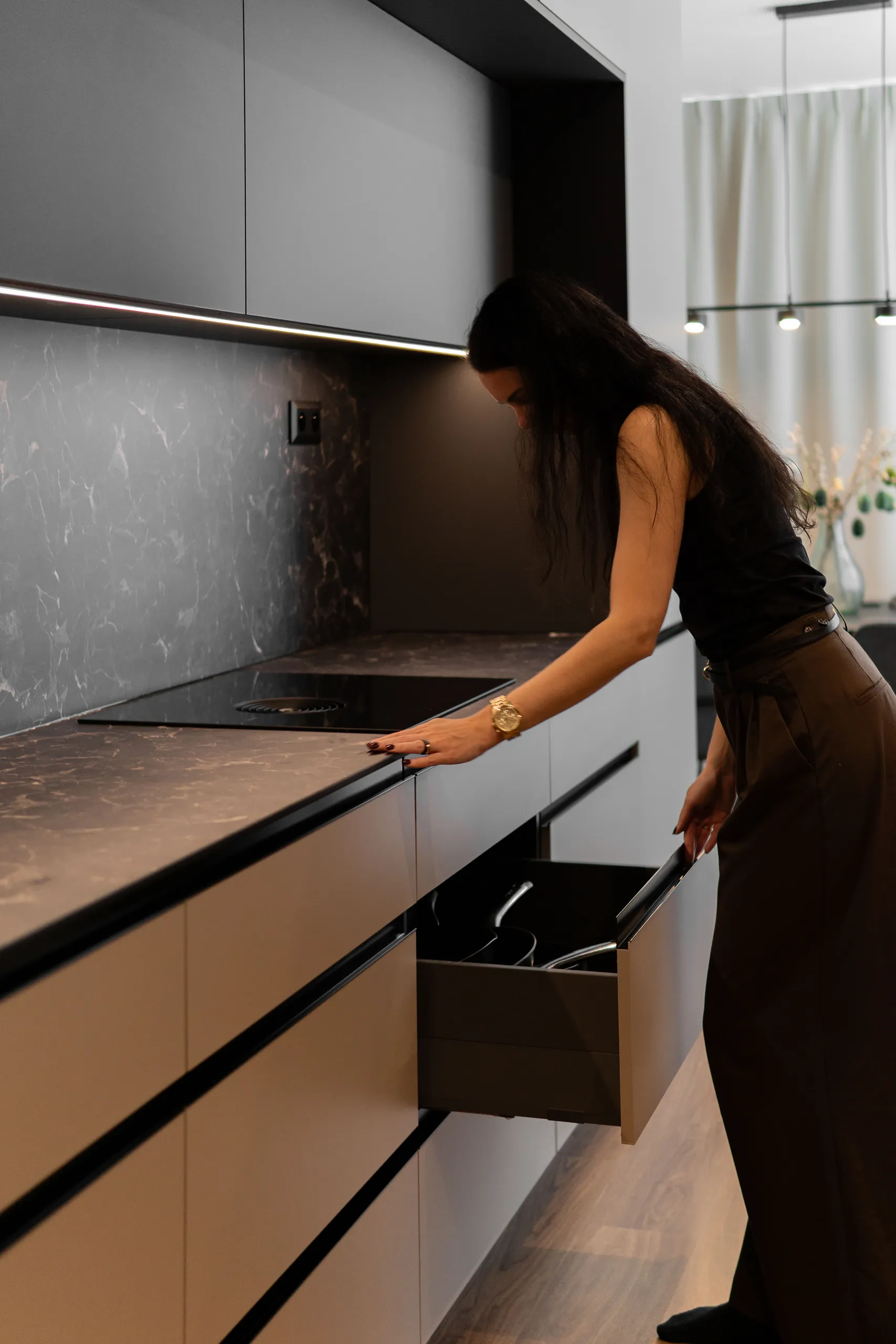
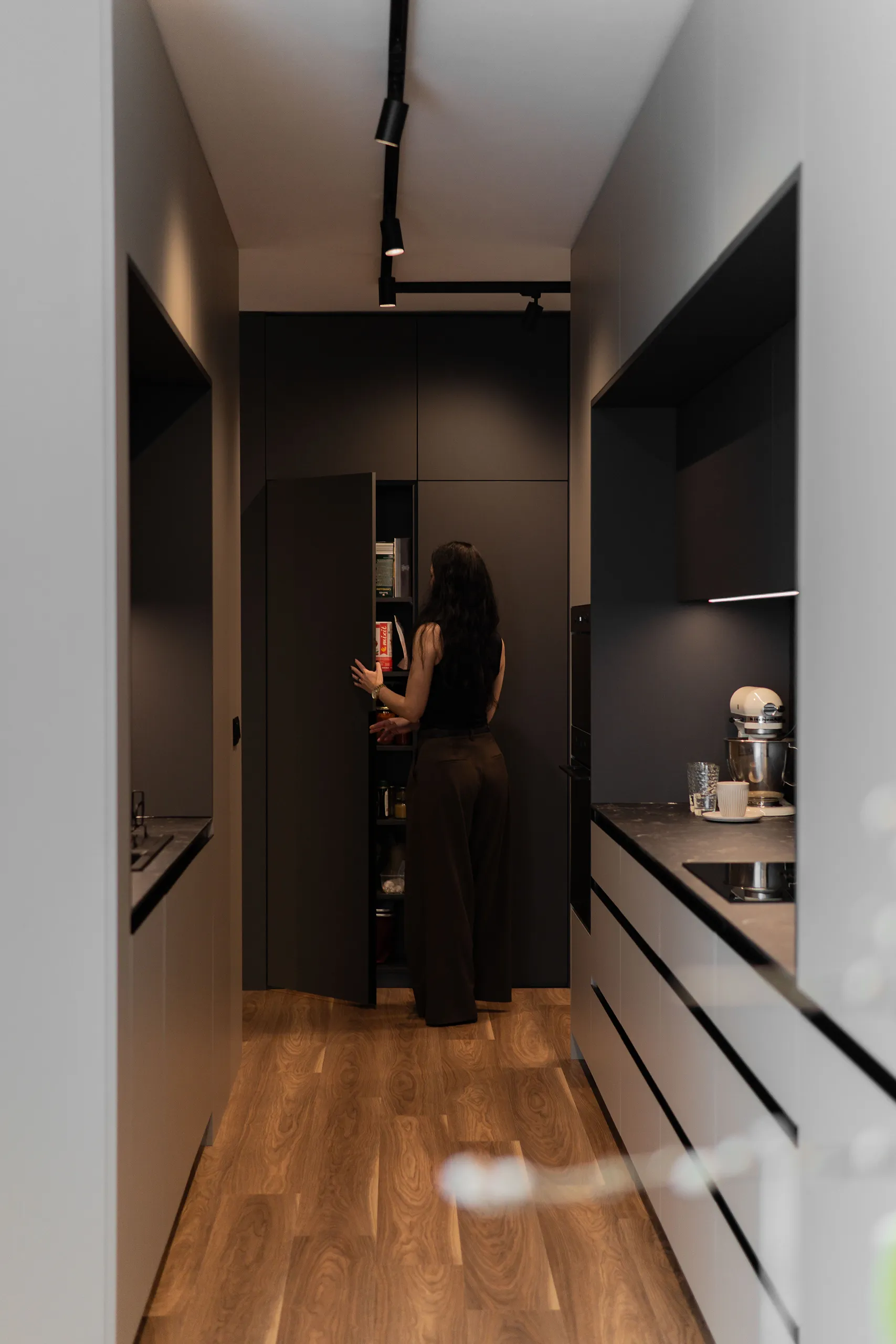
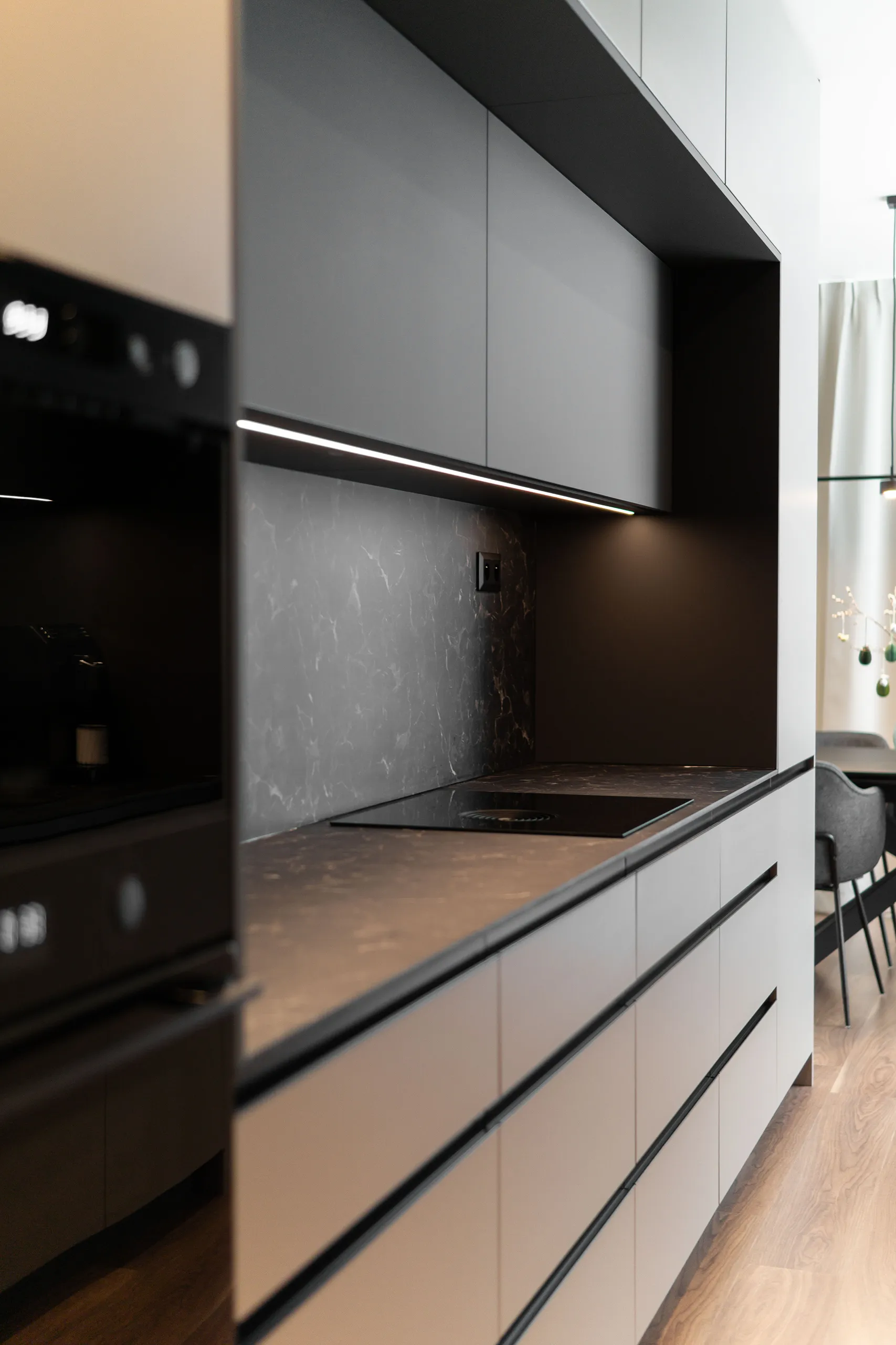
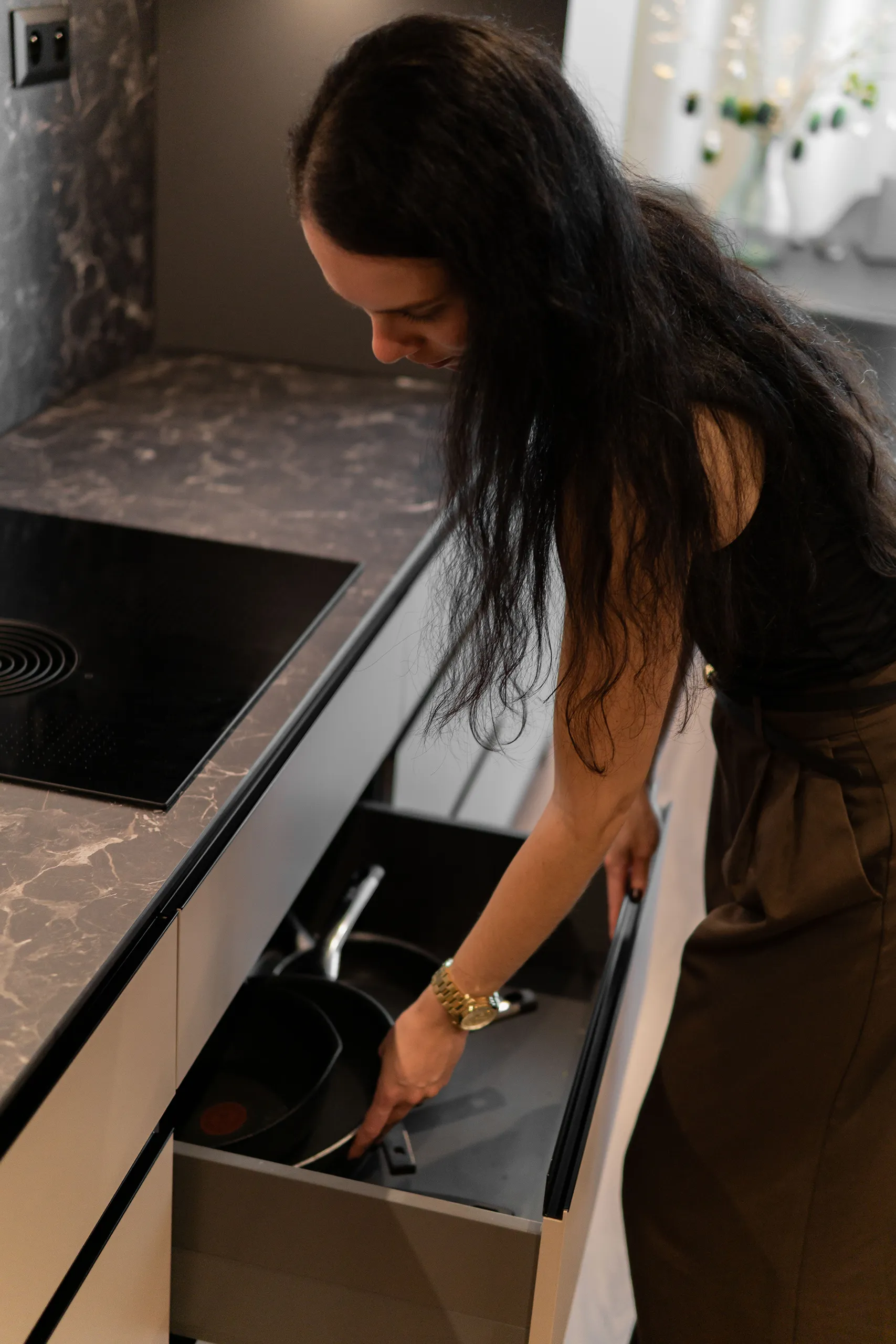
An I+I shaped kitchen layout … worktop on both sides, prep on one, washing-up on the other. Logical, functional … and in this apartment also spatially interesting, since one kitchen block sits next to the TV wall, giving the kids something to run around.
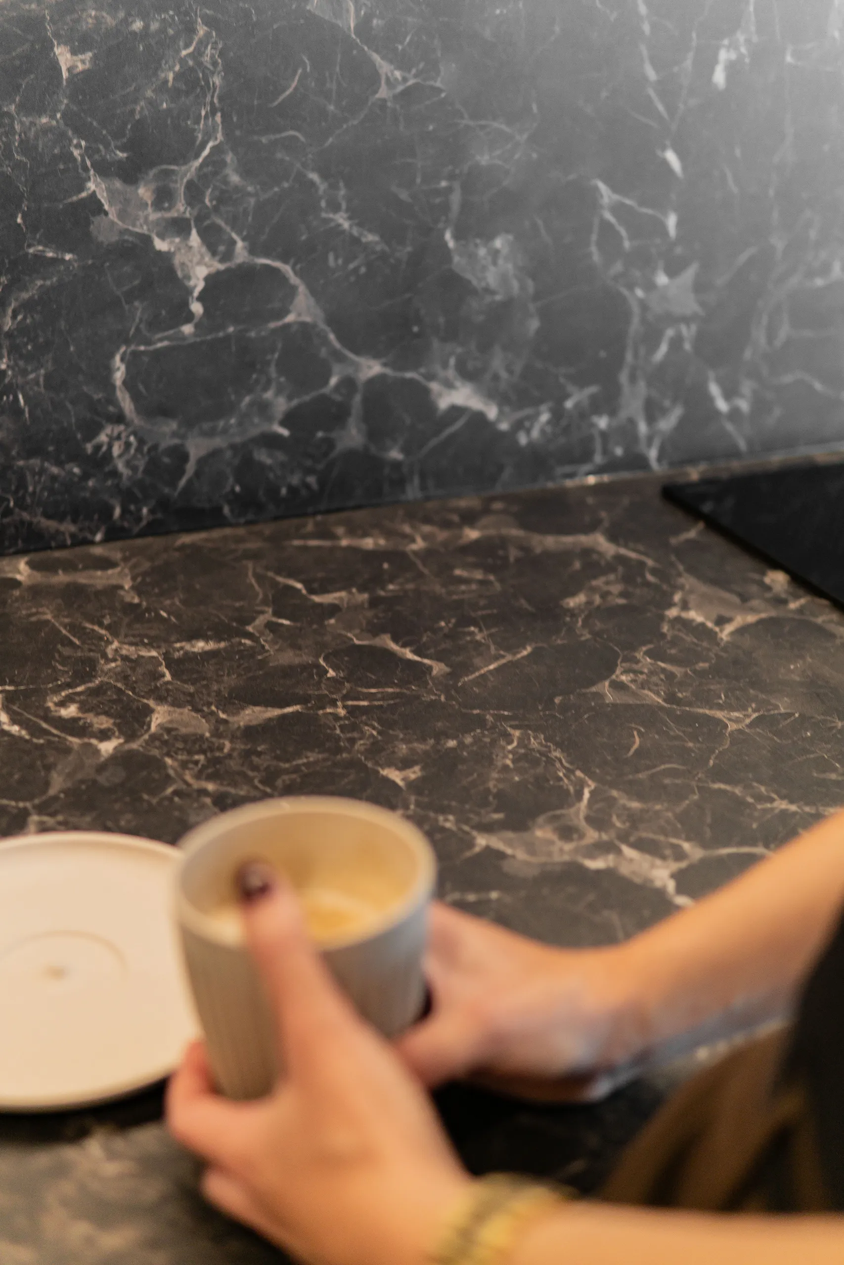
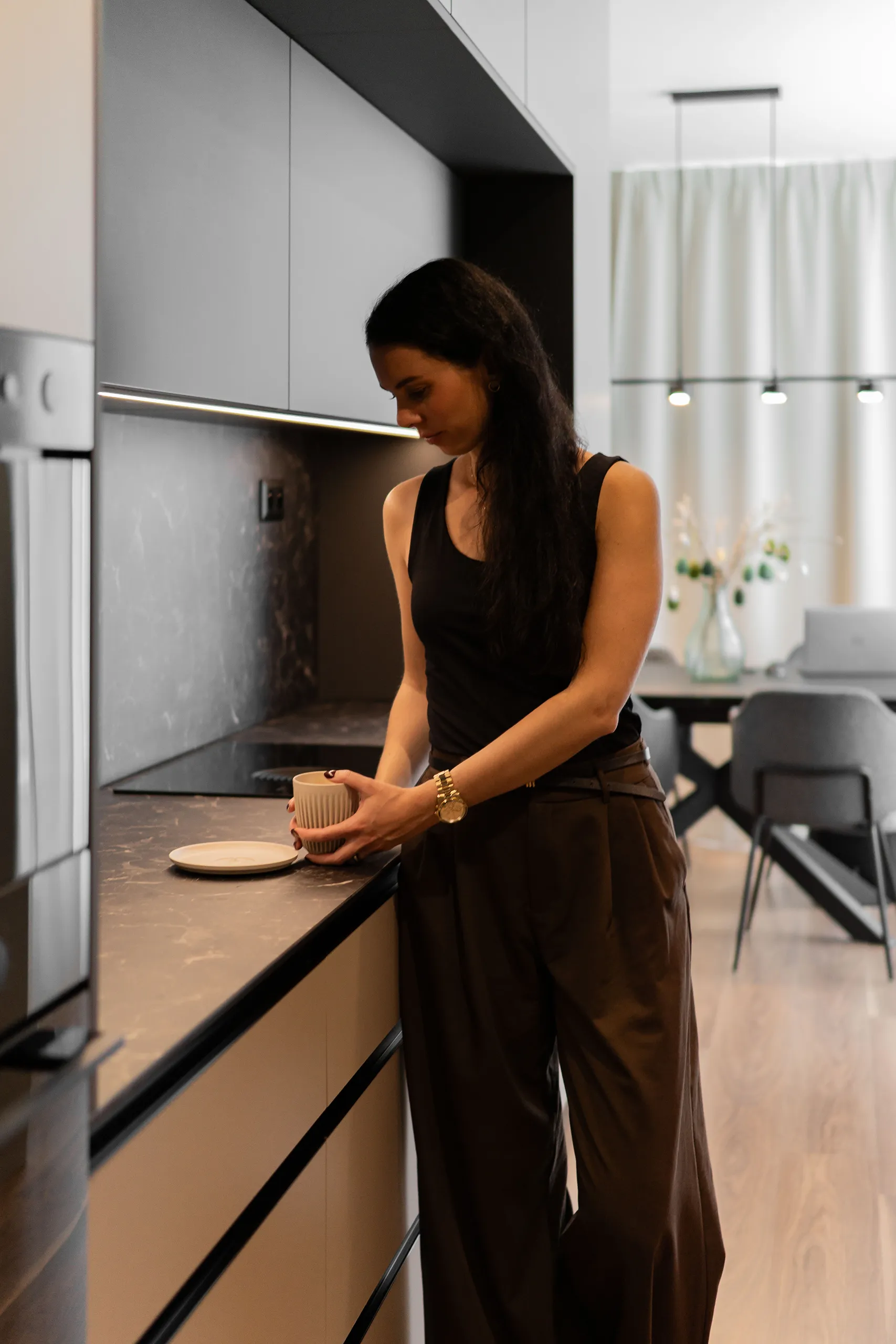
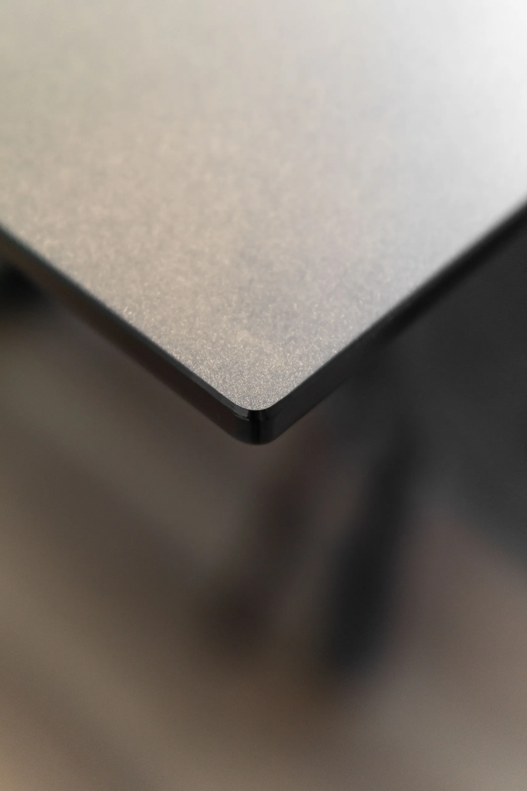
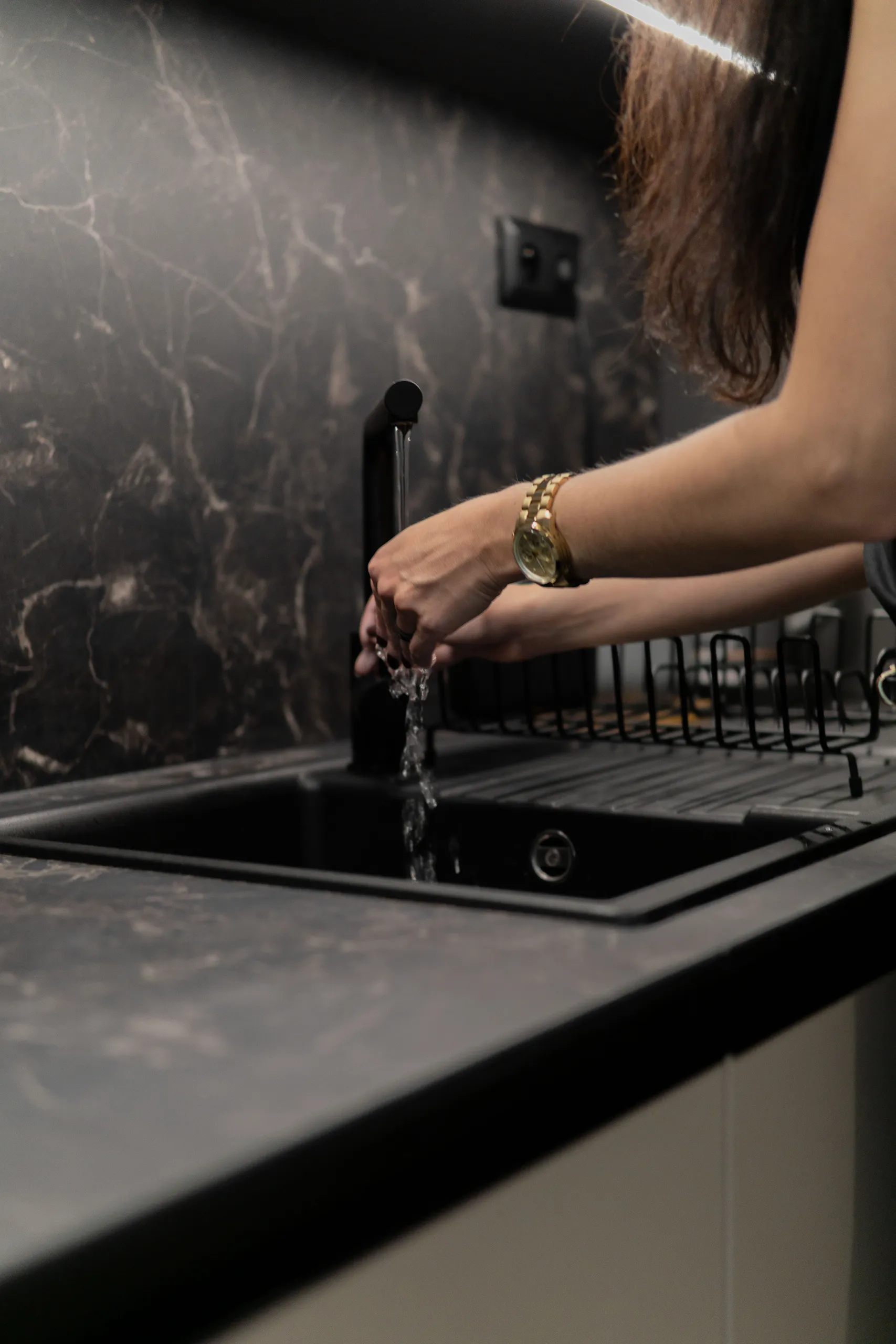
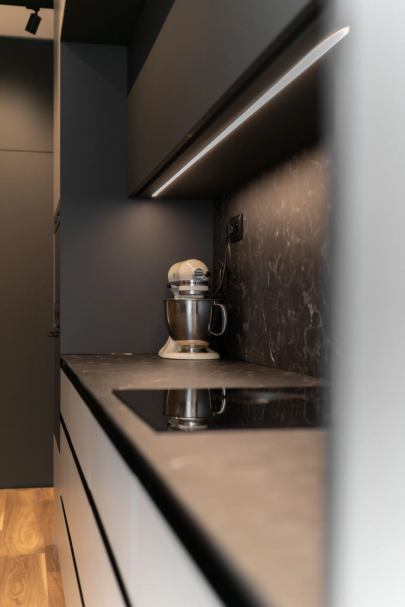
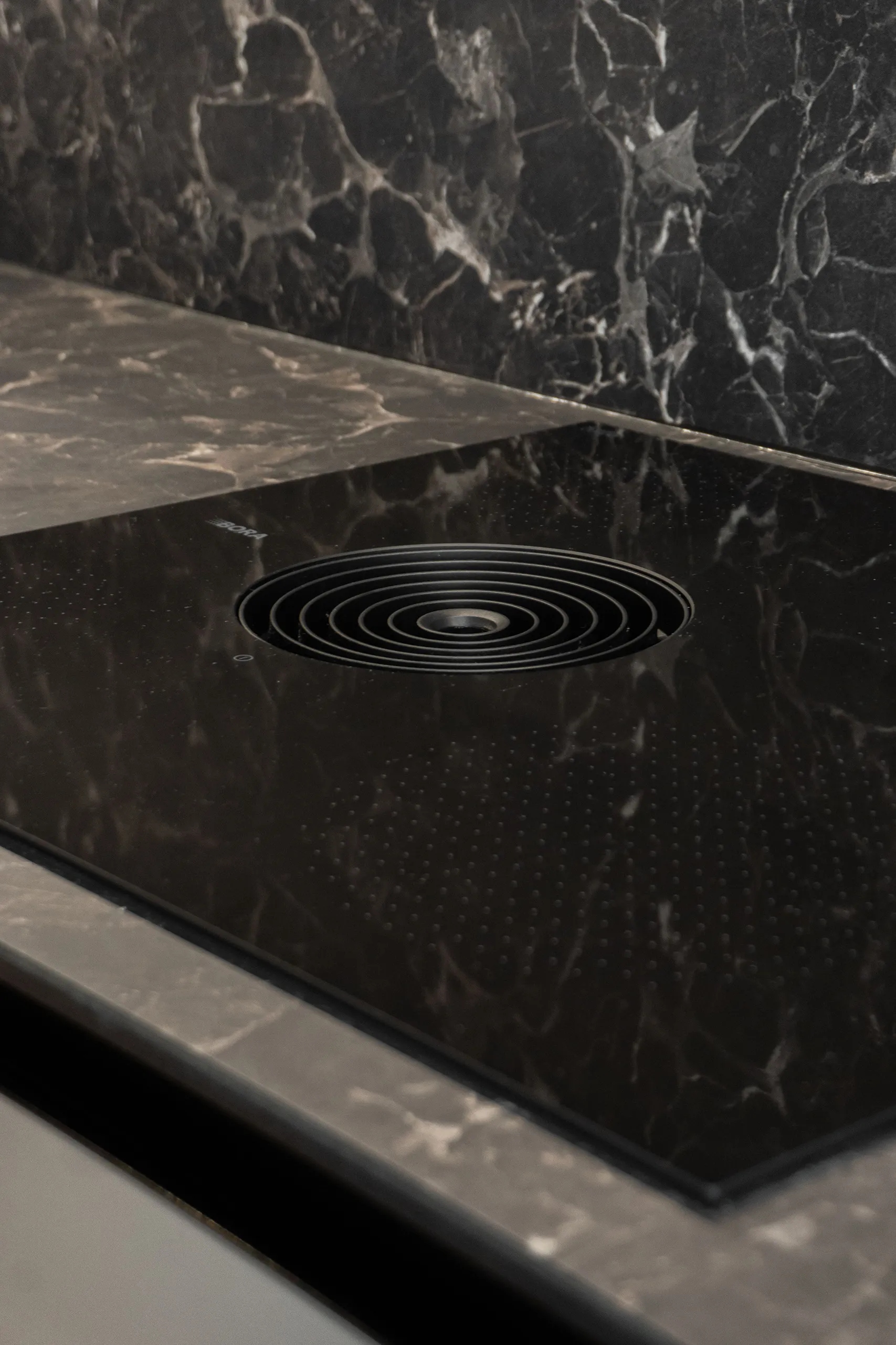
The worktop is made from a compact material … anthracite veining in a super matte finish, perfectly resistant to stains, heat, and moisture. One of those materials that looks great on day one and just as great five years later! And of course, an induction hob with integrated extraction, the BORA S Pure. No extractor hood overhead, no cable, no noise … just a clean worktop and a cooking zone that extracts right at the source.
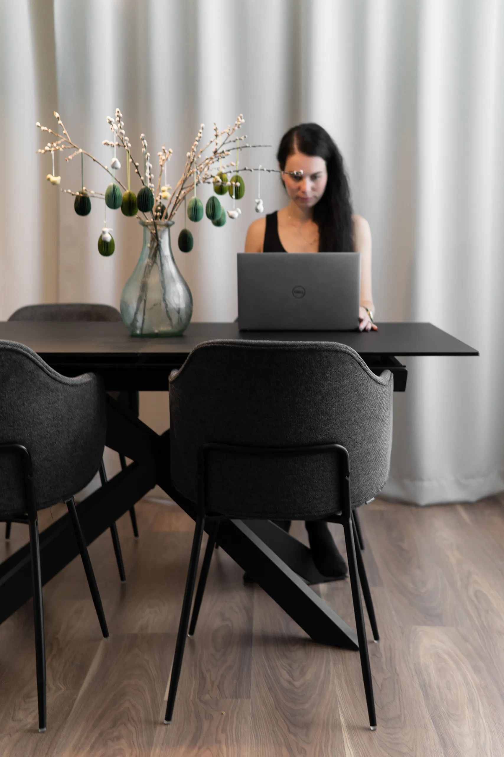
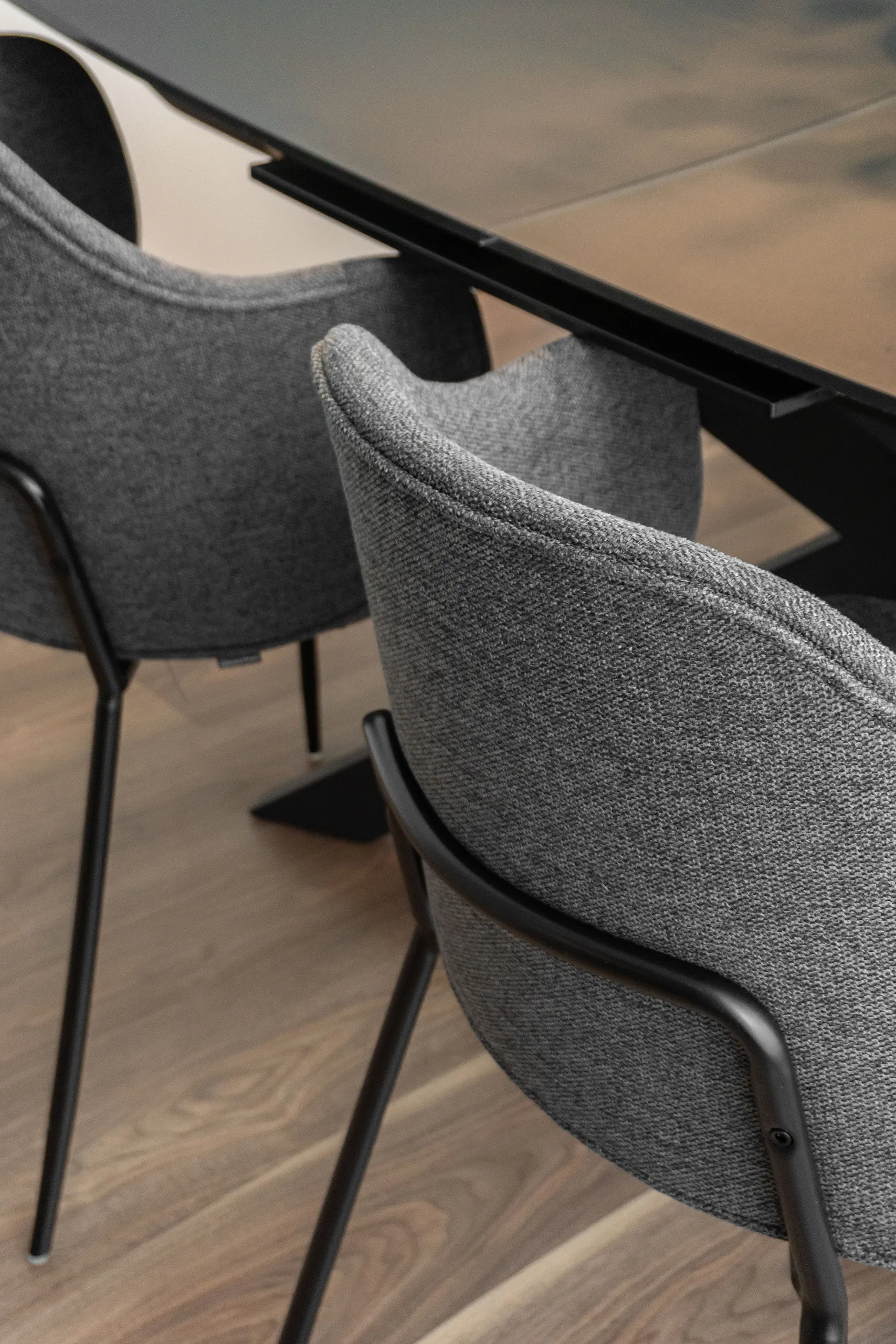
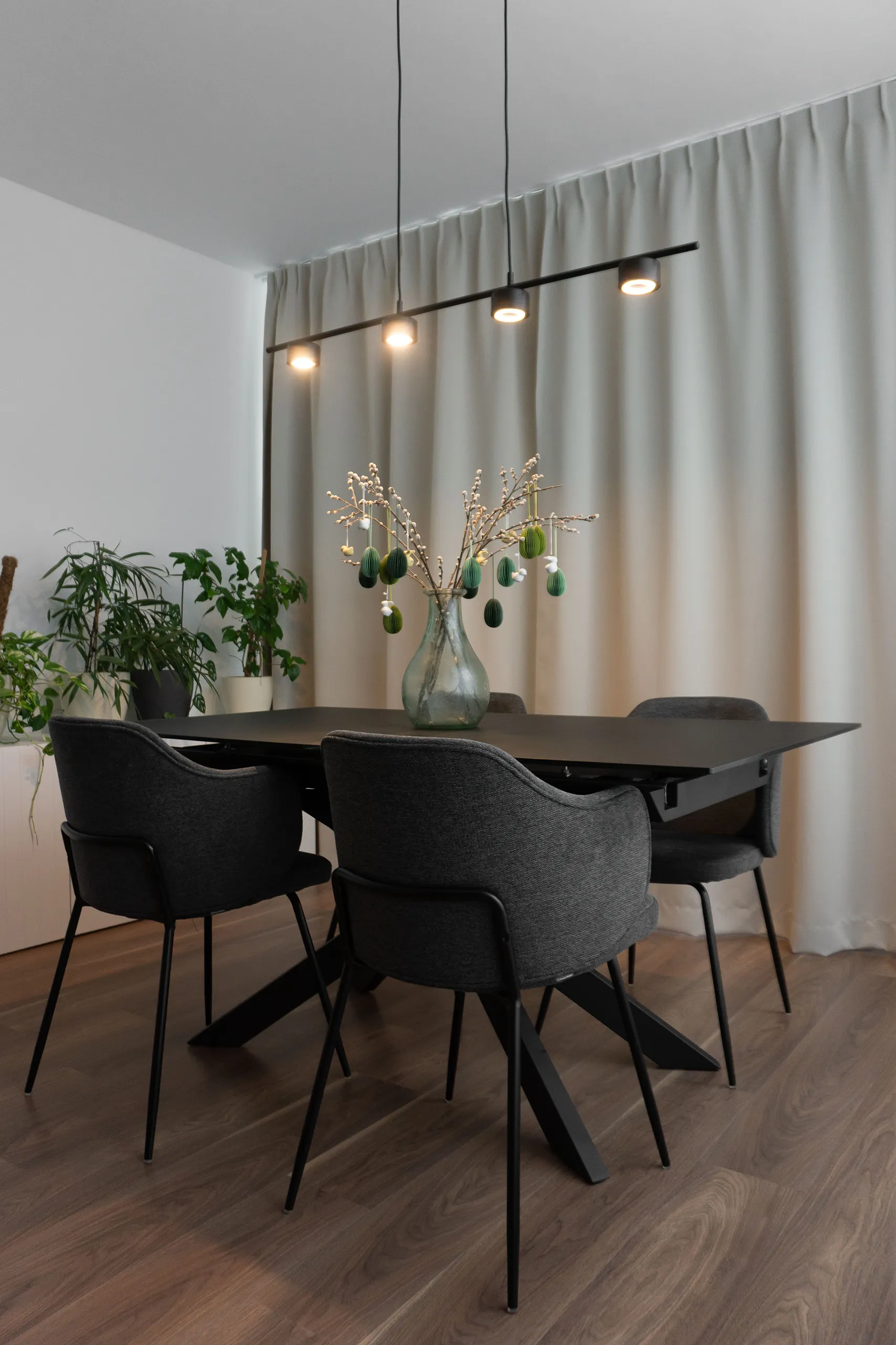
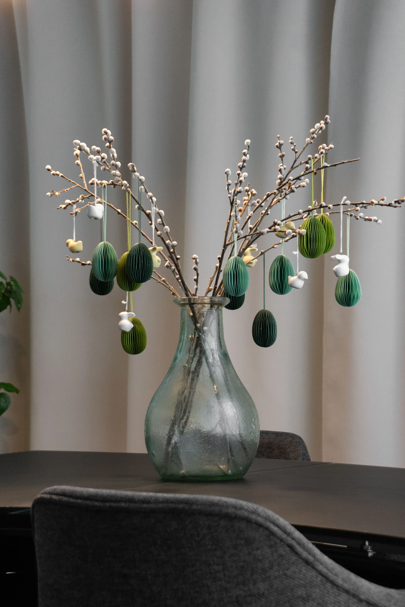
For the dining area, we went with an extendable table for everyday meals as well as unexpectedly large gatherings. The composition is rounded off with dark grey upholstered chairs and the CLYDE pendant light with a built-in Moodmaker function.
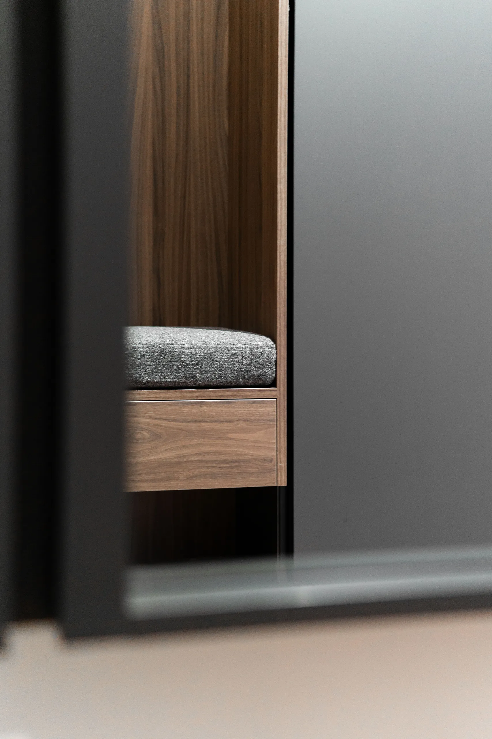
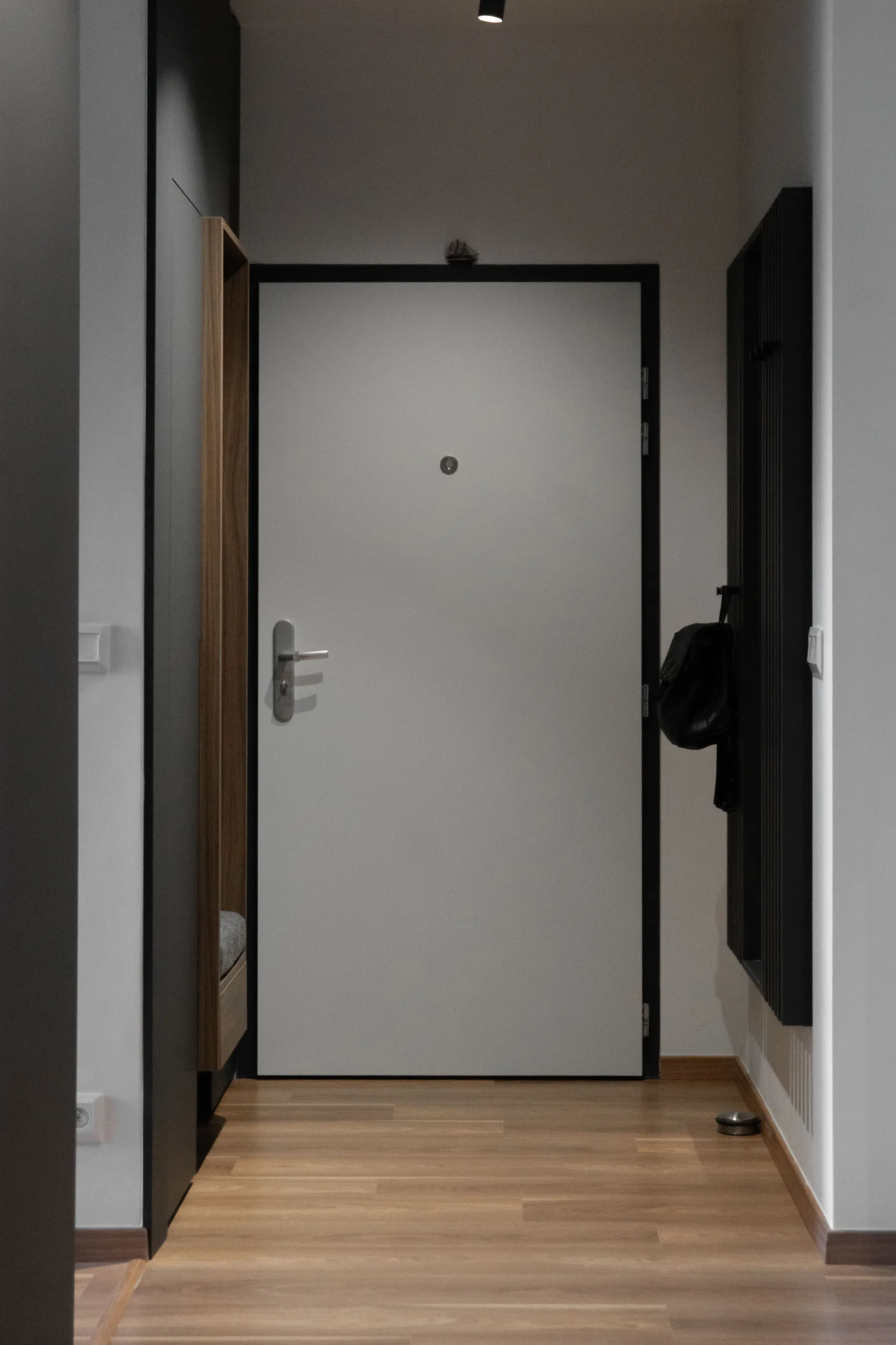
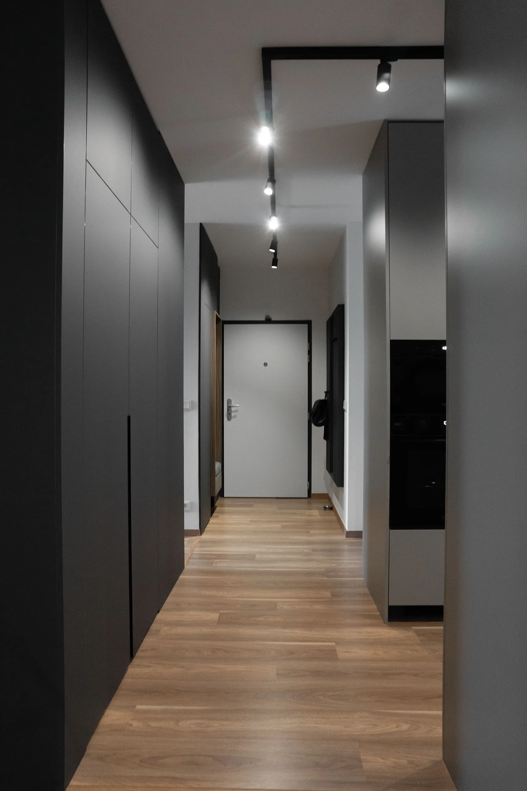
entrance hall
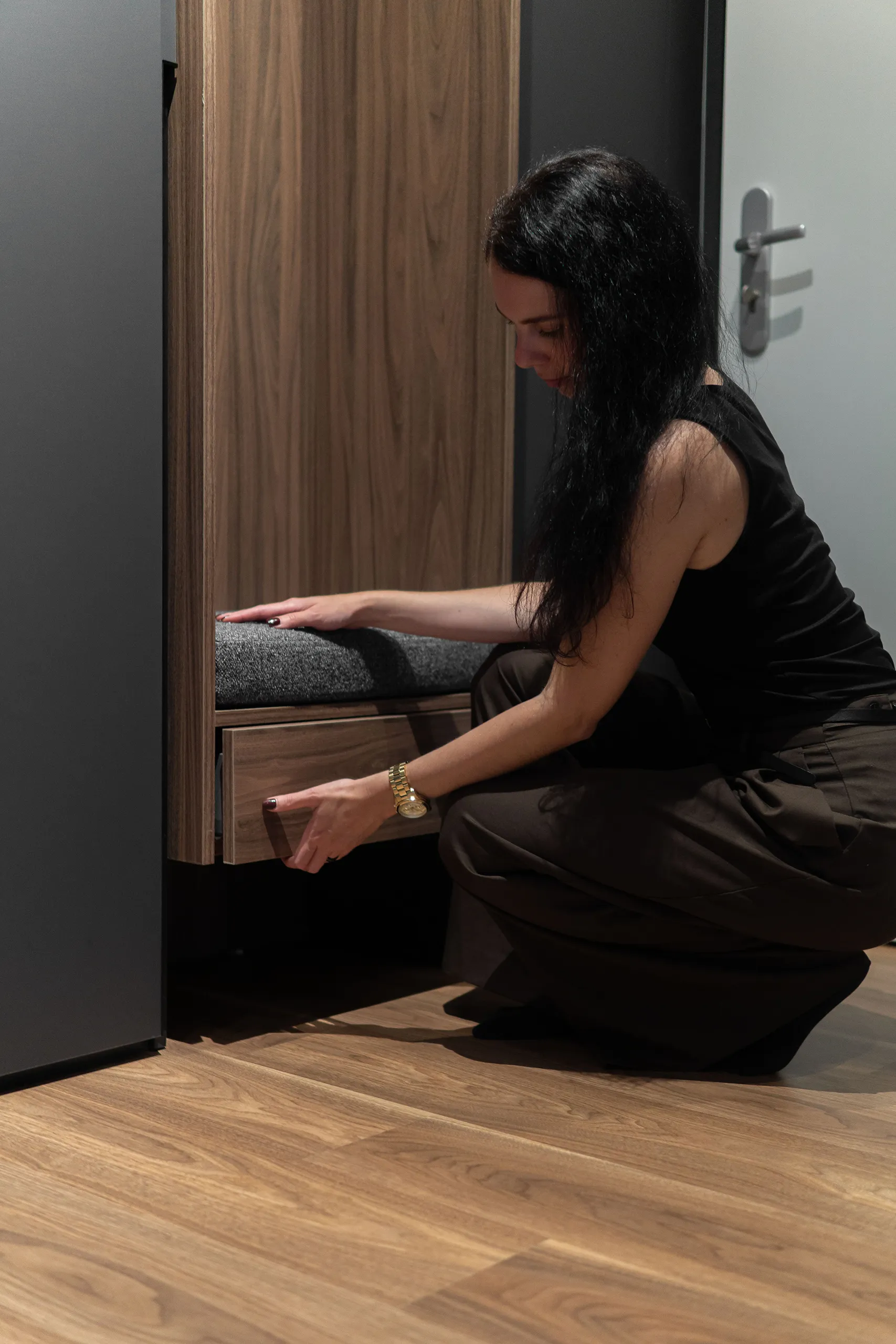
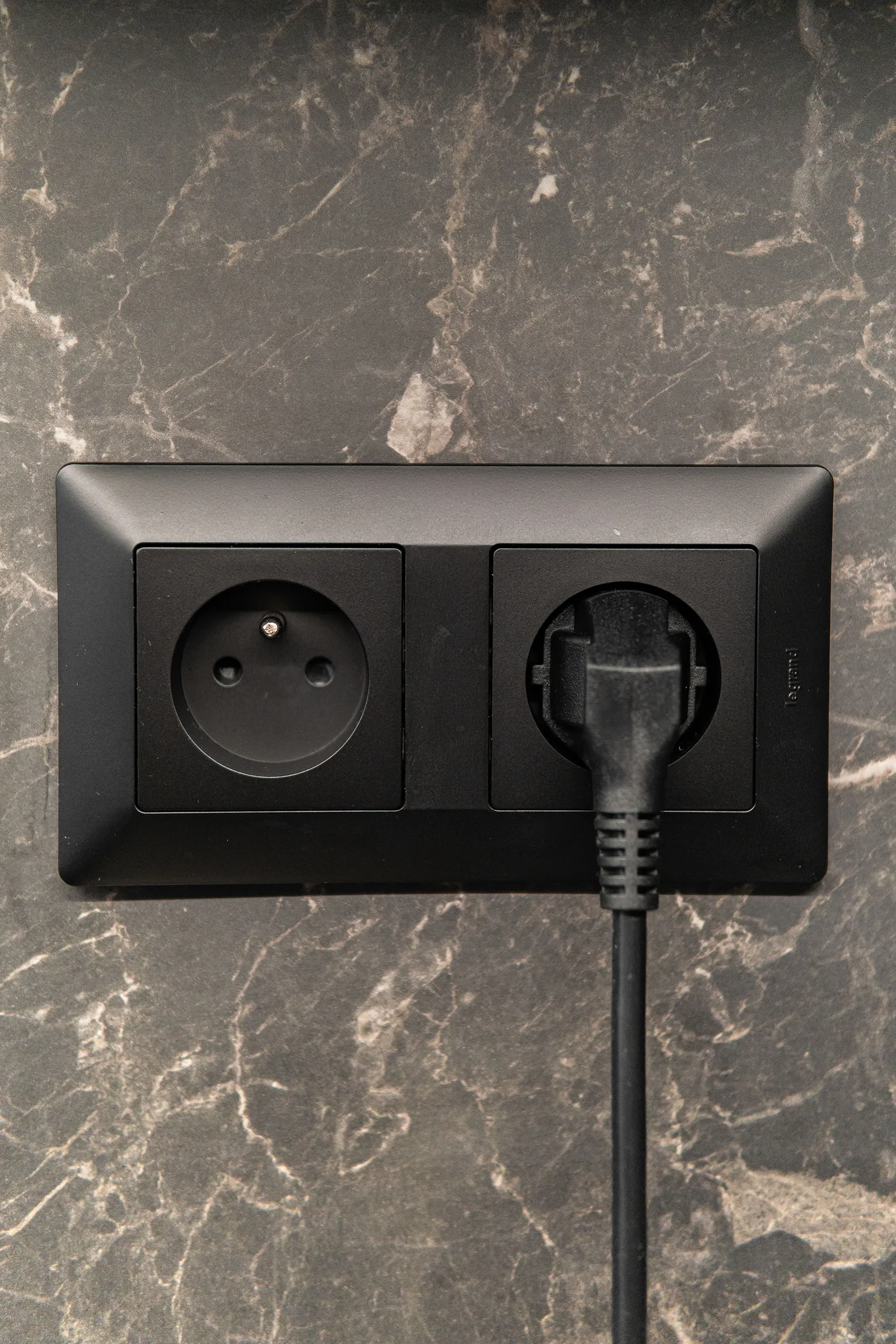
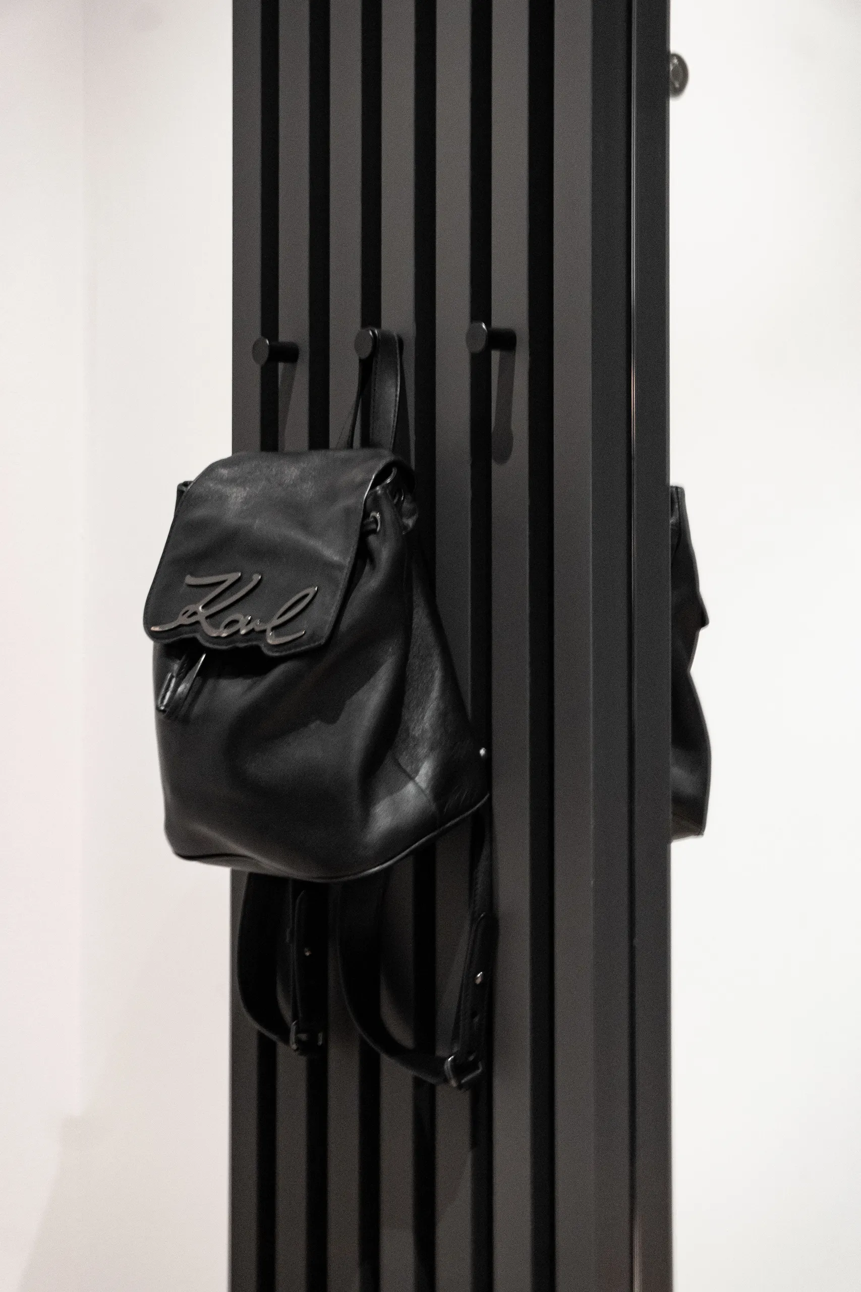
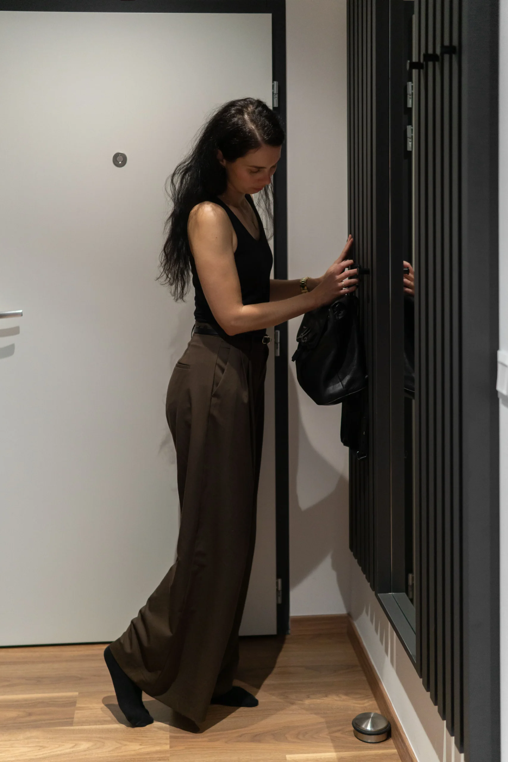
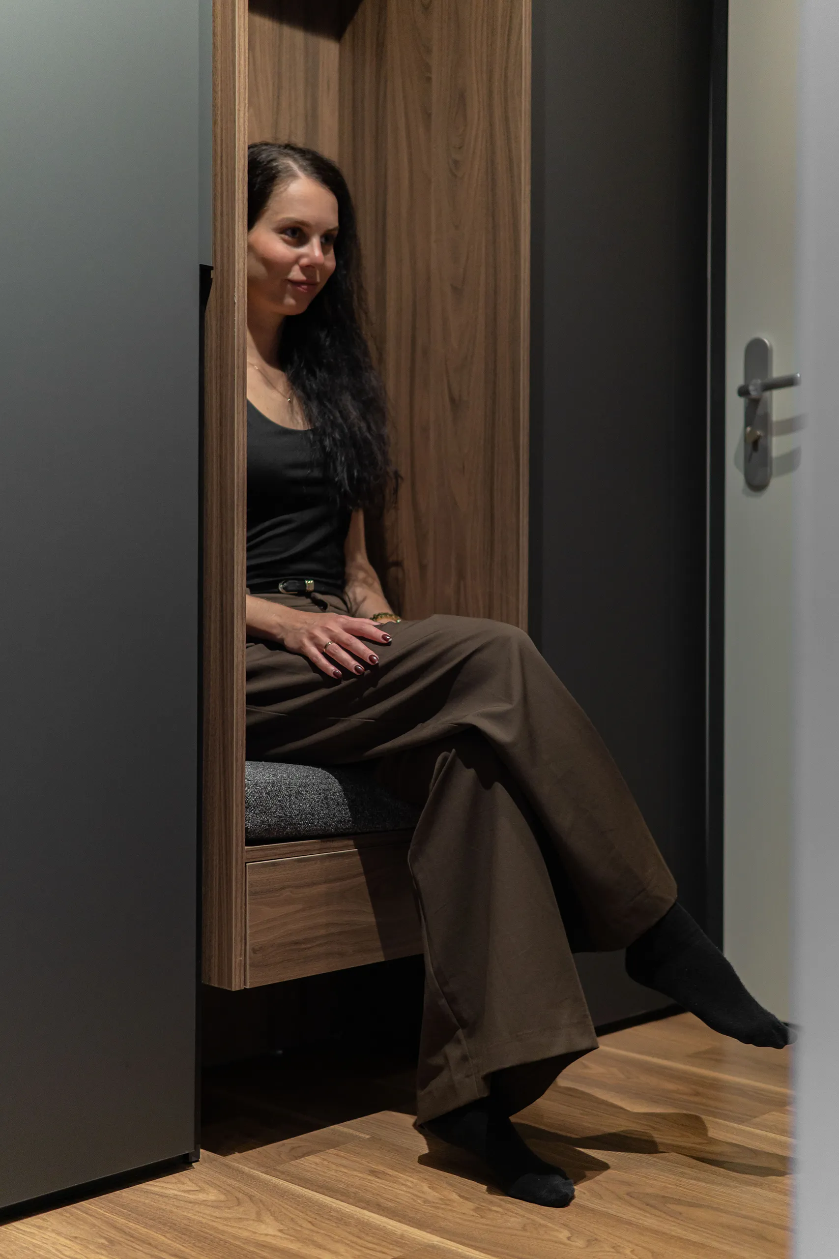
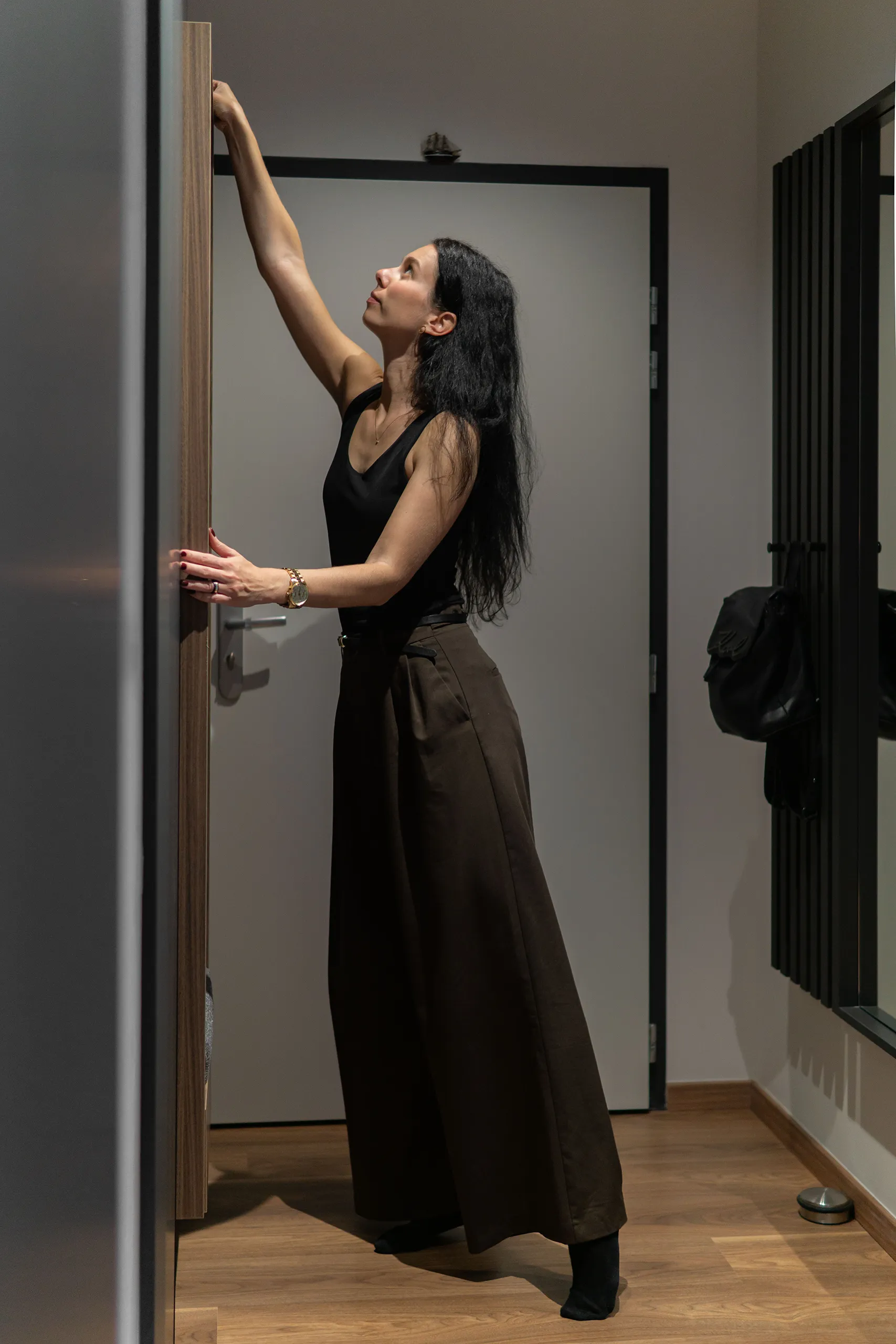
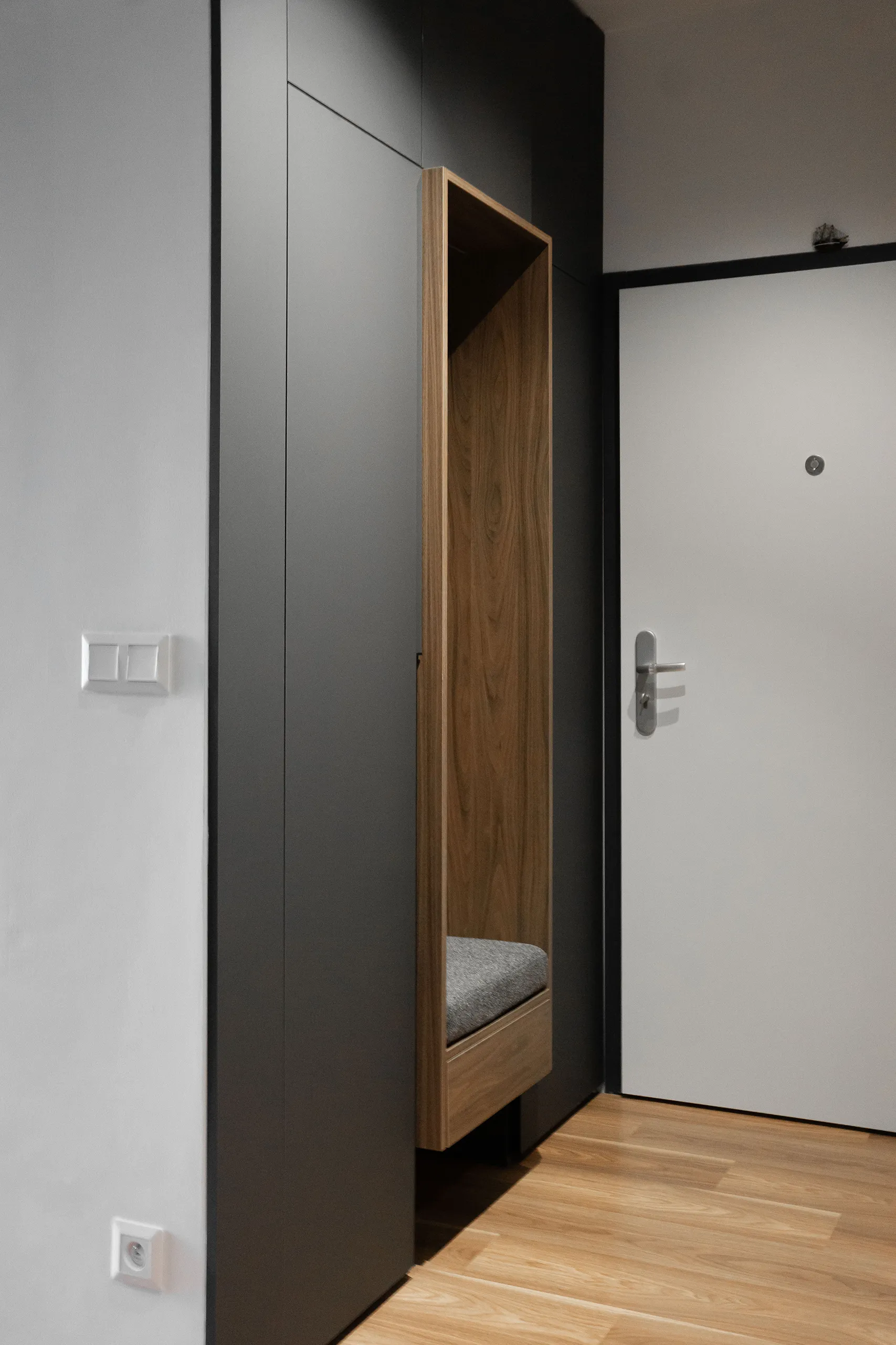
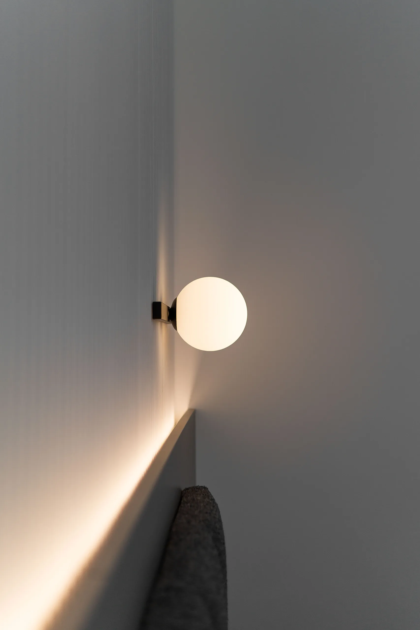
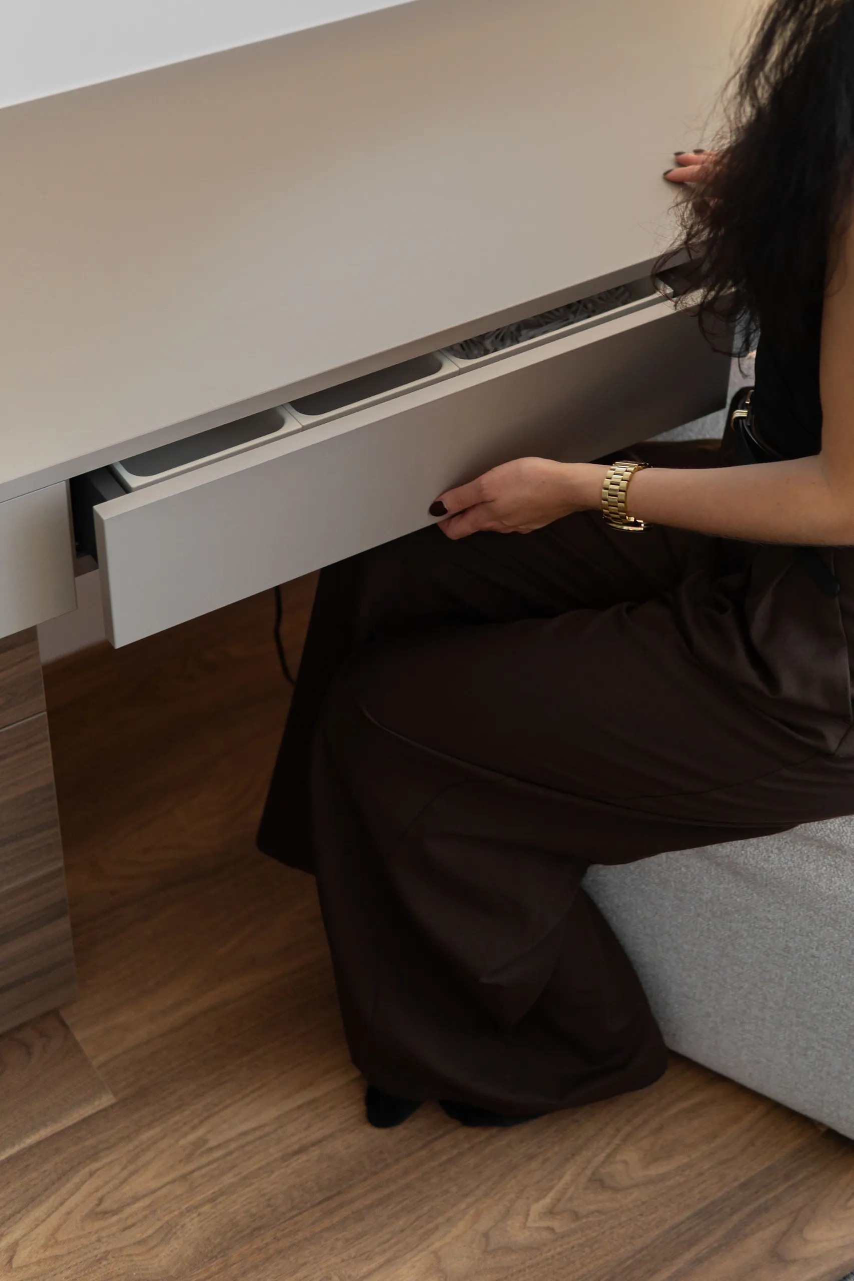
The first contact with the apartment is always the entrance hallway, and this is exactly where it’s decided whether an interior feels thought-through or just pretty. In this apartment, we built the electrical distribution box into the custom furniture so that it simply disappeared. Alongside it, we created a bench with a storage drawer beneath the seat for small items, plus open space below for shoes.
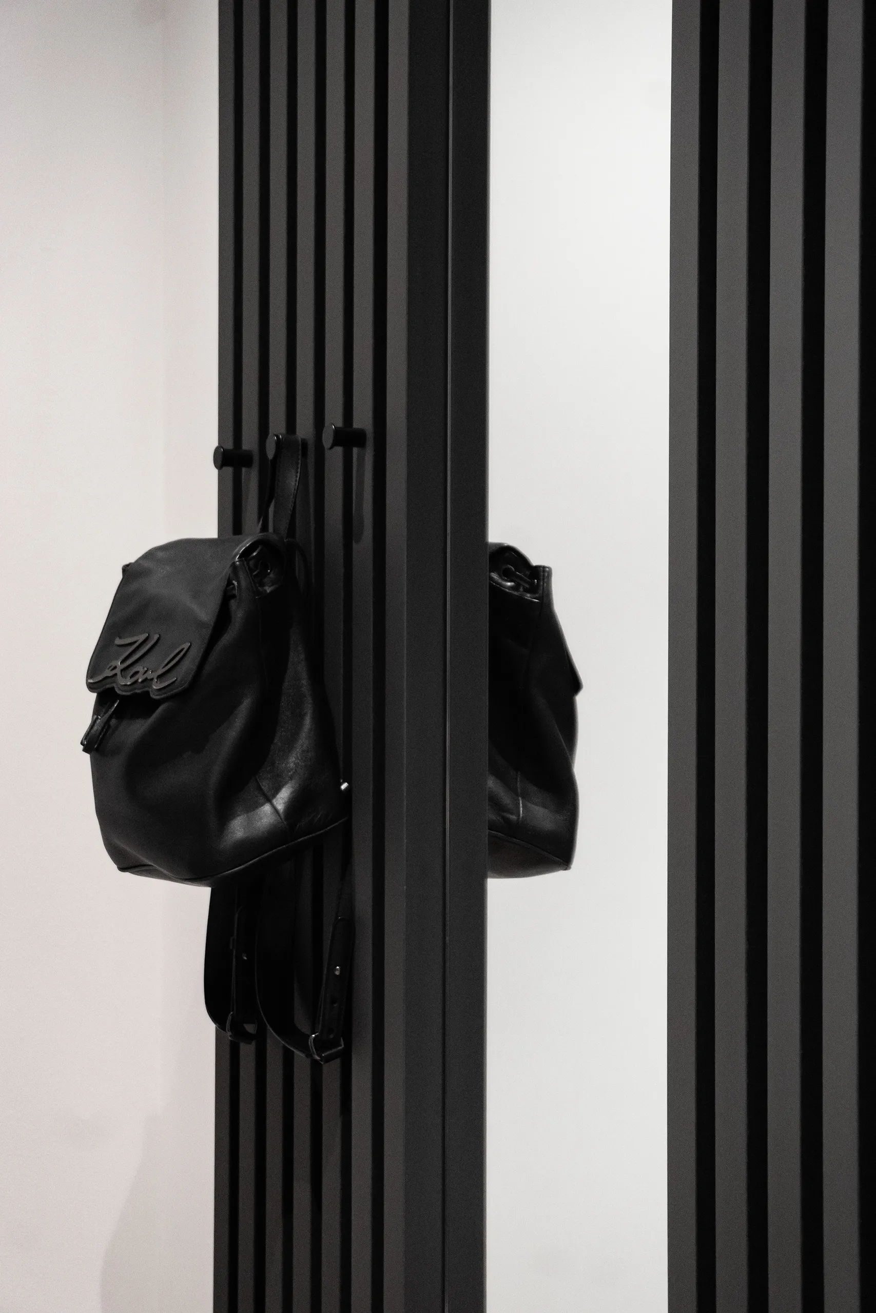
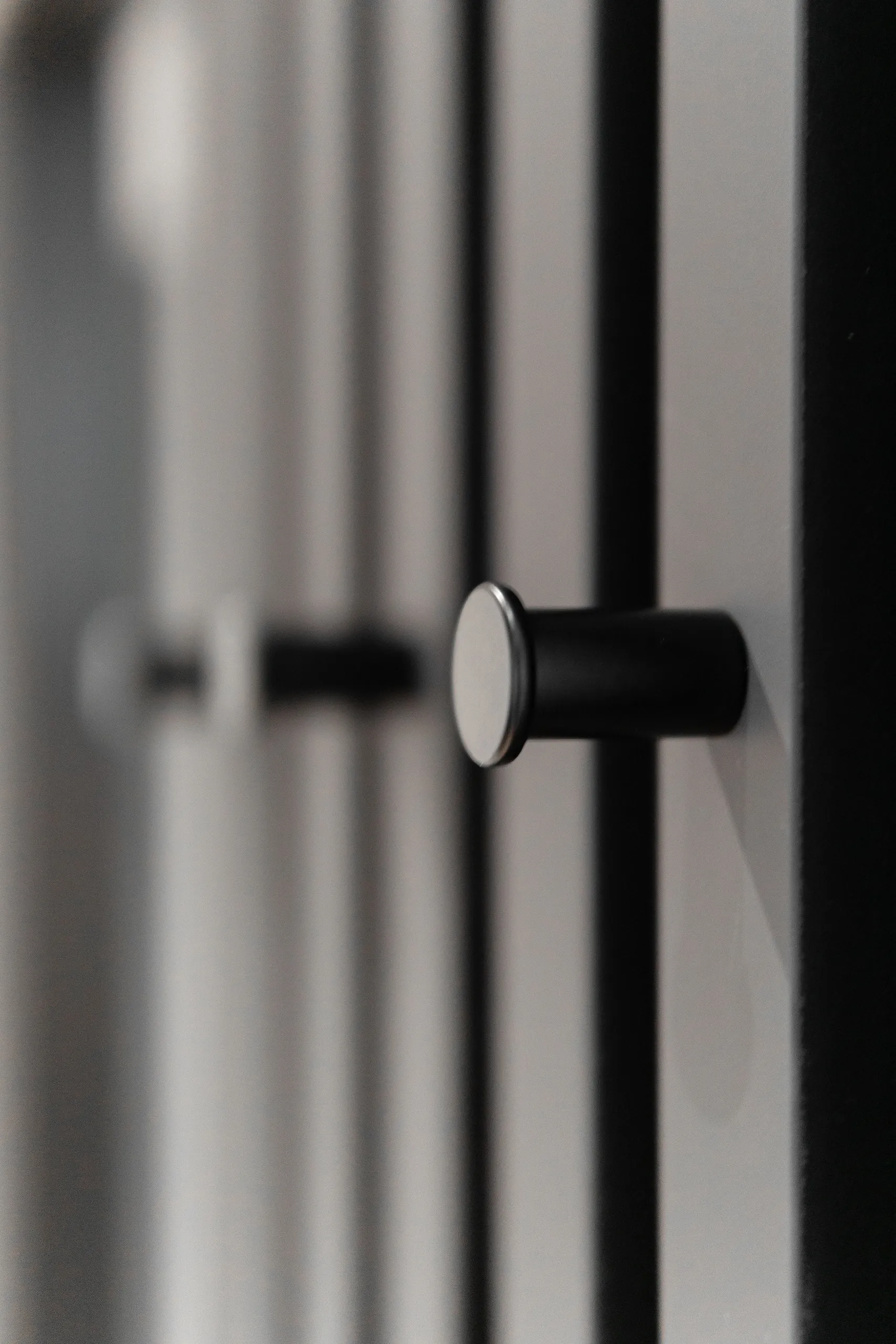
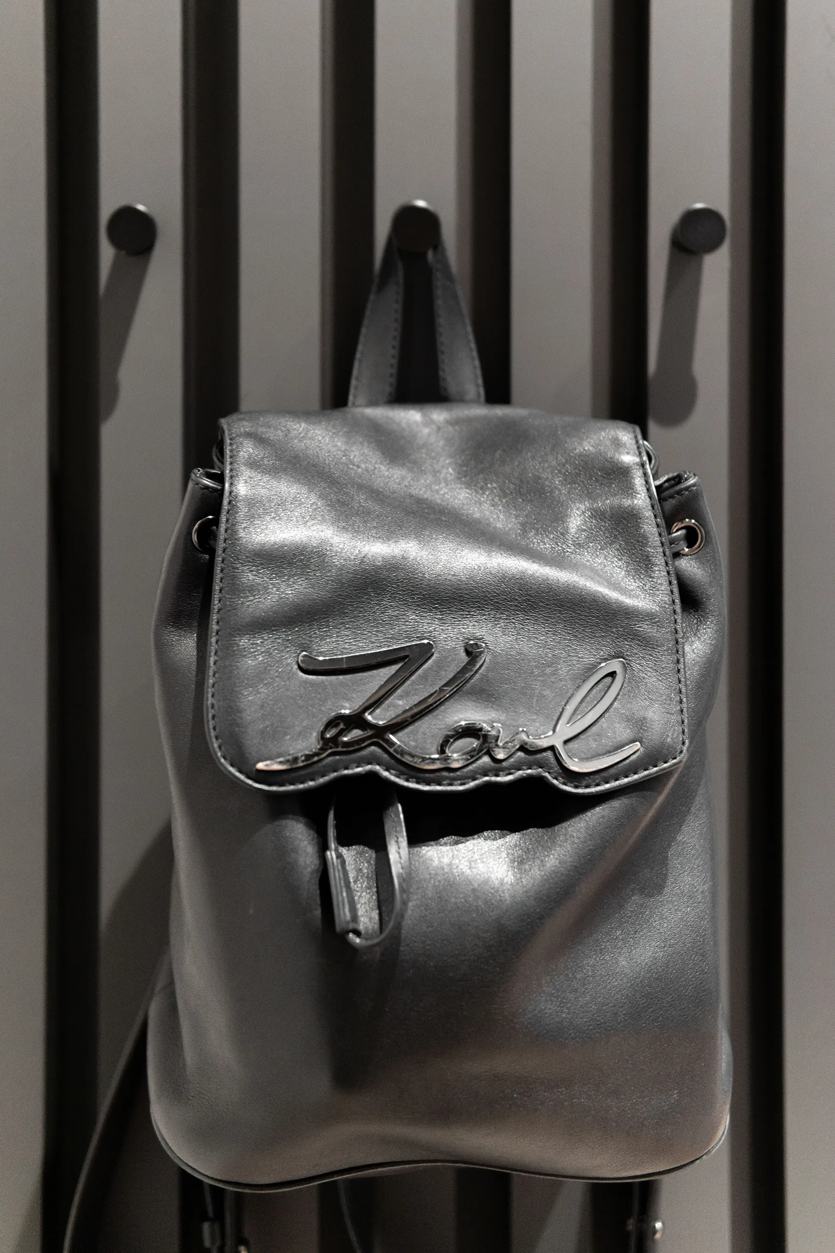
Opposite, we placed a mirror set into a slatted panel with coat hooks at two different heights … one for parents, one for kids. A small detail the whole family appreciates every day.
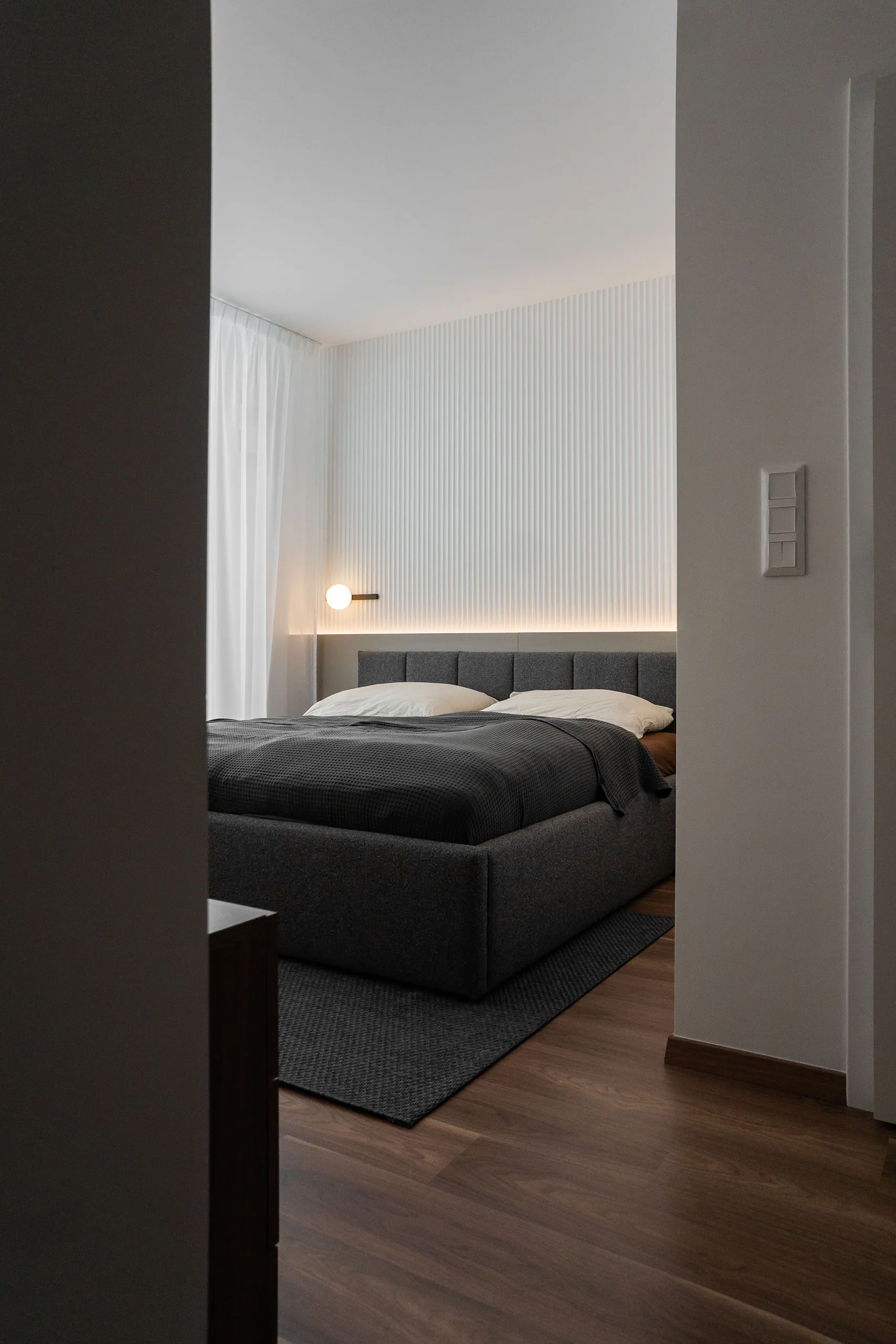
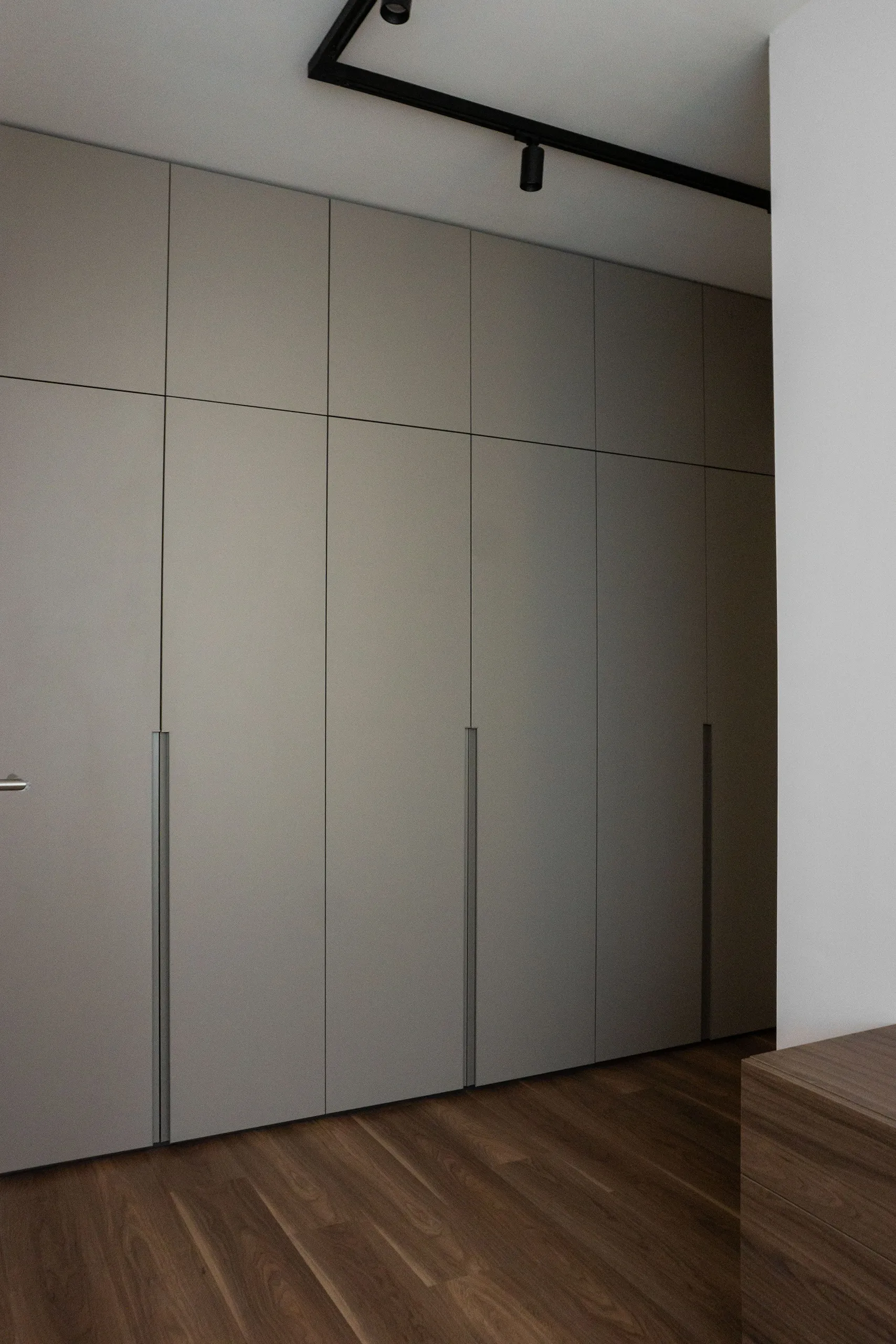
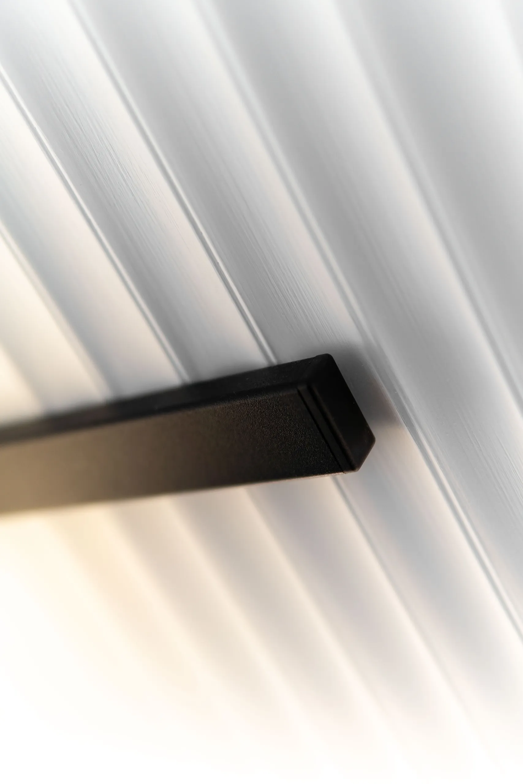
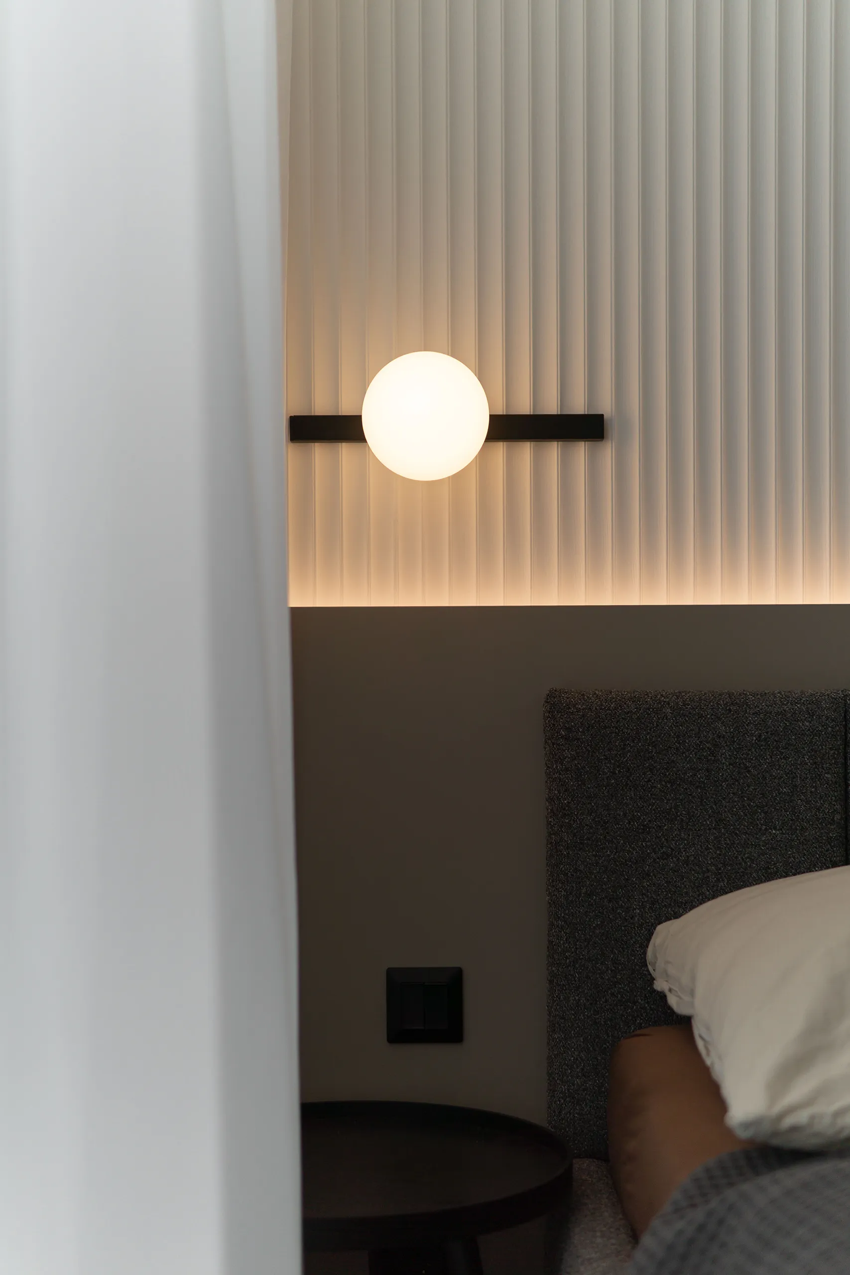
bedroom
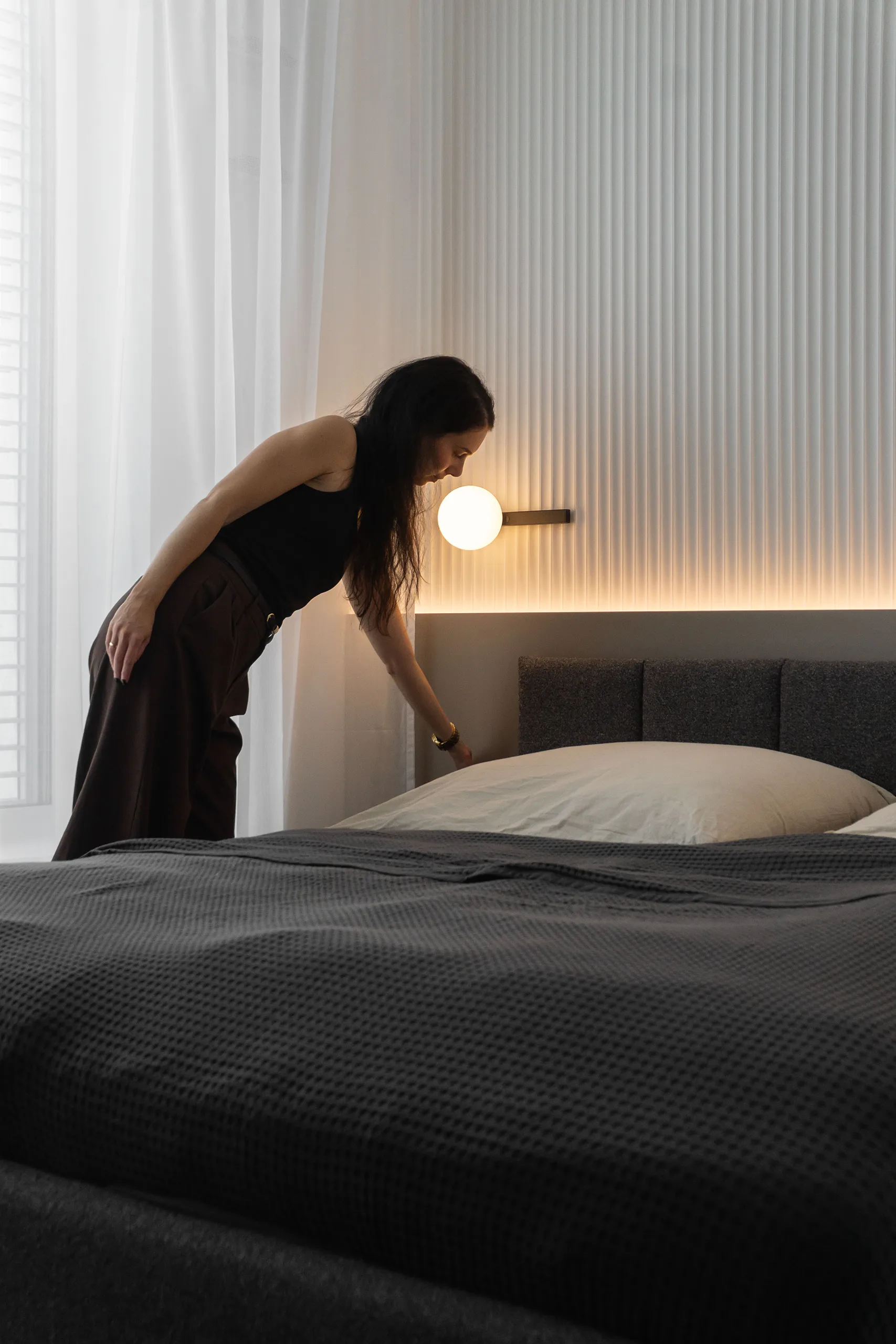
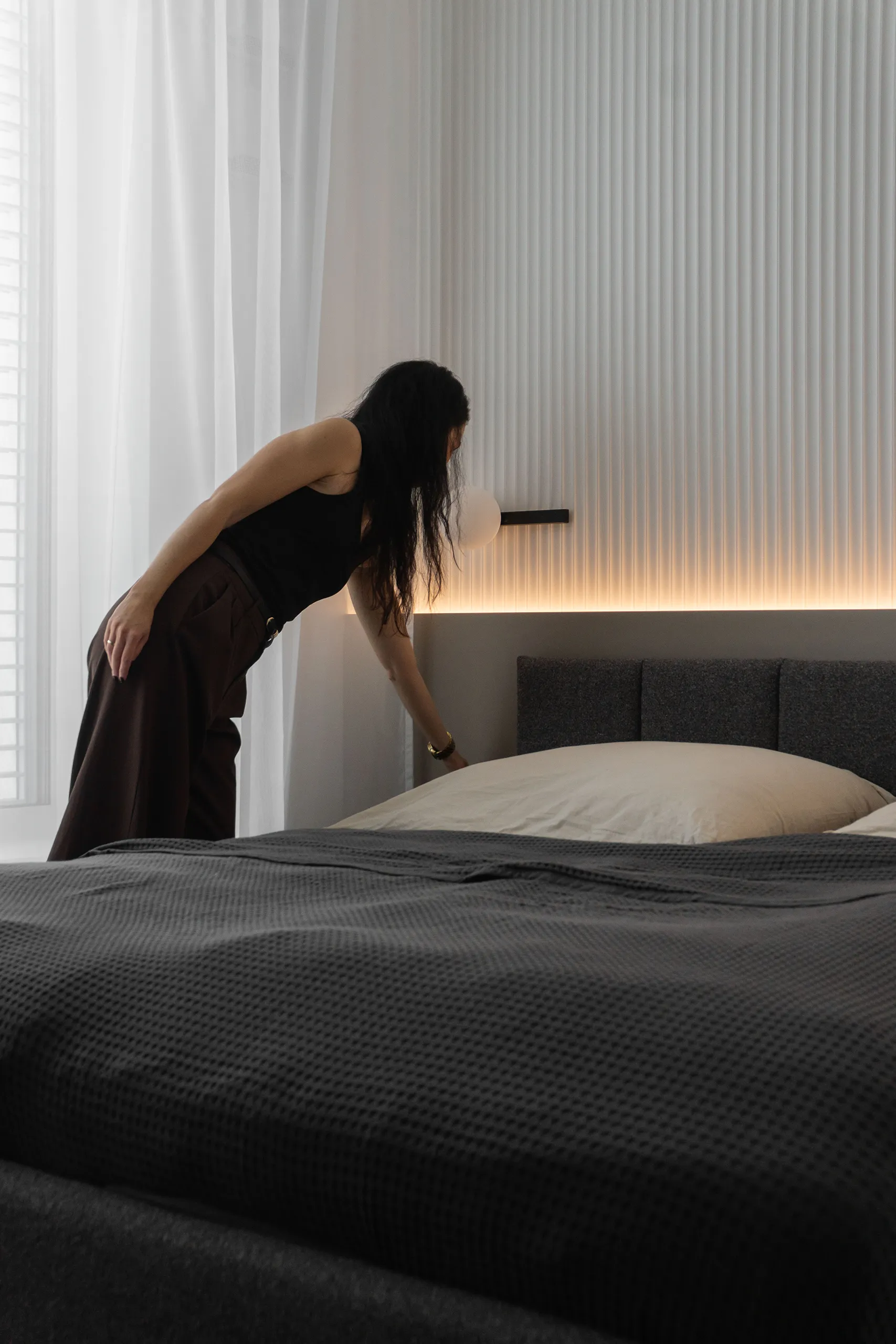
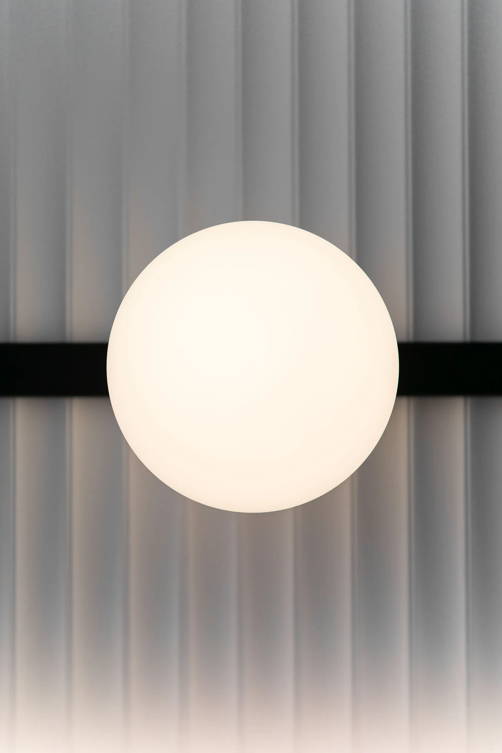
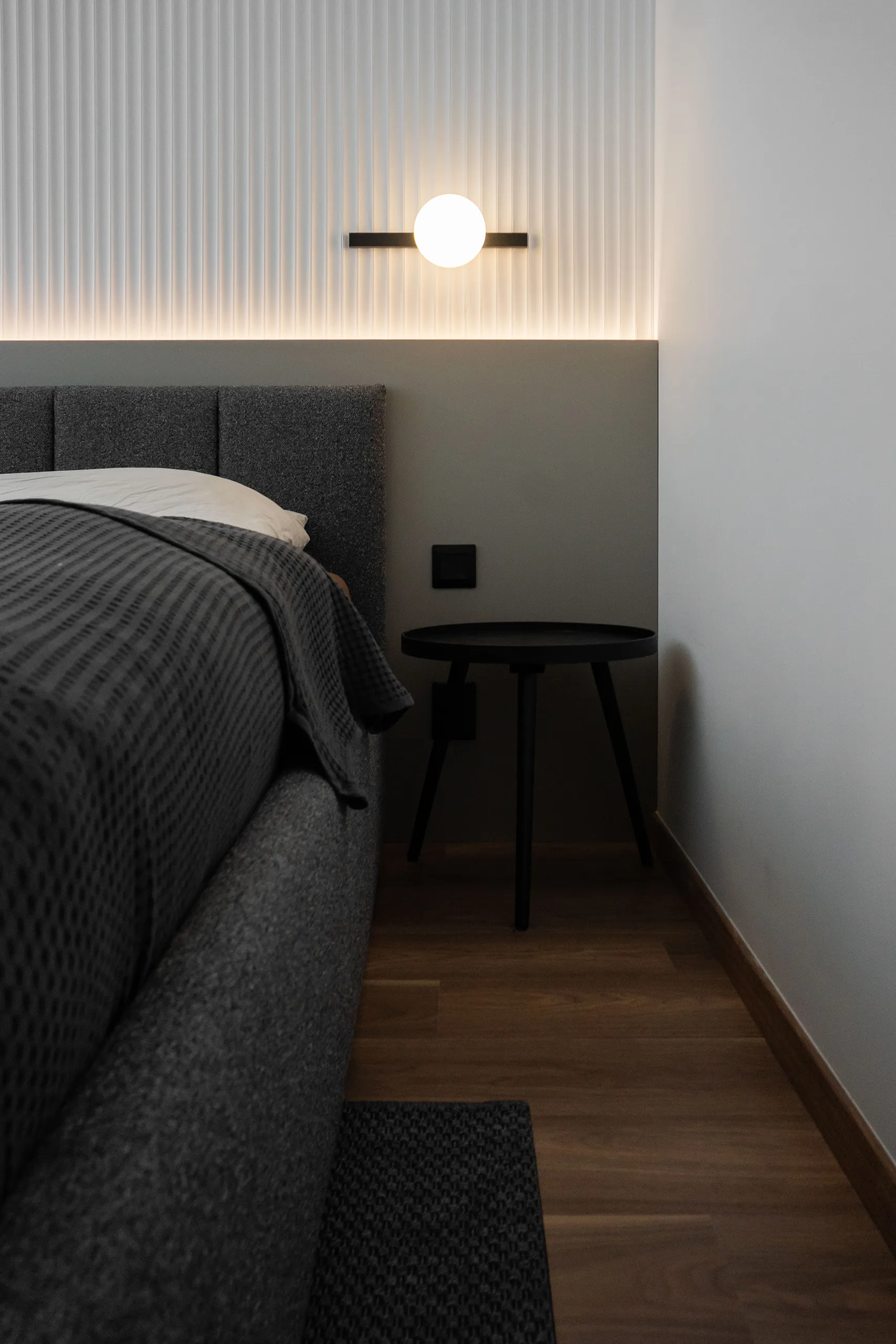
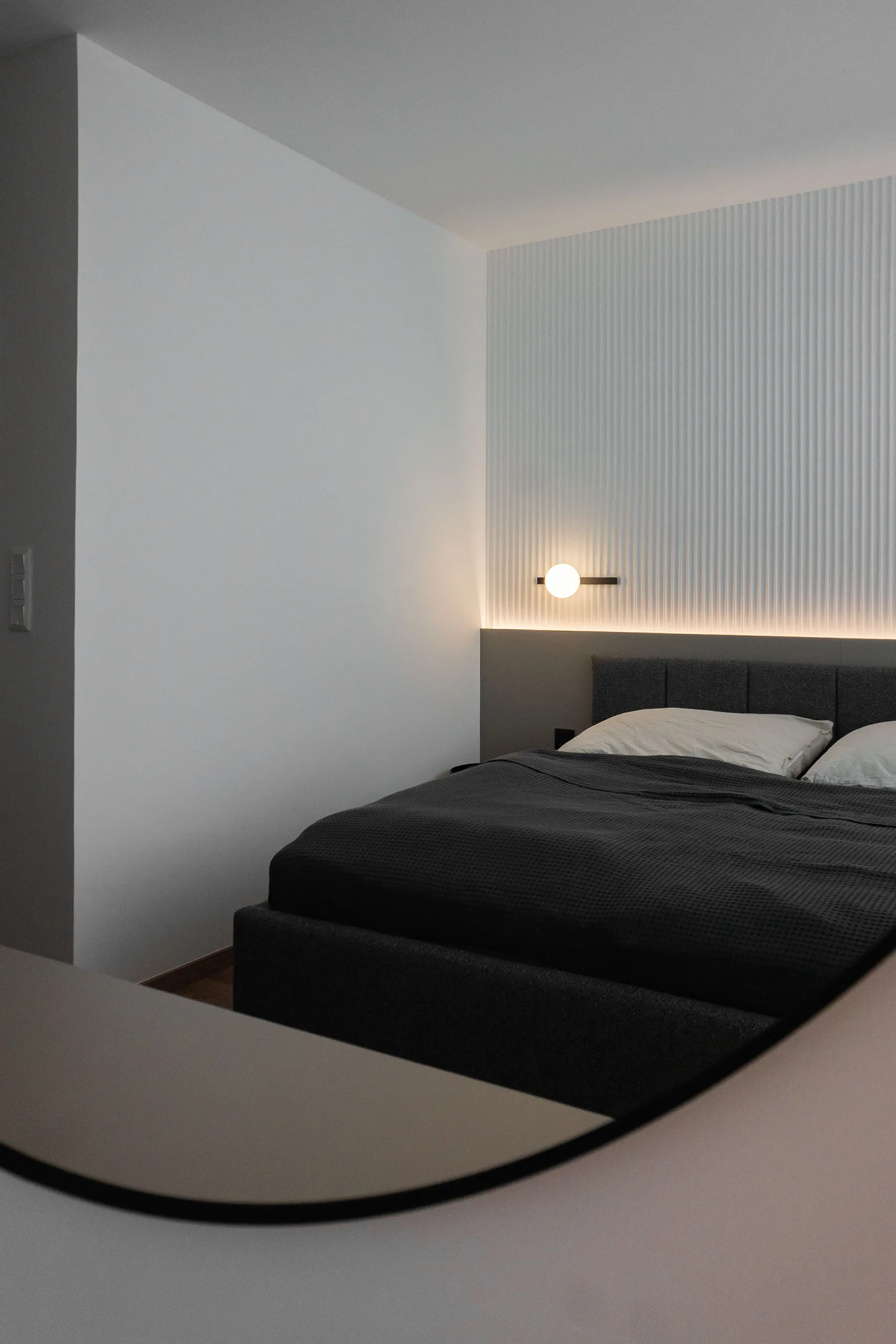
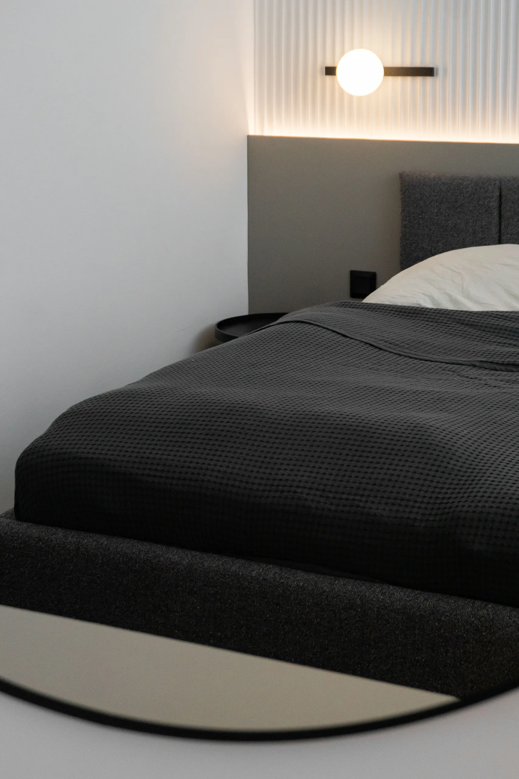
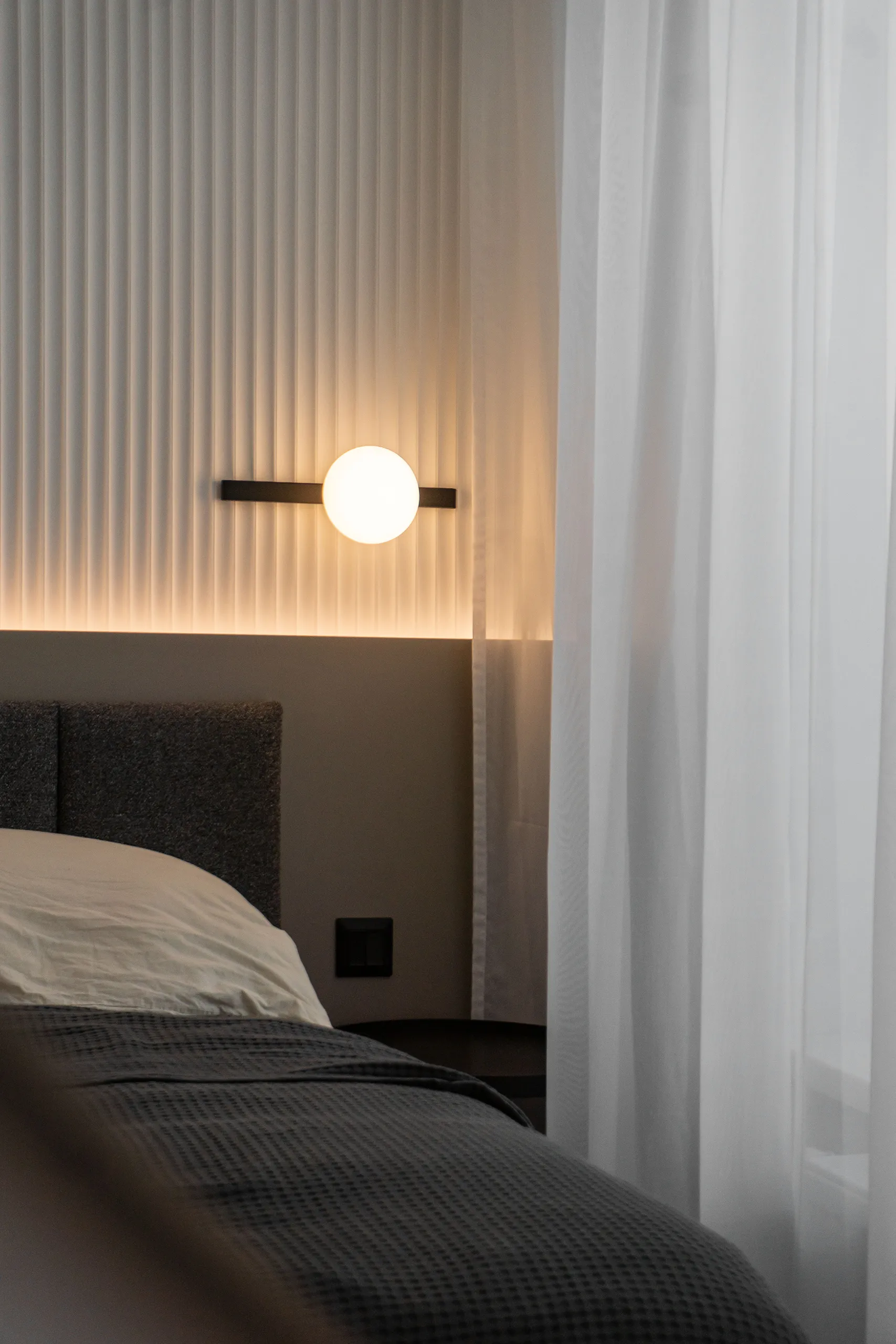
We dressed the wall behind the bed in 3D panels from Orac … a white relief structure with delicate vertical grooves. The panels are backlit from below with an LED strip, which at night creates beautiful shadows across the surface, making the entire wall practically glow. An effect that already looks great in photos, but surprises even more in person.
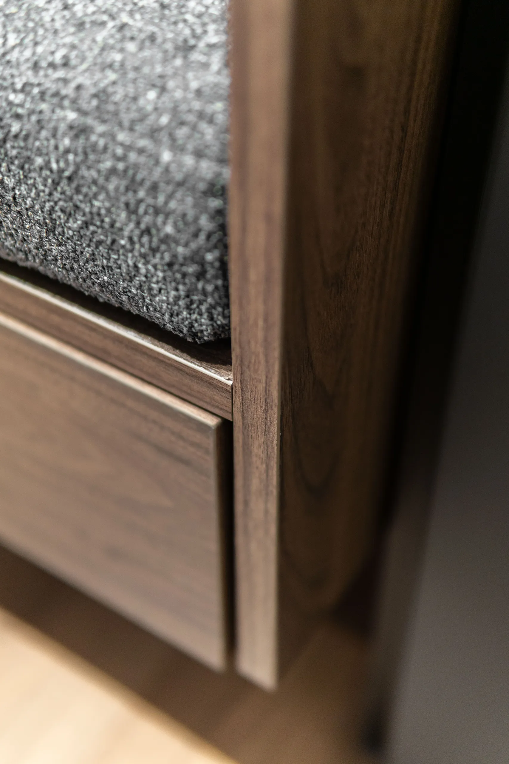
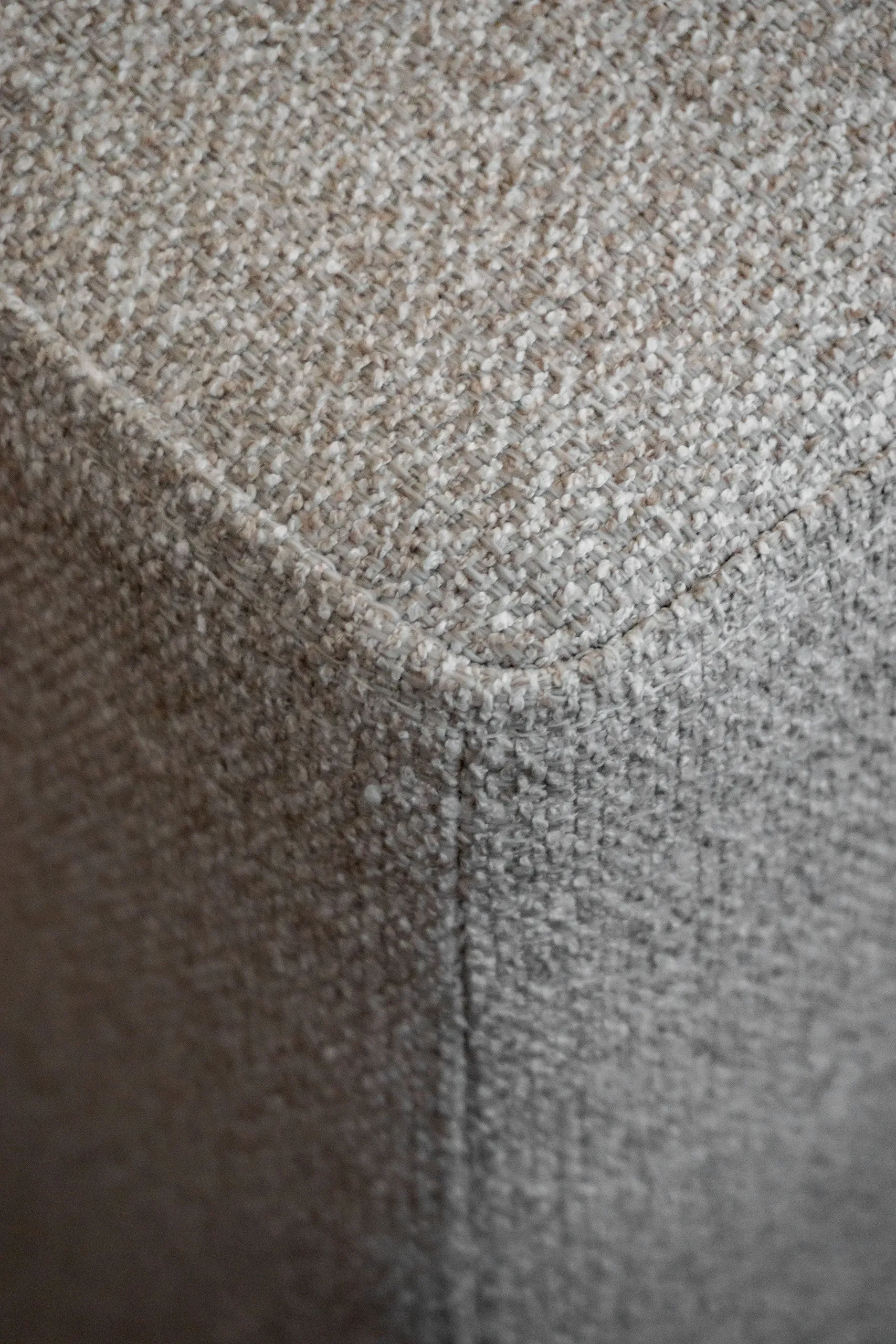
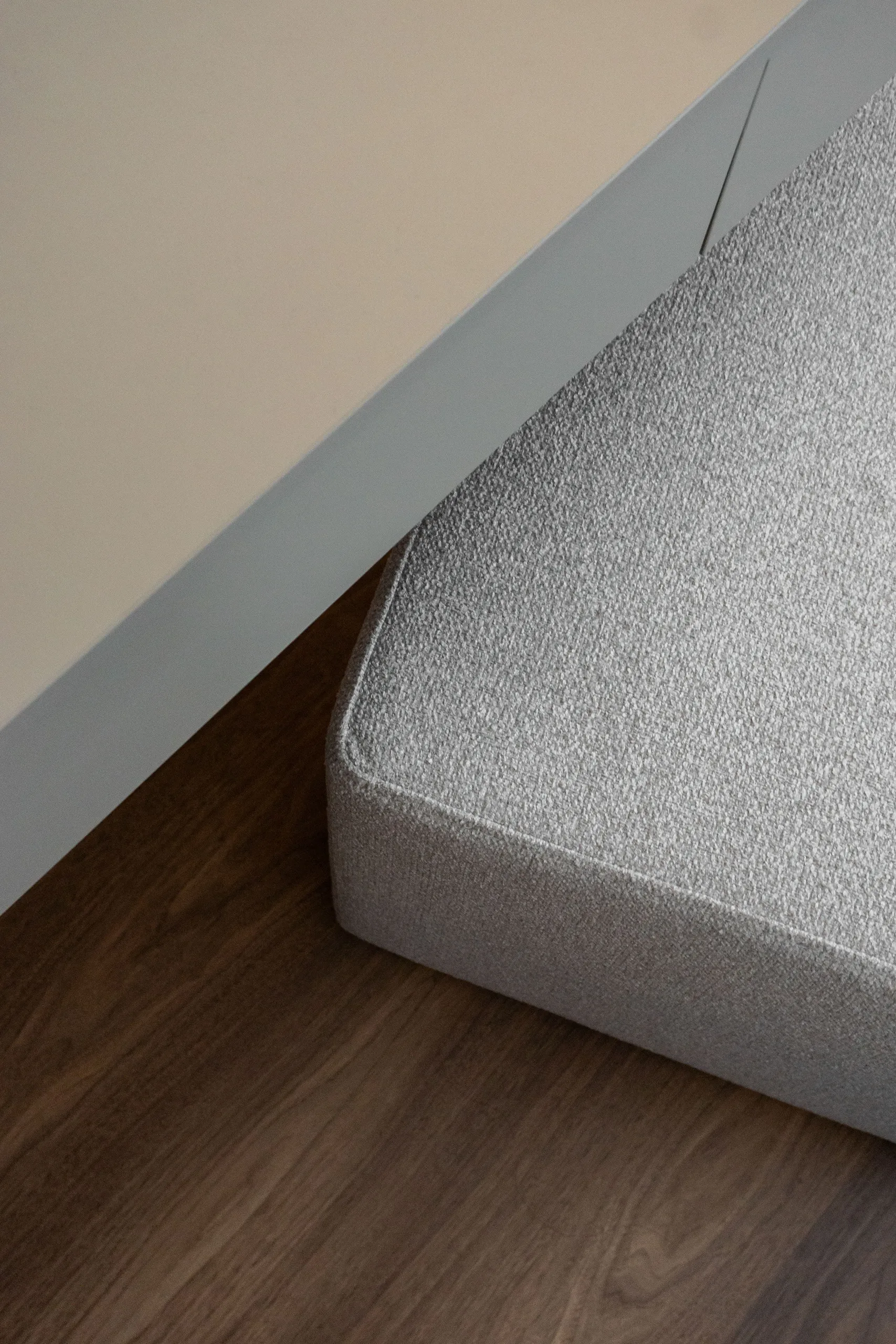
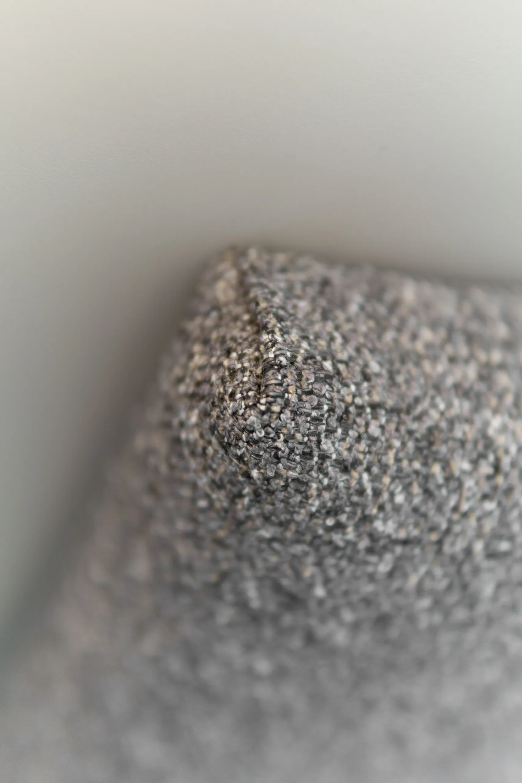
The bed is fully upholstered with a low headboard in CREVIN fabric, a brand we love for its combination of soft texture and durability. On either side, we added a pair of mobile nightstands in black. Not fixed, but free-standing … and that was intentional. It keeps the narrower part of the bedroom flexible enough to fit a crib later on, with no changes needed to the furniture.
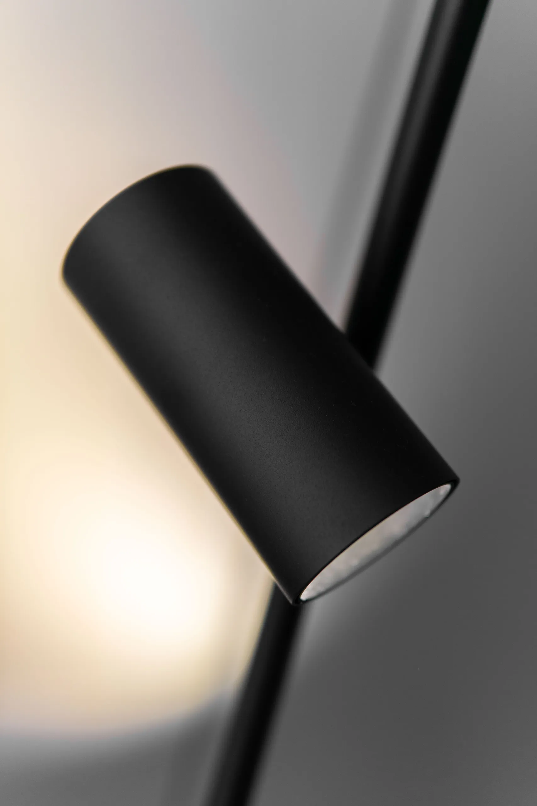
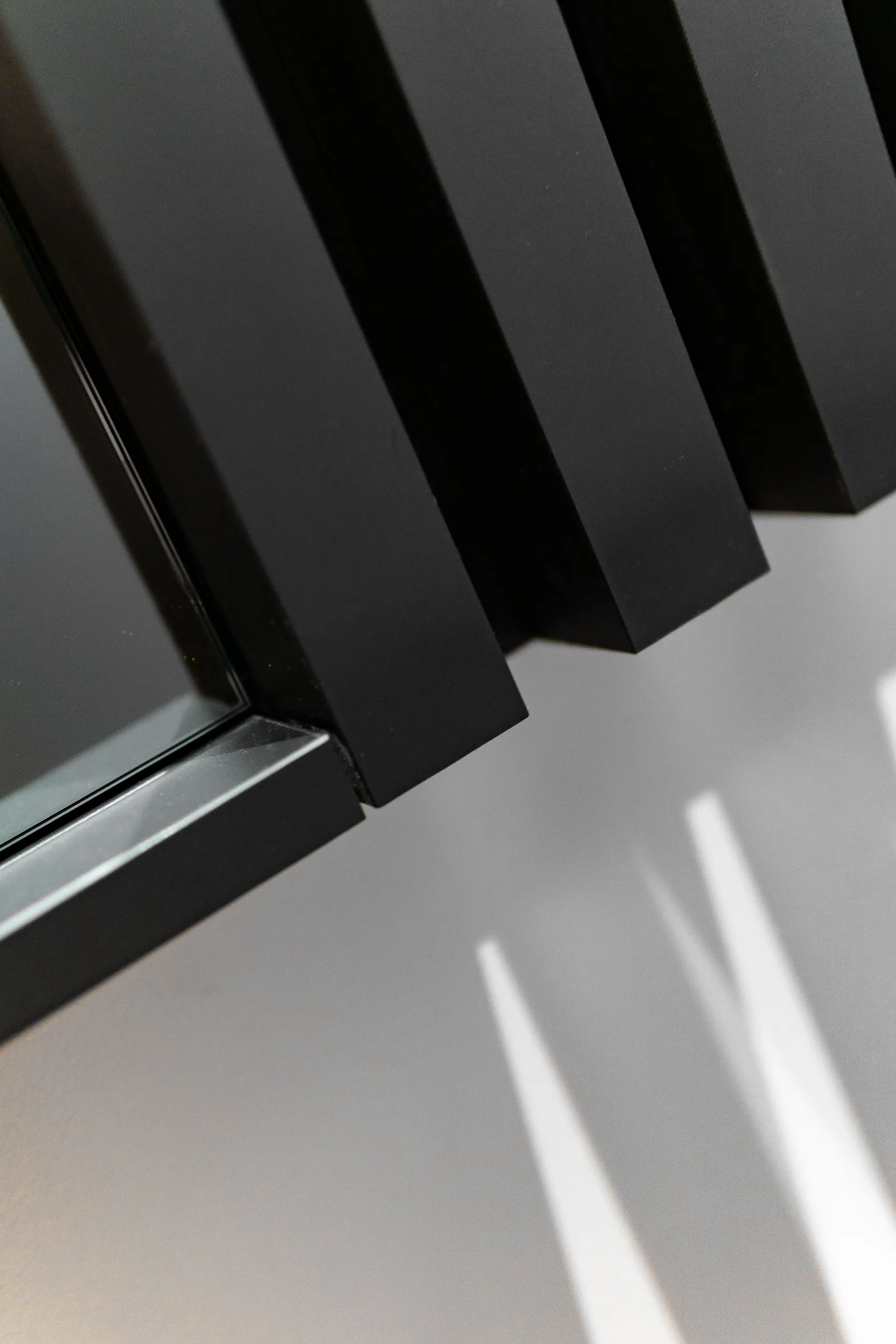
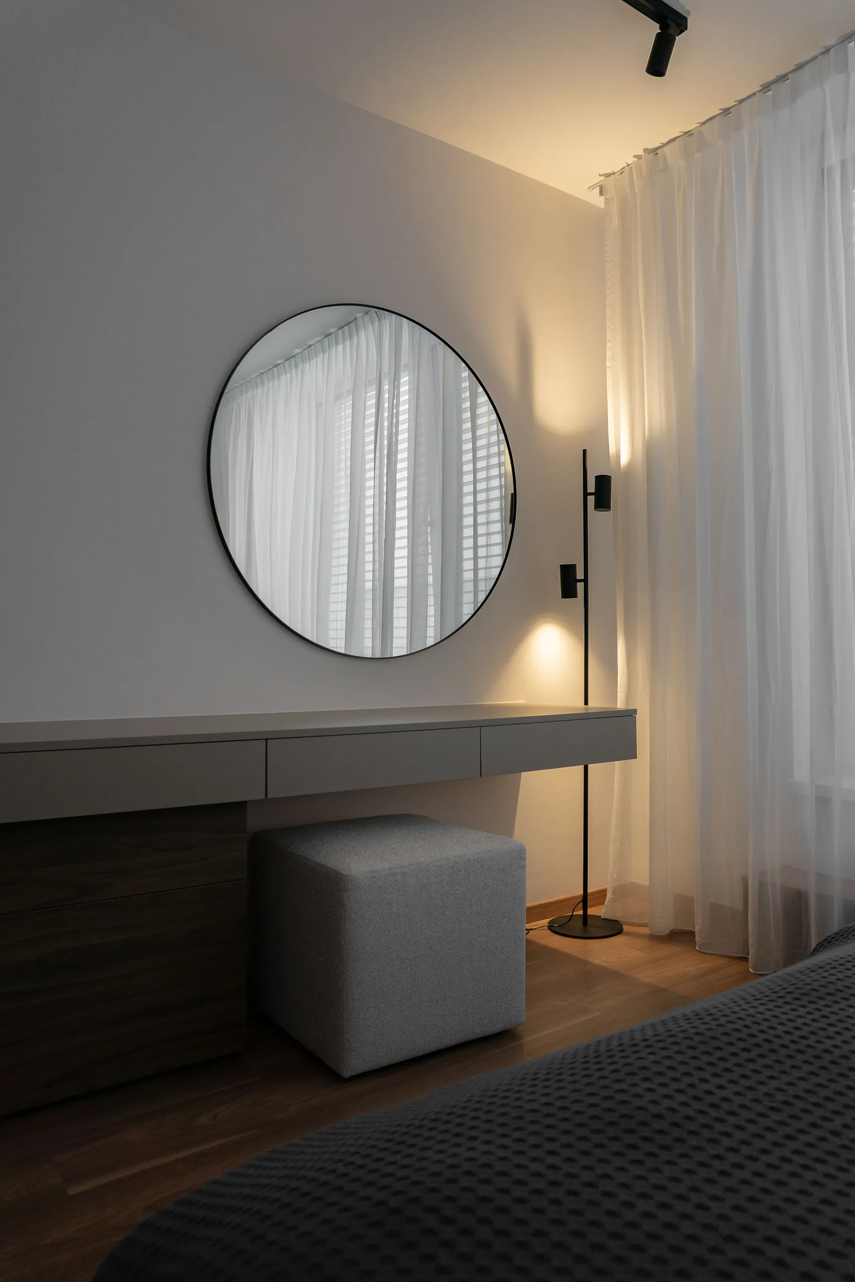
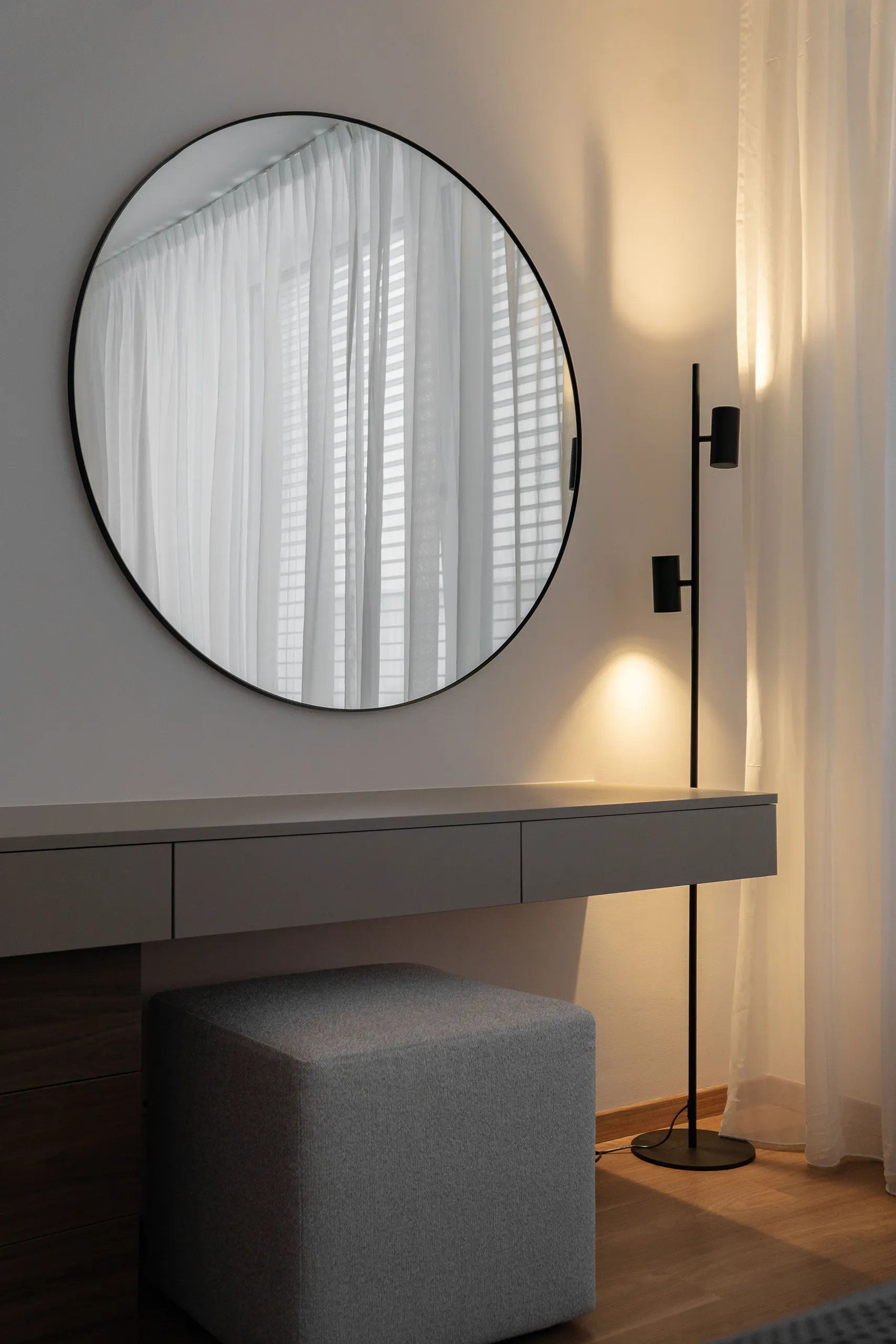
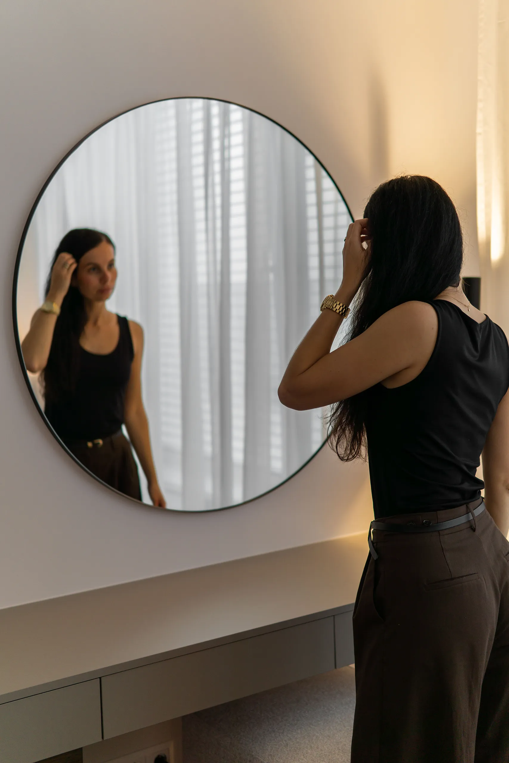
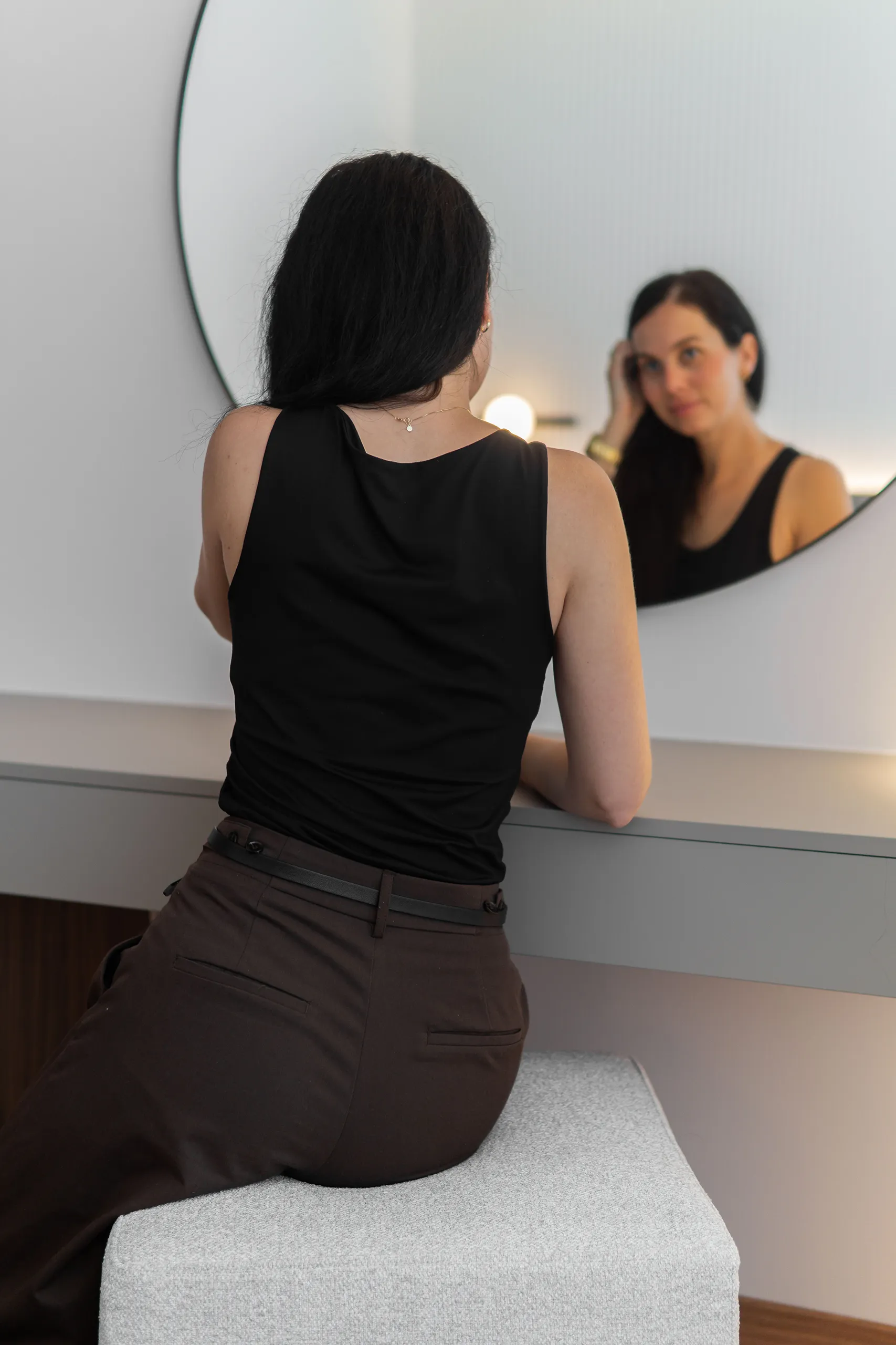
Across from the bed, we had enough room for a vanity table with small storage compartments. The composition is completed with a simple round mirror in a black frame and a floor lamp with adjustable spotlights.
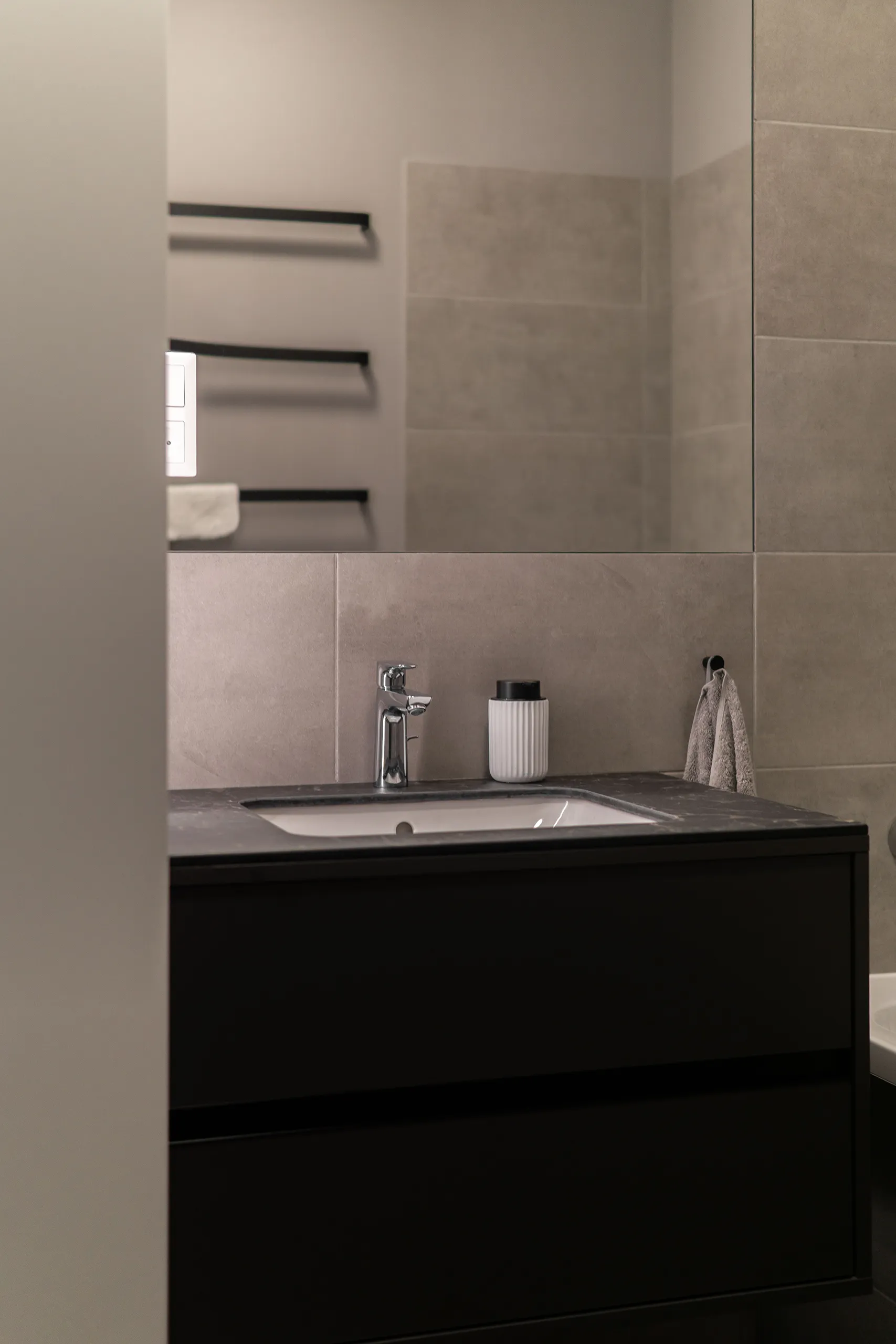
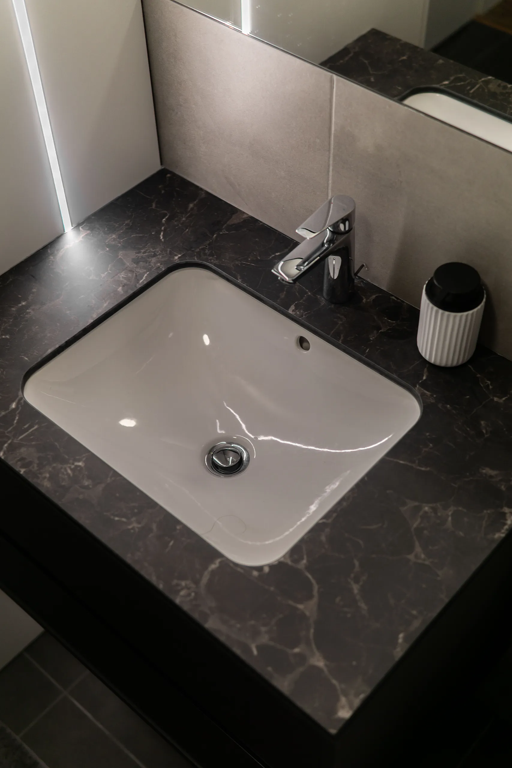
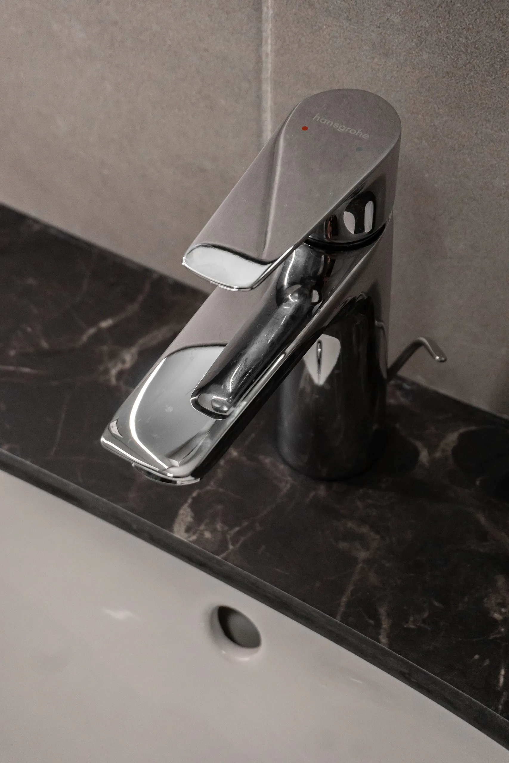
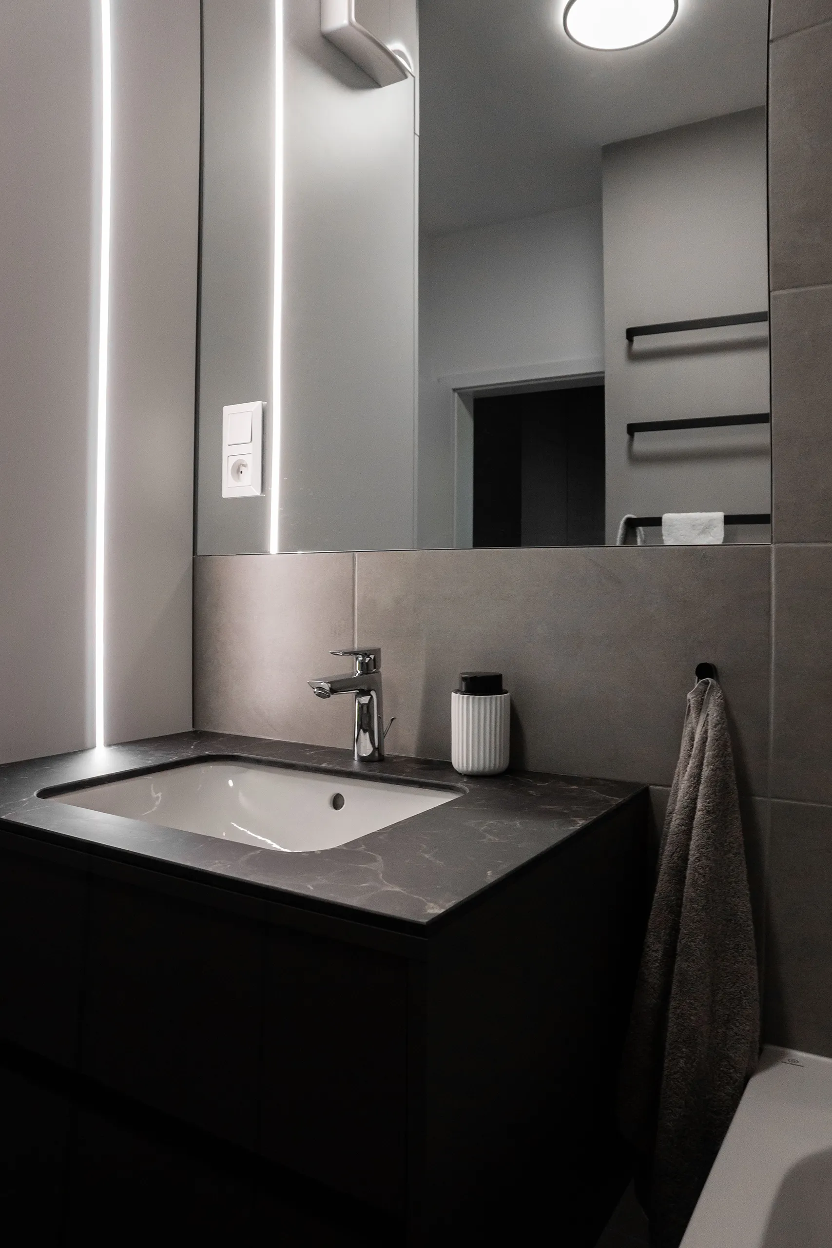
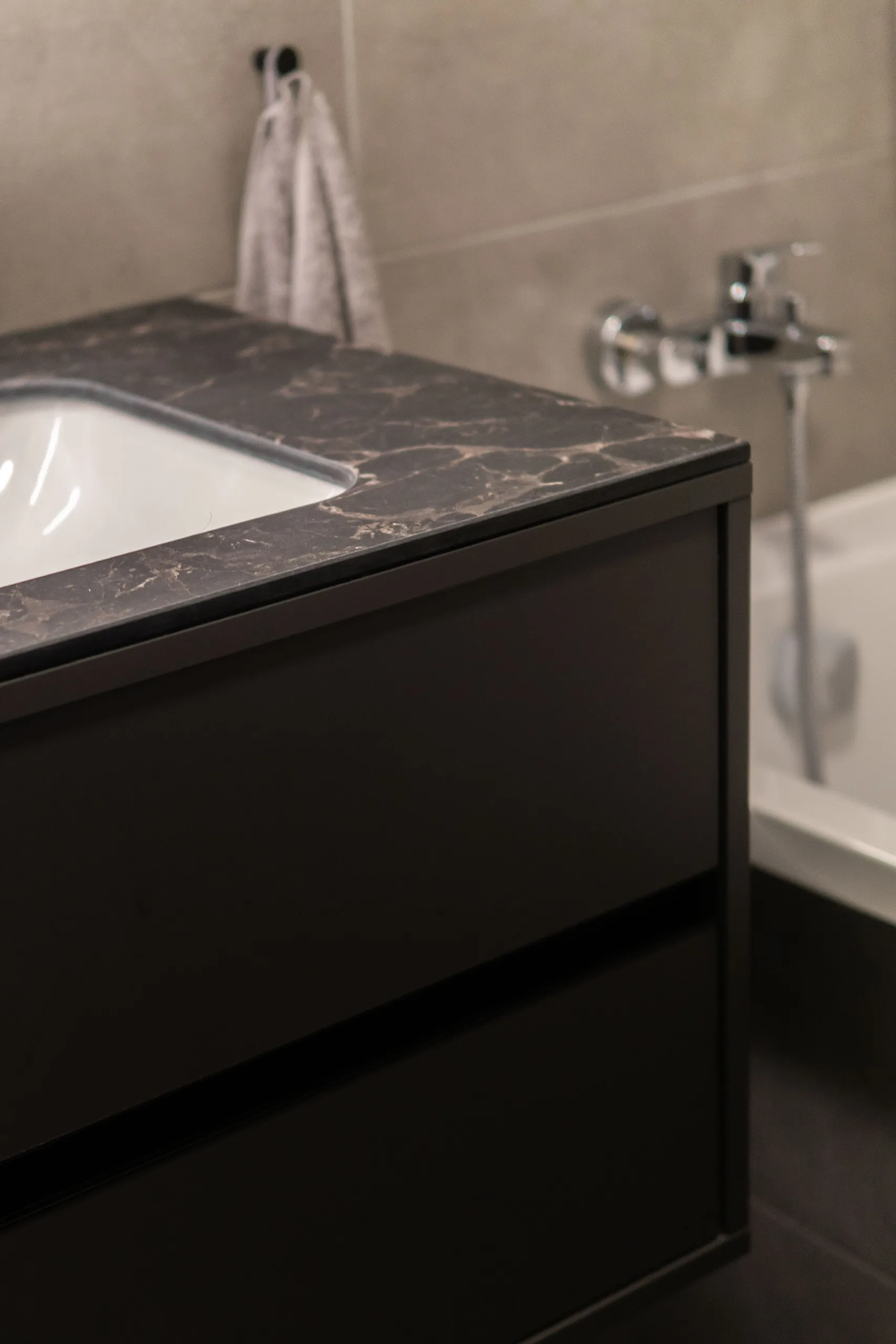
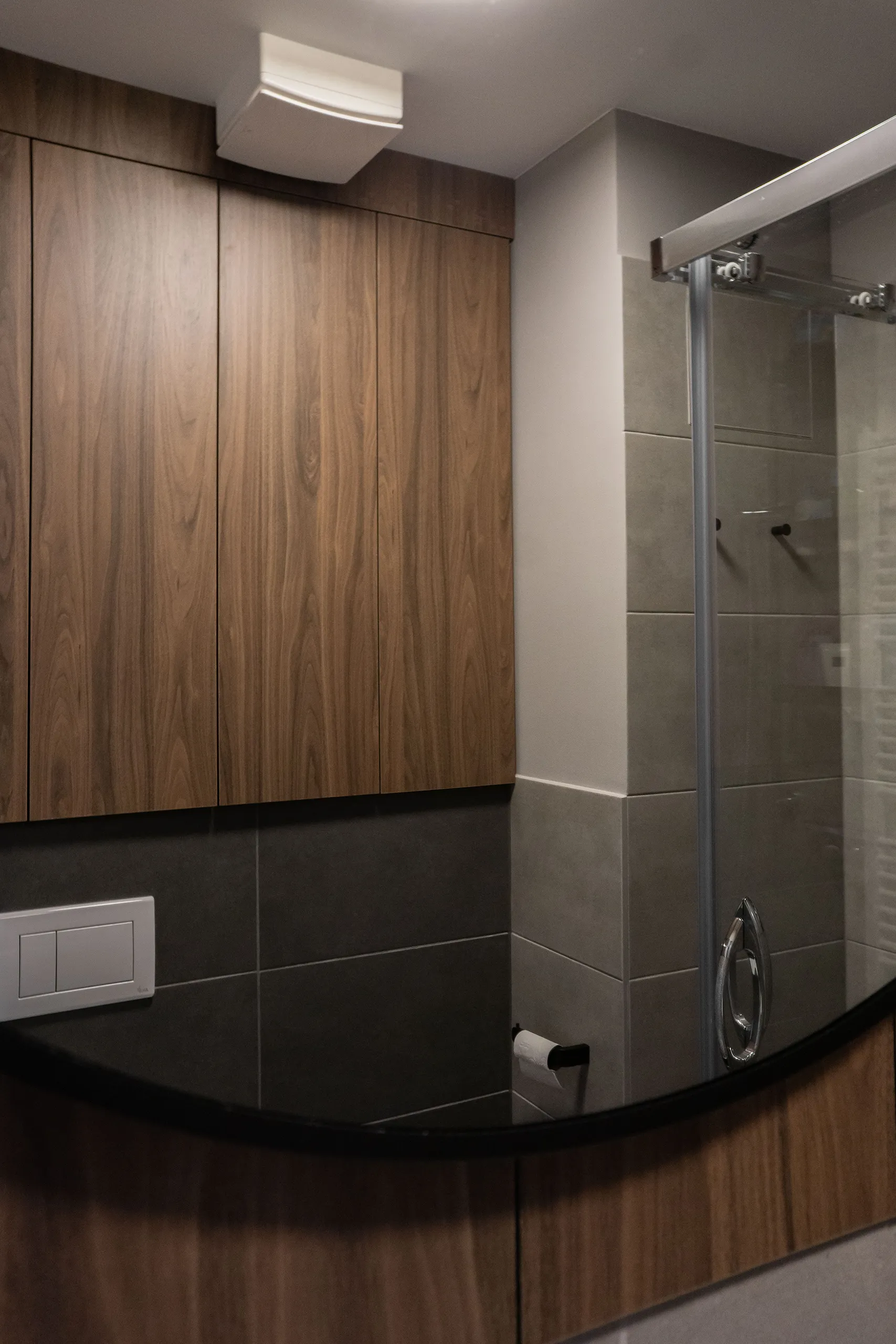
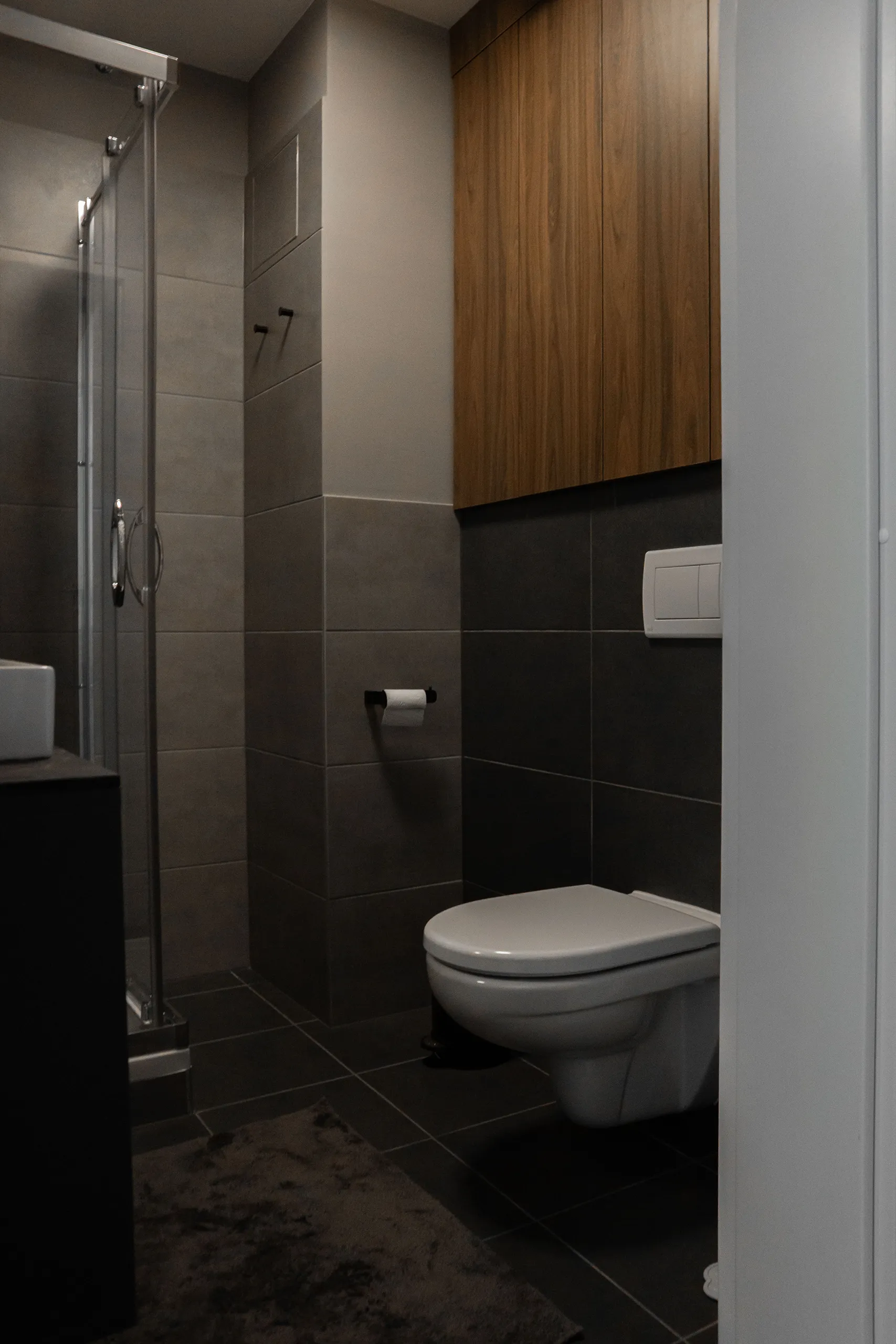
guest bathroom and parents' bathroom
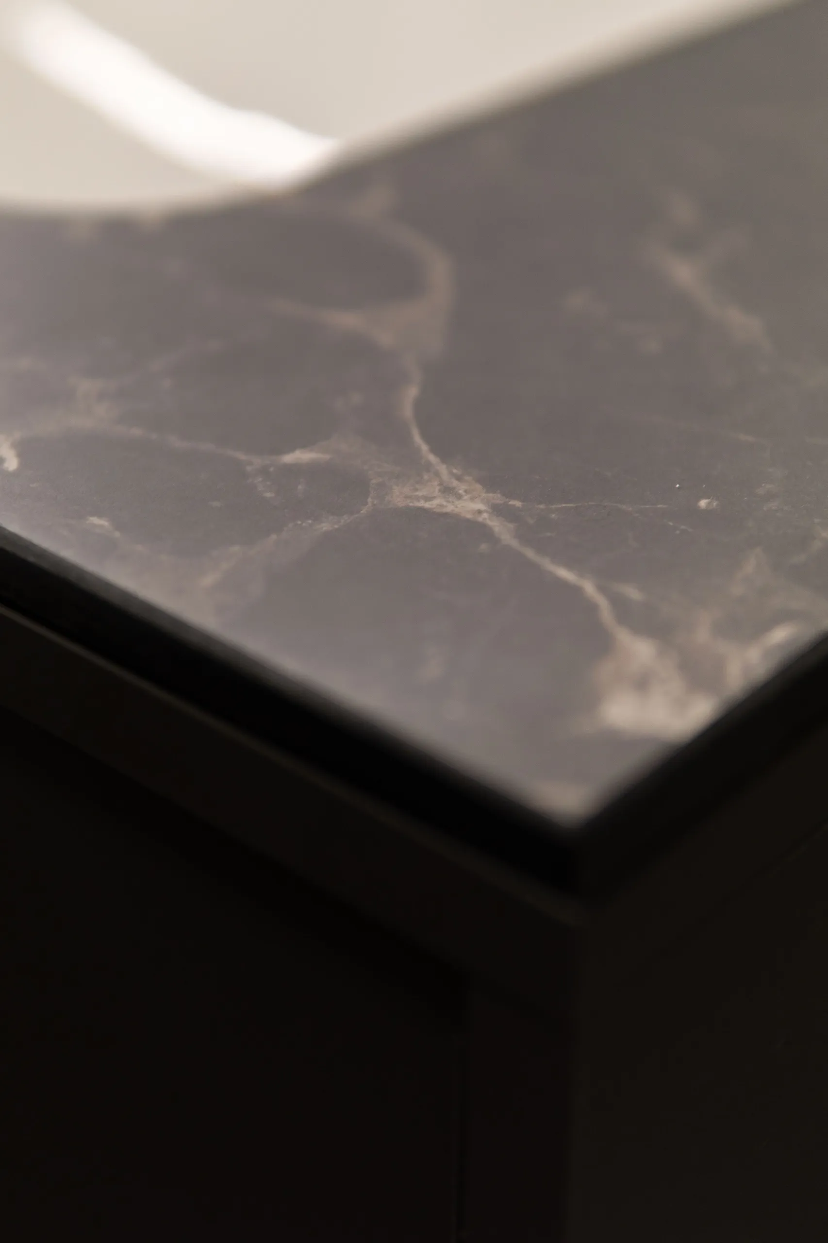
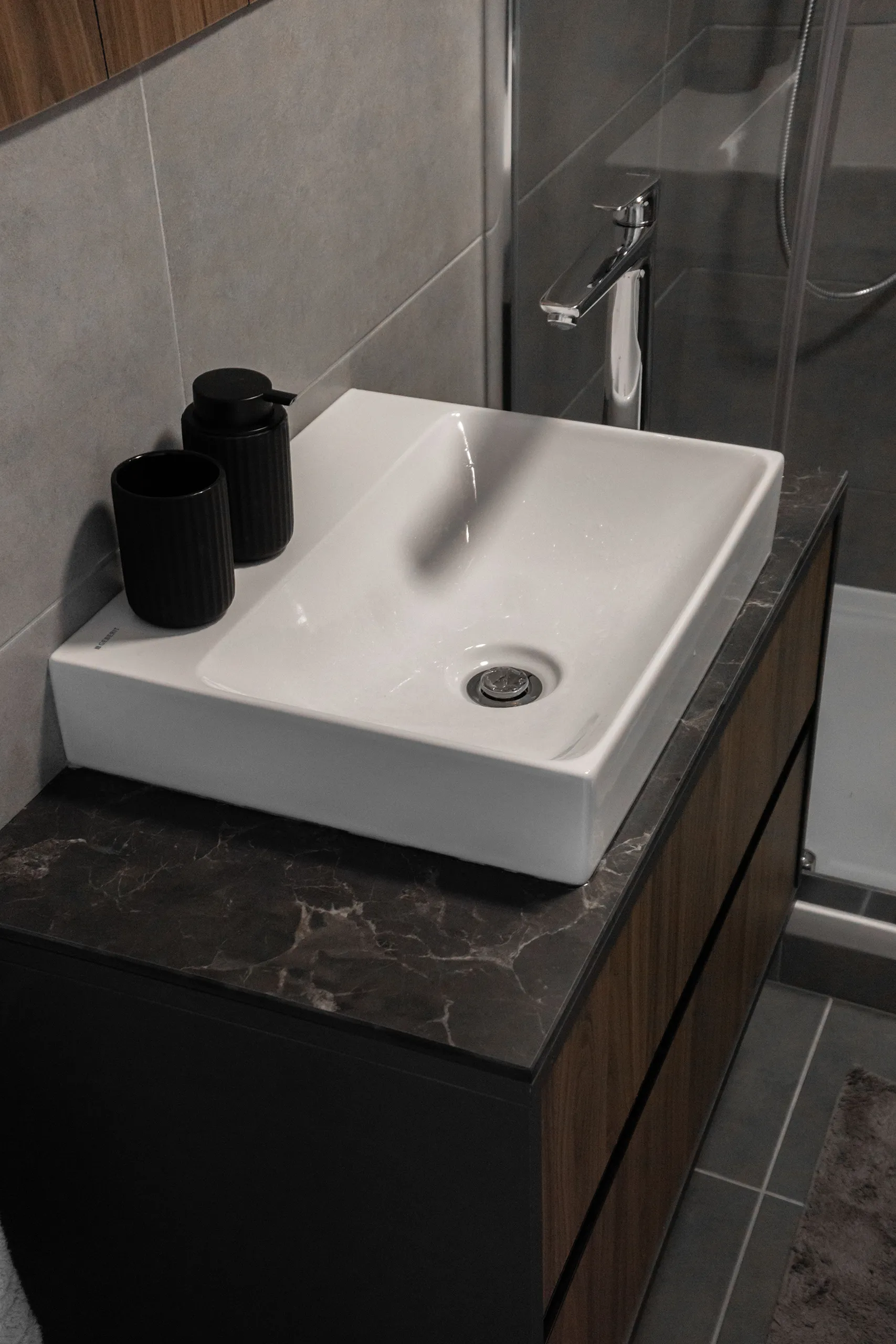
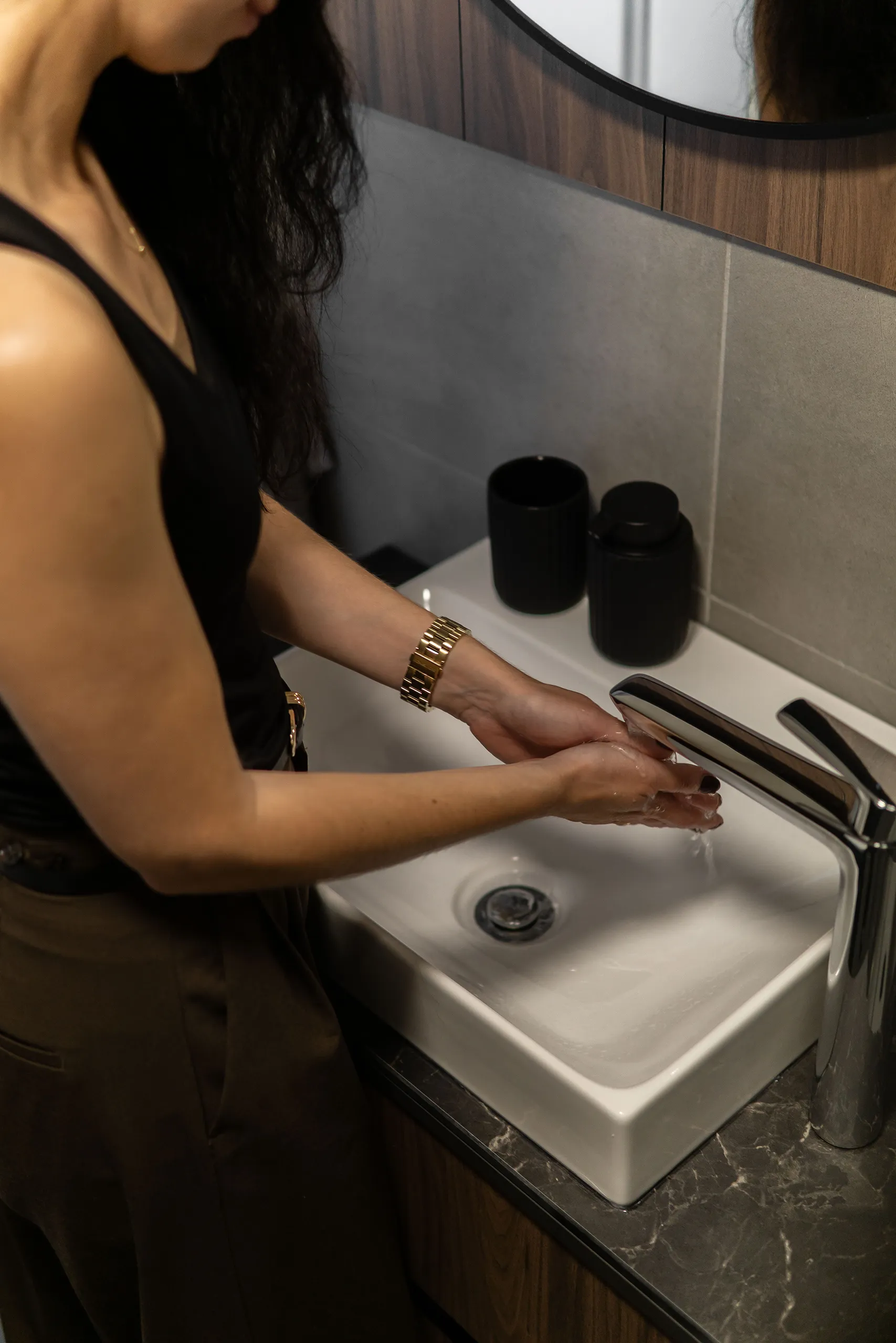
The bathroom was handed over in the standard developer finish, which for us meant working with what was already there and finding solutions without unnecessary intervention. We mounted the sink under a worktop made from a compact material, the same one used for the kitchen countertop, resistant to moisture and intensive daily use. The missing tile area next to the sink was solved with a flush mirror surface, and for the remaining untiled wall sections, we measured the colour with a spectrometer and matched it with regular paint. No wet works, no extra tiling. Creating an ambient atmosphere in this room was a must, so we went with a vertical LED strip that lights up the entire sink area.
The washing machine and dryer are built into a closed storage cabinet, keeping the space visually clean and fully functional.
In the parents’ bathroom, we applied similar principles. Above the Geberit unit, we created storage that hadn’t existed before, and designed a bathroom cabinet at the maximum dimensions the space allowed. Nothing flashy, just well thought-out.
REVIEW
Choosing the Nestor interior studio was honestly a great decision. Their timeless design hit our taste exactly. We really appreciated their sense for harmonising the individual rooms into one cohesive whole. Since they’re architects, they were always able to give us valuable technical input related to the design as well. Last but not least, we have to highlight how pleasant they were to work with, which made us feel completely comfortable openly sharing our ideas. Michaela and Peter, thank you for creating our new home.
VERONIKA and MARIÁN
